

The Bite Shot
Summary
The Bite Shot specializes in food photography. This rebrand was prompted by the desire to refine the branding as the business expands its offerings in the education space. The goal with the logo and brand visuals is to capture a bright, lively, professional, fun personality to complement the bold photography.
Below each of the three concepts shows the
Horizontal Logo
Vertical Logo
Logo Mark
Business Card Design
Photo Application Collage with Pattern Elements
Note
While each of these designs are meant to show a developed idea of each concept, each will be refined and the chosen concept will be carefully considered and added to until the brand is the strongest representation it can be.
Business card concepts and each of the mockups are meant to show how the brand can progress beyond the logo alone and will be refined along with the logo. Additionally, the information shown is placeholder information.
Moodboard
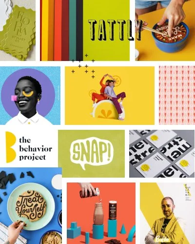
Bold, colorful, altruistic
Personal, generous, expressive
Optimistic, encouraging, welcoming, approachable
Driven, intense, responsible, honest, aware, activating
Supportive, curious, playful, sometimes cheesy
Initial Concepts

Concept 1
Key descriptors: playful, geometric, type-driven
This concept has a lot of fun elements within the logotype with a bite taken out of the e, the selective yellow letters to allude to photography strategies such as composition/framing/balance, as well as the h framing the o, similar to framing a shot.
Having the call-out geometric, colorful details easily lends itself to having bright, geometric shapes throughout the brand. I think this would create a lot of variety within the brand and leave a lot of potential open with the website.

Concept 2
Key descriptors: professional, balanced, optimistic, upbeat
The type in this concept is playful and fun, yet still straightforward. One of the strong suits of the way this type is composed is that it has a very versatile and timeless appeal.
The logo mark has a lot of personality and creates a very memorable impression. It combines food (lemon), and photography (shutter), as well as brings in your bright personality and alludes to specializing/education (sunburst to point to lighting and education). This works really well as a bold mark and easily lends itself to patterning, etc.

Concept 3
Key descriptors: pop art, playful
This concept has the most POP art feeling to it. One of the things I like about this concept is how strong the type is. It is easily legible on any background. I think it also has a strong correlation with shadows, lighting, and composition so it has tie in with photography as well. The little burst can also be used as a repeating element throughout brand materials.
I wanted to include one option that utilizes the camera + cookie mark and gave it a shadow treatment similar to the type treatment for "Shot”. I think it plays into the pop art look well and keeps some of the original brand elements. I also wanted to add something with some energy and more “pop” and think the exclamation pattern is a really energetic and fun component.
