

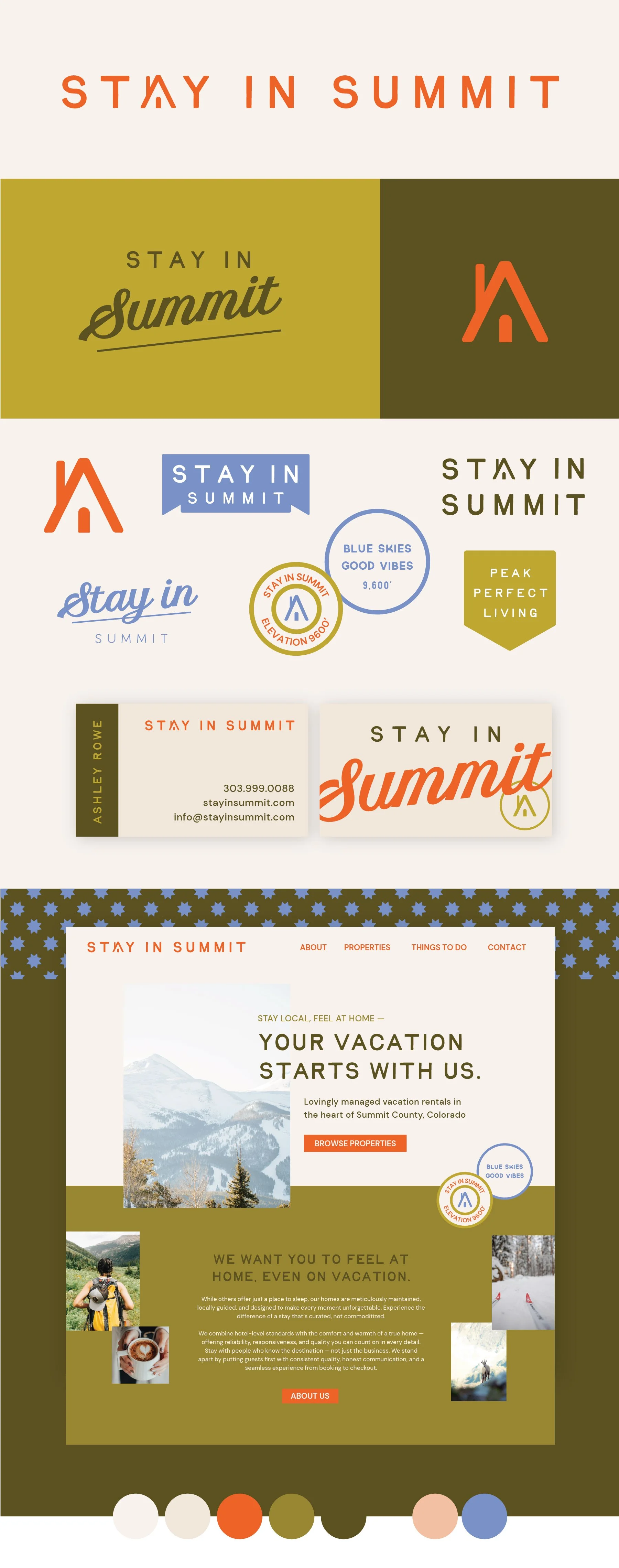
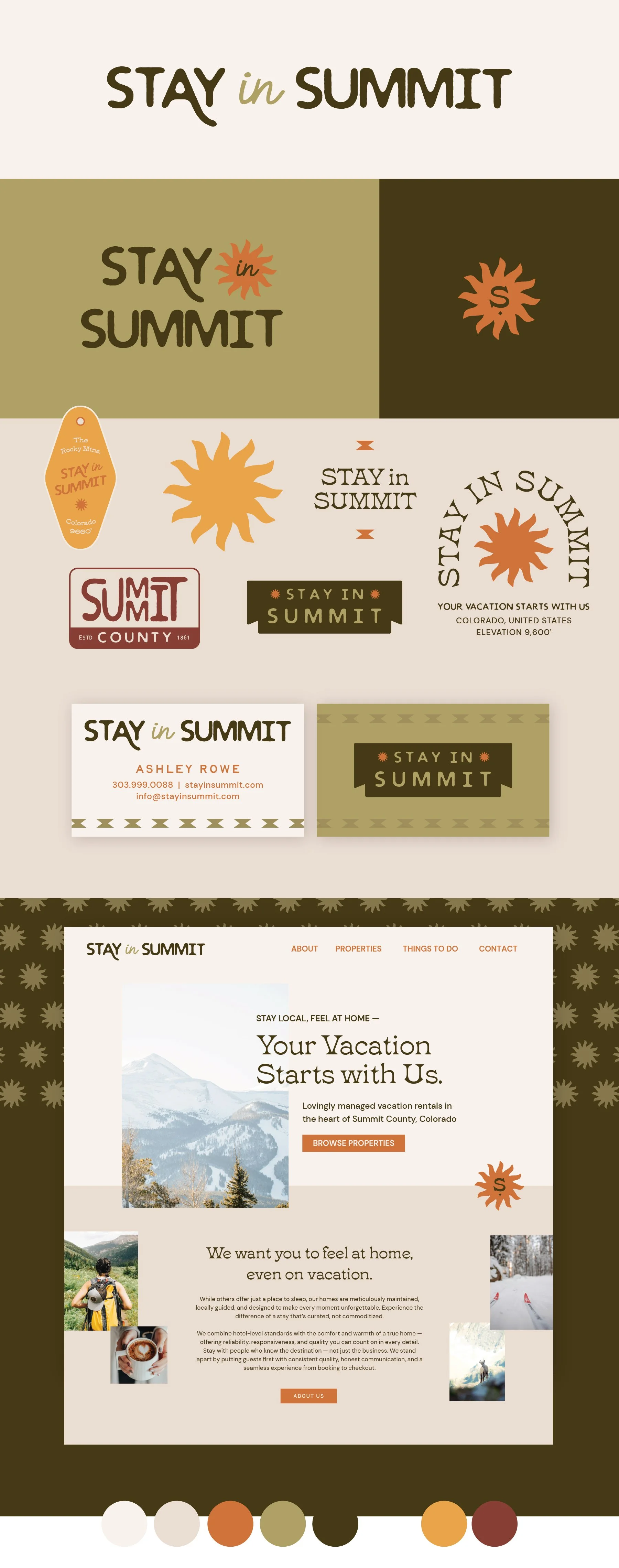
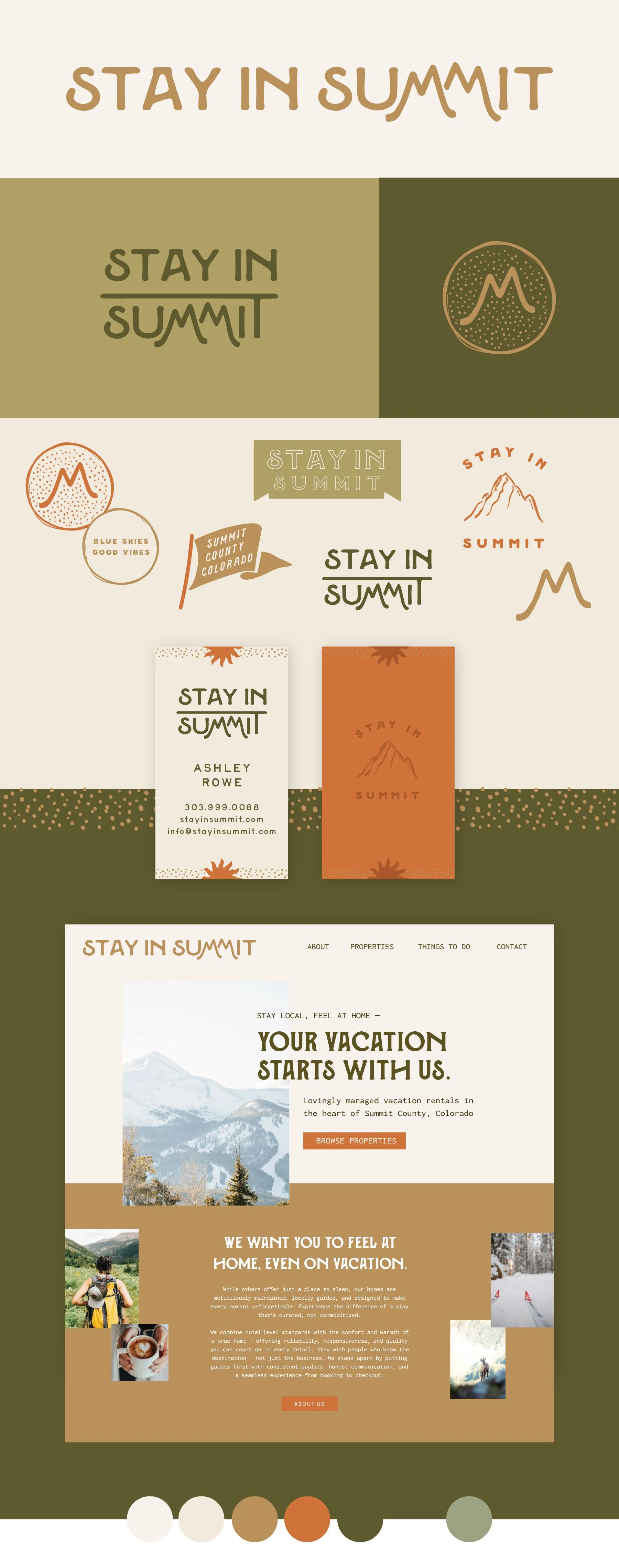
Stay In Summit
Below each of the three concepts shows the
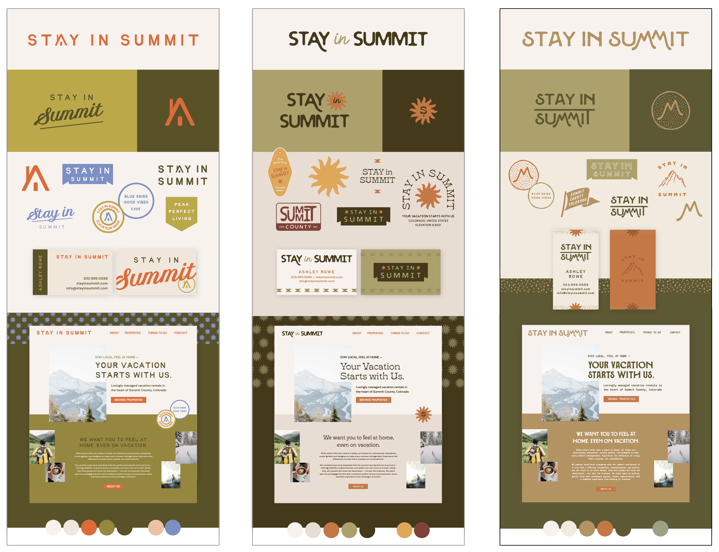
Primary Logo
Monogram Mark
Alternative Logo
Horizontal Extended Logo
Photo Overlays
Business Card Mockup
Logo Suite
Note
While each of these designs are meant to show a developed idea of each concept, each will be refined and the chosen concept will be carefully considered and added to until the brand is the strongest representation it can be.
Business card concepts and the homepage mockup are meant to show how the brand can progress beyond the logo alone and will be refined along with the logo. Additionally, the information shown is placeholder information.
Moodboard
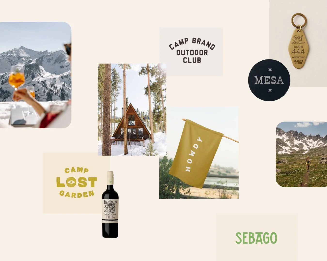
Personable, Local, Adventurous, Reliable, Authentic, Professional, Enthusiastic
Initial Concepts

Concept 1
Bright, energetic, modern, layered
This direction brings a clean, vibrant, modern feel to an outdoors-inspired brand. It’s approachable for outdoor lovers of all kinds—inviting without requiring a hardcore hiking persona.
The color palette delivers a fresh, unexpected twist while still nodding to classic camping tones with its green–tan–orange combination. The A-frame detail beautifully represents your guests, your local positioning, and your services. It communicates something more personal and intentional—an A-frame hideaway rather than a large, corporate lodge. The result is a timeless mark with personality, rooted in the type of experience you provide.
Concept 2
Raw, Imperfect, Intriguing, Western Flair
This concept carries a laid-back, effortlessly cool vibe—something that feels more like a curated getaway than a literal landscape. The visuals remain intentionally open-ended, leaning into mood and atmosphere rather than specific activities or scenery.
The sun-inspired icon reinforces the idea of a sunny, relaxed escape without tying the brand to one sport, setting, or type of lodging. It taps into the broader “Colorado lifestyle” that visitors are drawn to: warm, welcoming, and full of easygoing adventure.
Concept 3
Organic, vintage, Western-deatils,
This concept highlights the defining feature of the region—the mountains—while keeping the look modern-vintage, approachable, and distinctly local. The goal is to reference the landscape in a way that feels cool and stylish, not overly sporty or tied to specific mountain activities.
The Mountain M’s are designed with softer, less angular peaks so they blend naturally with the letterforms while still offering a recognizable mountain silhouette. This gives you flexibility for more literal mountain illustrations, like the version used on the back of the business card, without losing the brand’s warm, handcrafted vibe.
Main things to choose from here:
Favorite overal concept
Color Scheme
Font choices on the website mockup