SRI
Below each of the three concepts shows the
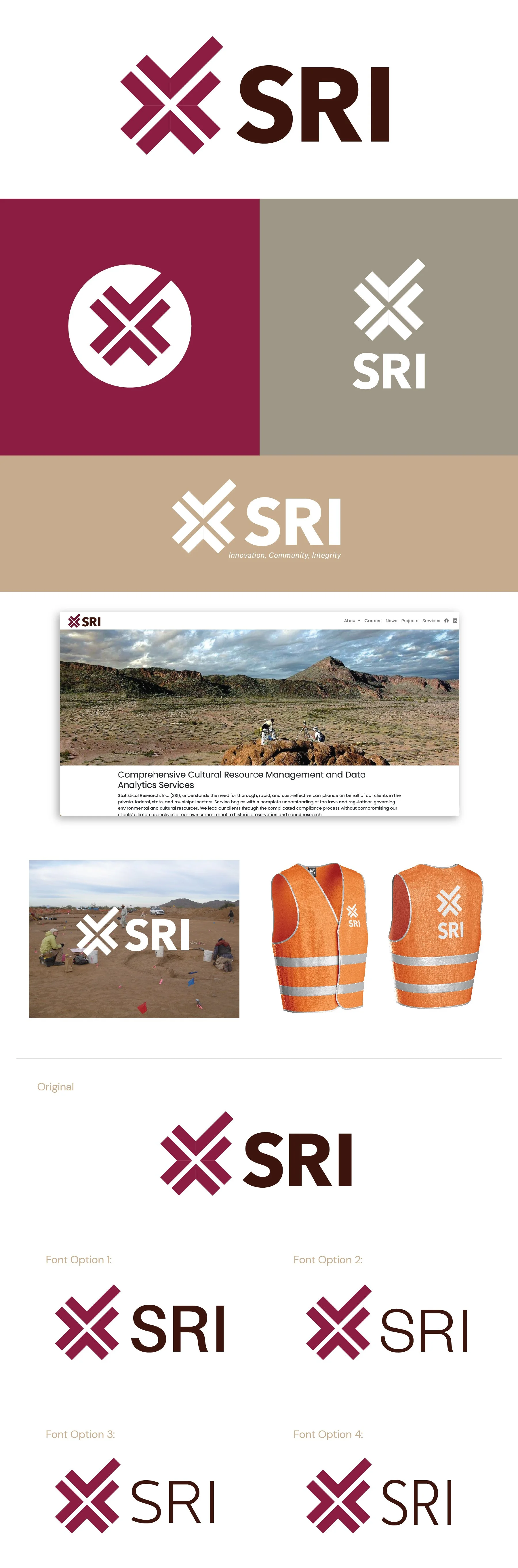
Primary Logo
Secondary Logos
One Color with Tagline
Homepage Mockup
Logo Overlay on a Photo
Saftey Vest Mockup
Note
While each of these designs are meant to show a developed idea of each concept, each will be refined and the chosen concept will be carefully considered and added to until the brand is the strongest representation it can be.
Business card concepts and the homepage mockup are meant to show how the brand can progress beyond the logo alone and will be refined along with the logo. Additionally, the information shown is placeholder information.
**The taglines are placeholder info and can be updated in revision rounds.
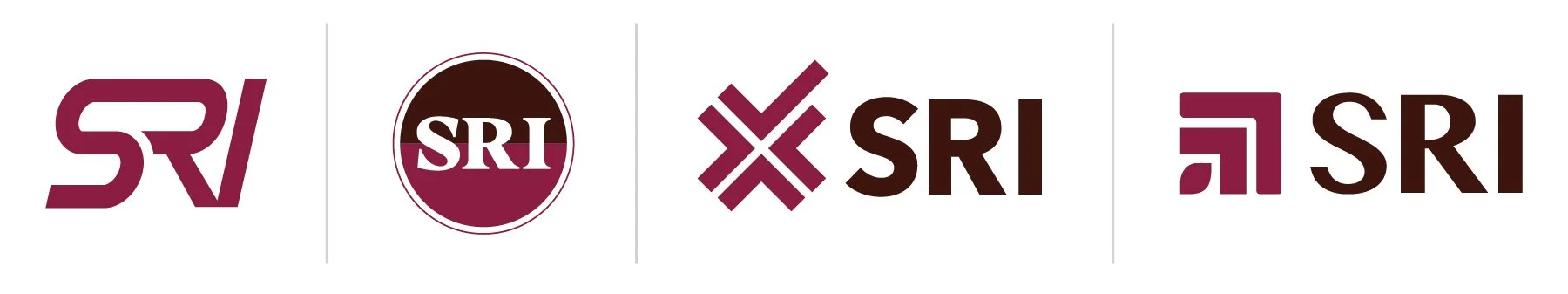
Initial Concepts
Revisions
Chosen Concept
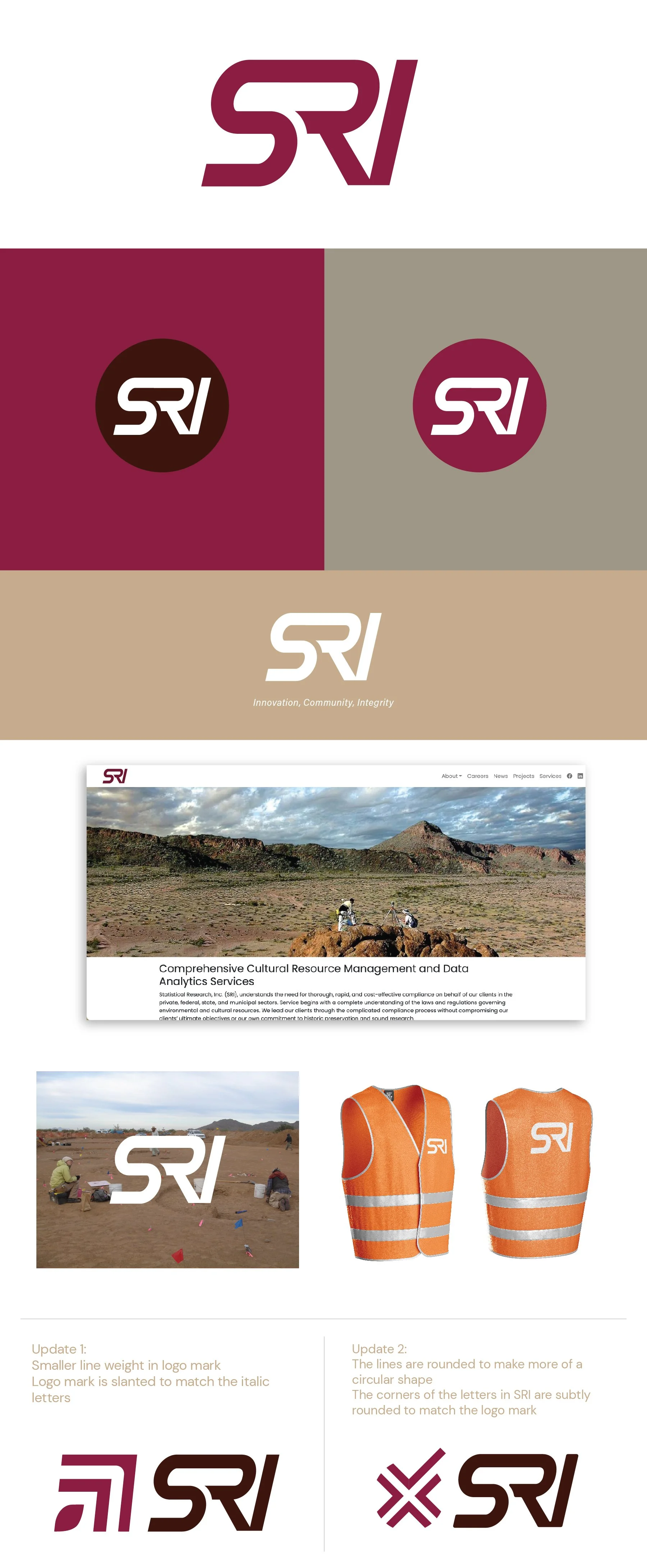
Tagline updated to Statistical Research Inc.
Concept 1
This concept draws on the idea of movement and continuation. The boldness and customization in the letters make a strong, distinct impression and will work well at both large and small scales. This option also works well with the letter inside a circle so you have multiple formatting options.
*Updates:
Logo mark options
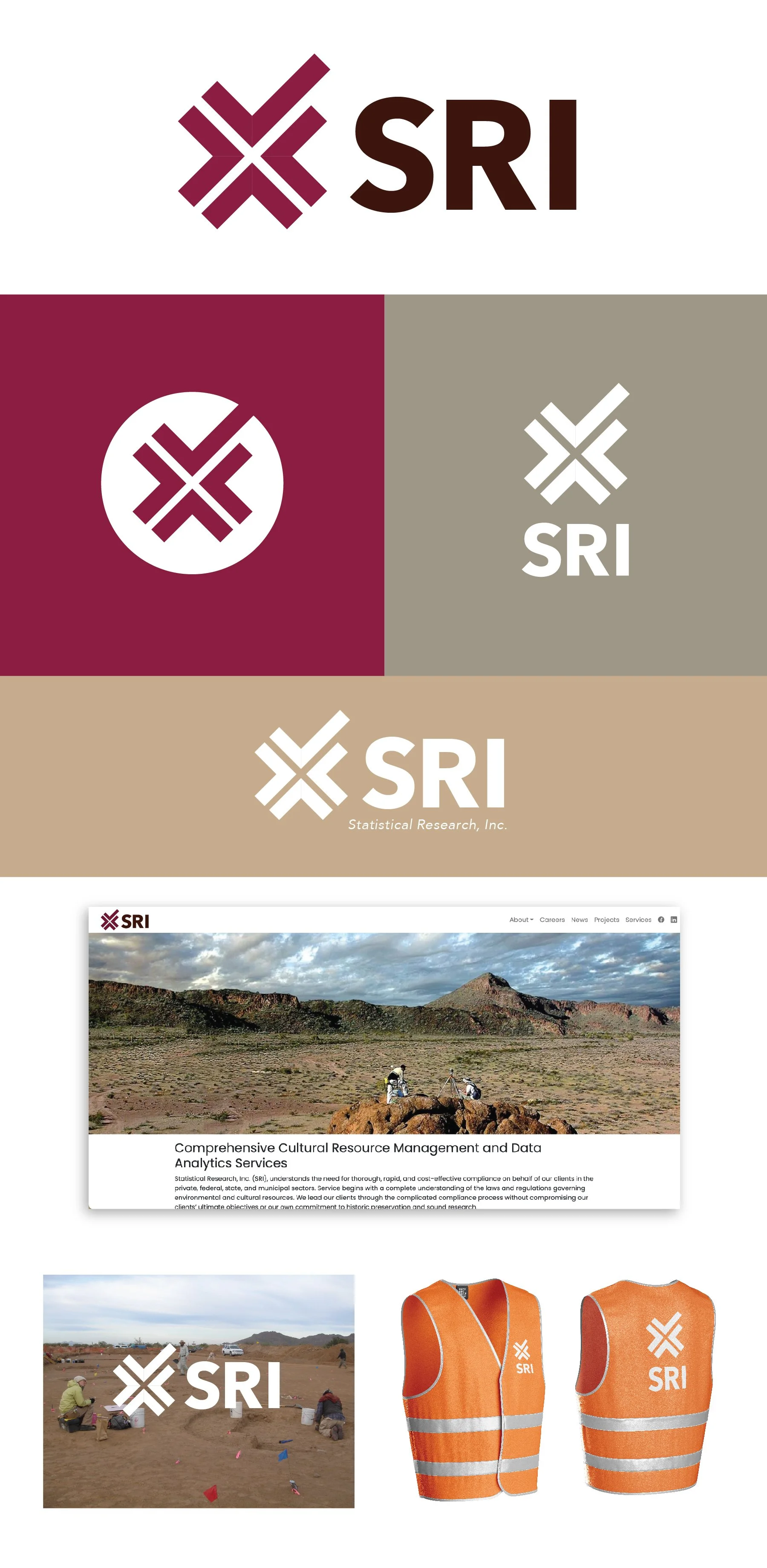
Concept 2
This concept brings in a visual to represent the compliance aspect of your business. The check mark at the top of the logo mark represents your SRI’s ability to complete your client’s tasks and reinforces the idea that the clients are in good hands. The repetition of the check mark in a circular pattern creates a distinct mark, but also creates an open-ended focal point that can loosely represent mapping, a target, or an “x-marks the spot”.
*Updates:
4 fonts to compare
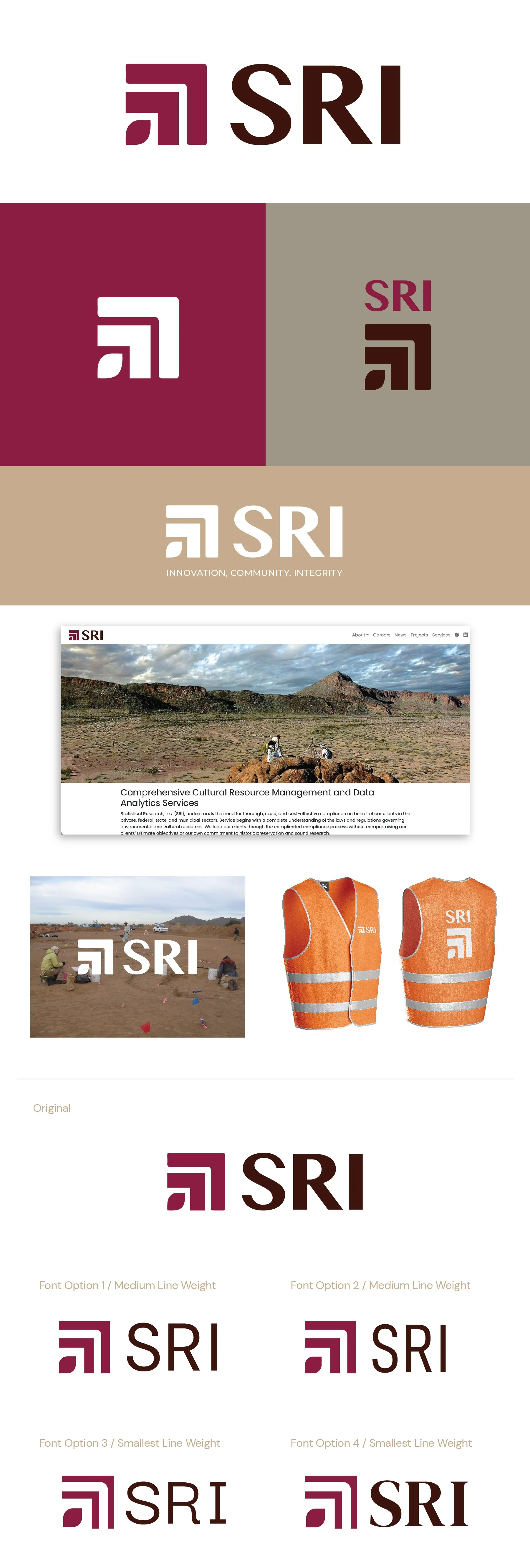
Concept 4
This concept has several elements that can be loosely interpreted to describe a lot of what SRI does. The smallest shape is shaped like a leaf, so it ties in with the natural aspect of what you do. The next two right-angle shapes can function to show growth, building blocks, data, and structures. This option is modern enough to be attractive to new employees but is timeless enough to appeal to both the public and private sectors that you work with.
*Updates:
Two variations on the line width of the logo mark
4 fonts to compare