Platte Valley Veterinary
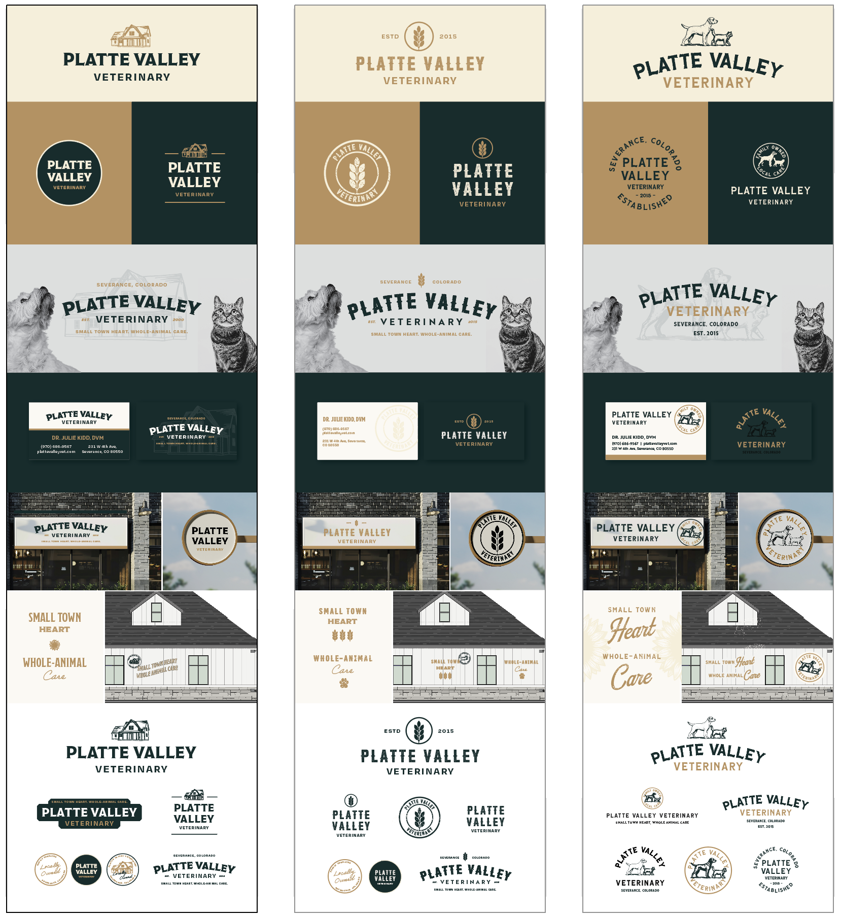
Below each of the three concepts shows the
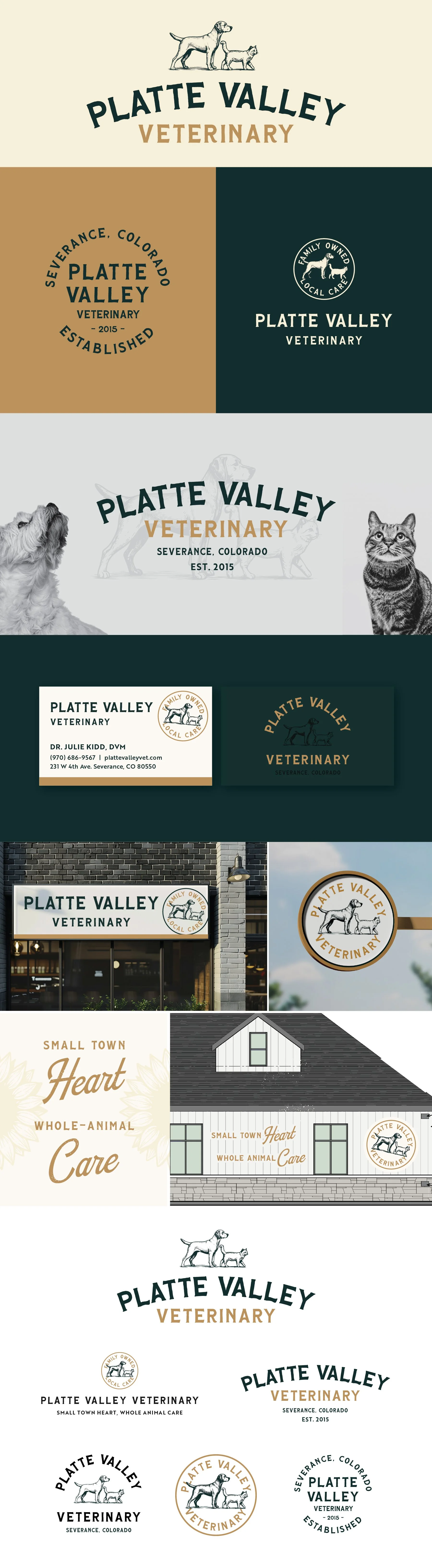
Primary, Horizontal Logo
Vertical Logo
Monogram Mark
Horizontal Extended Logo
Business Card Mockup
Photo Overlays
Logo Suite
Note
While each of these designs are meant to show a developed idea of each concept, each will be refined and the chosen concept will be carefully considered and added to until the brand is the strongest representation it can be.
Business card concepts and the homepage mockup are meant to show how the brand can progress beyond the logo alone and will be refined along with the logo. Additionally, the information shown is placeholder information.
Moodboard

Inviting & Homey, Comfortable, Family-oriented, Small town, Good medicine, Current
Initial Concepts
Concept 1
The main idea behind this concept is to draw on the location. Making the farmhouse the focal point leans into that “old-school” care you’d expect in a small farming community. It also subtly communicates, “you’re welcome here—you’ll be taken care of.”
This direction feels especially distinct for a veterinary practice, since it’s not something you see often. It does a strong job of positioning you as the trusted, local vet.
The logo font complements this well—it has a vintage feel while still being polished and highly legible, and it works beautifully as a standalone element.

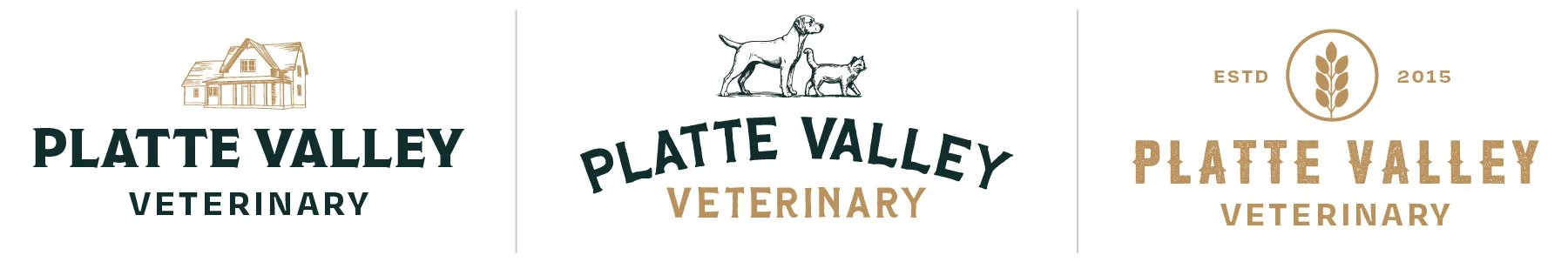
Concept 2
This concept leans fully into a vintage aesthetic and highlights the veterinary aspect with illustrated elements of a cat and dog. Every detail reinforces that old-school, established feel.
The illustrations bring a lot of character, helping the practice feel like a long-standing, trusted staple in the community.
From a functionality standpoint, the design is very versatile. The type and imagery can be used together or separately, depending on the application. The circular dog-and-cat mark, in particular, has a lot of potential—whether paired with the full practice name or used to emphasize the “locally owned” message.
Concept 3
This concept puts the strongest emphasis on community. The use of wheat is unique for a veterinary clinic, which makes the mark feel distinctive while naturally tying in the surrounding farming community and locally owned aspect.
The typography adds to this direction with a subtle ranch-inspired flair, reinforcing that connection to agriculture in a refined, intentional way.