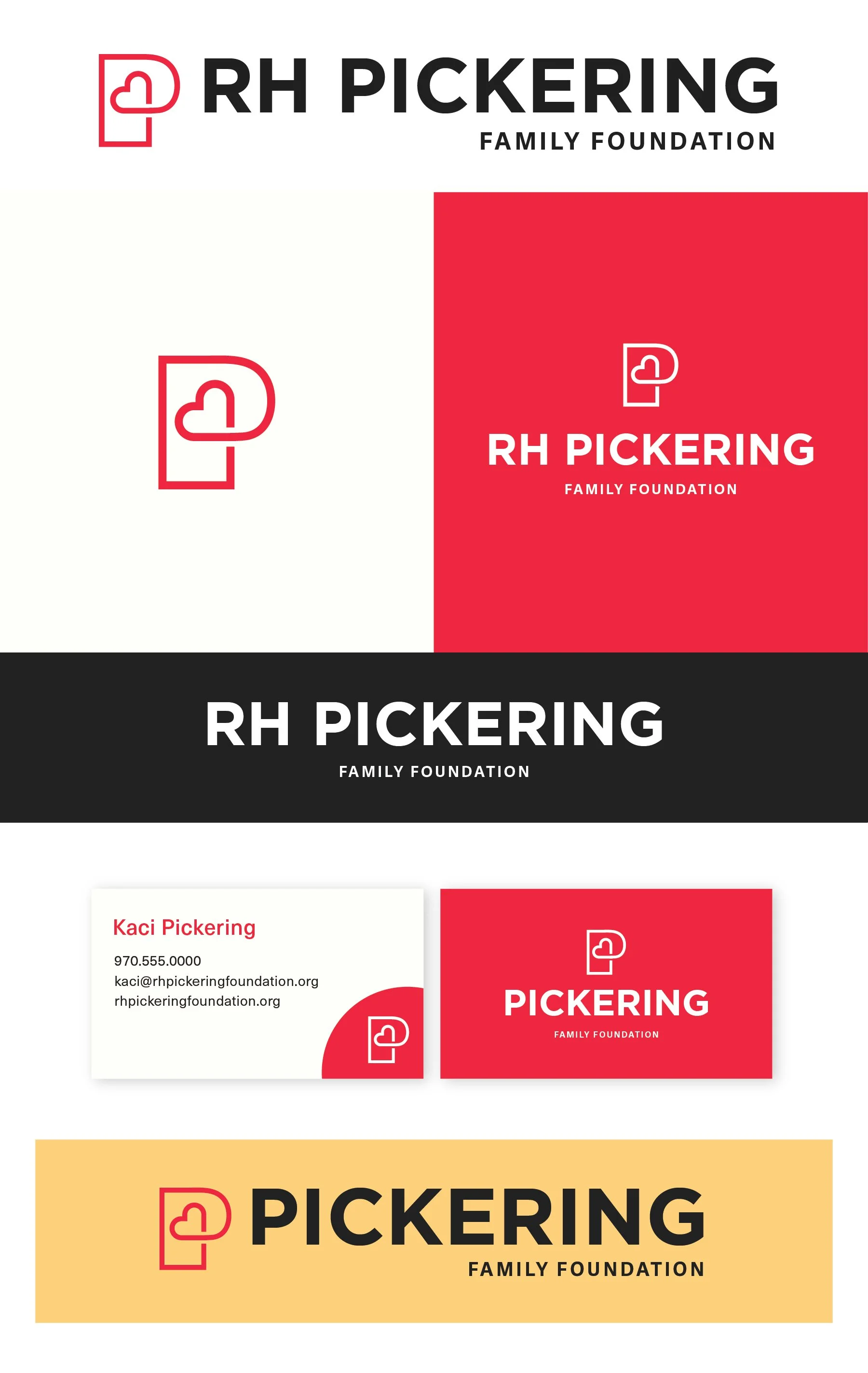
RH Pickering Family Foundation
Below each of the three concepts shows the
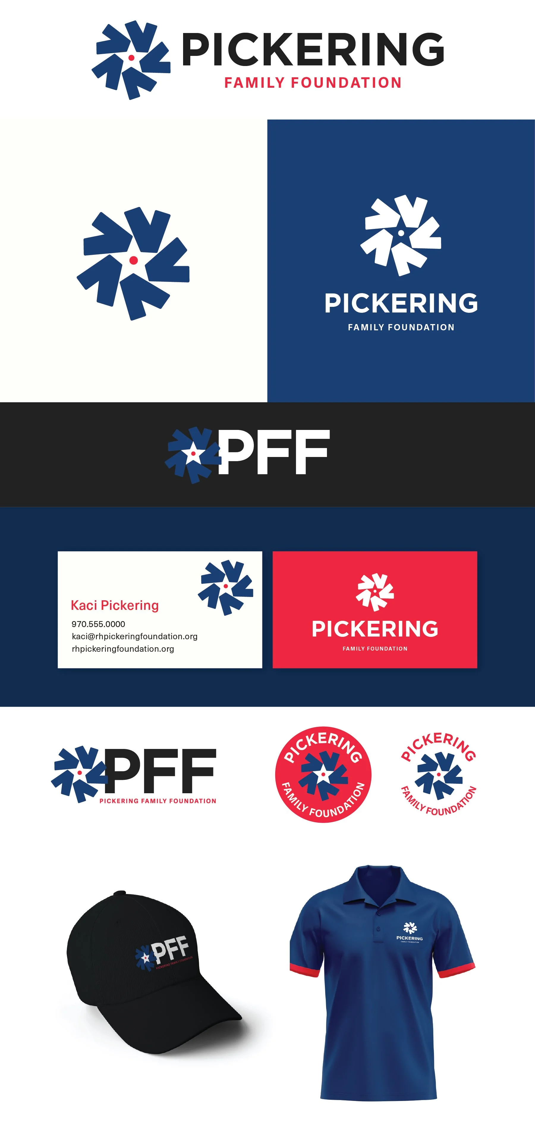
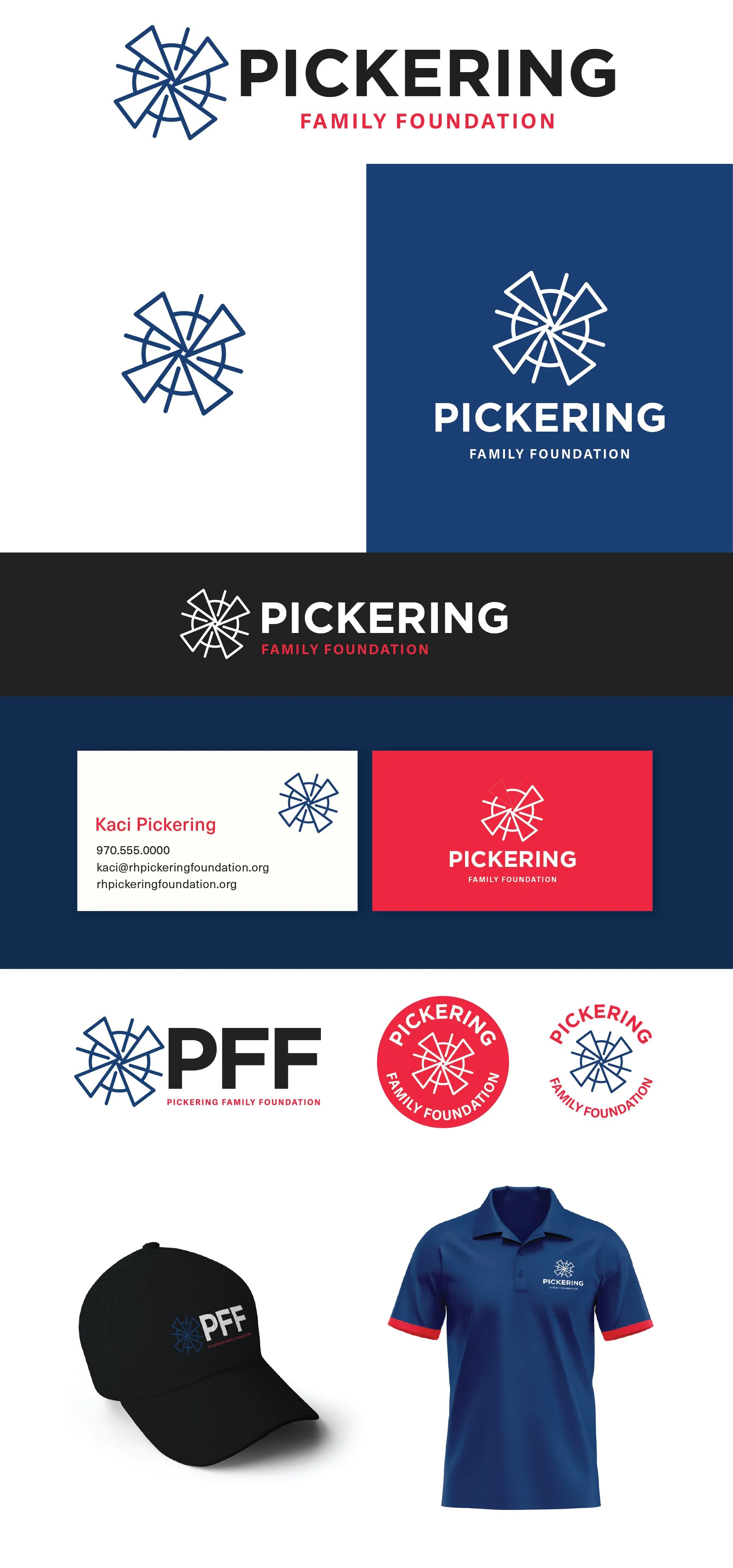
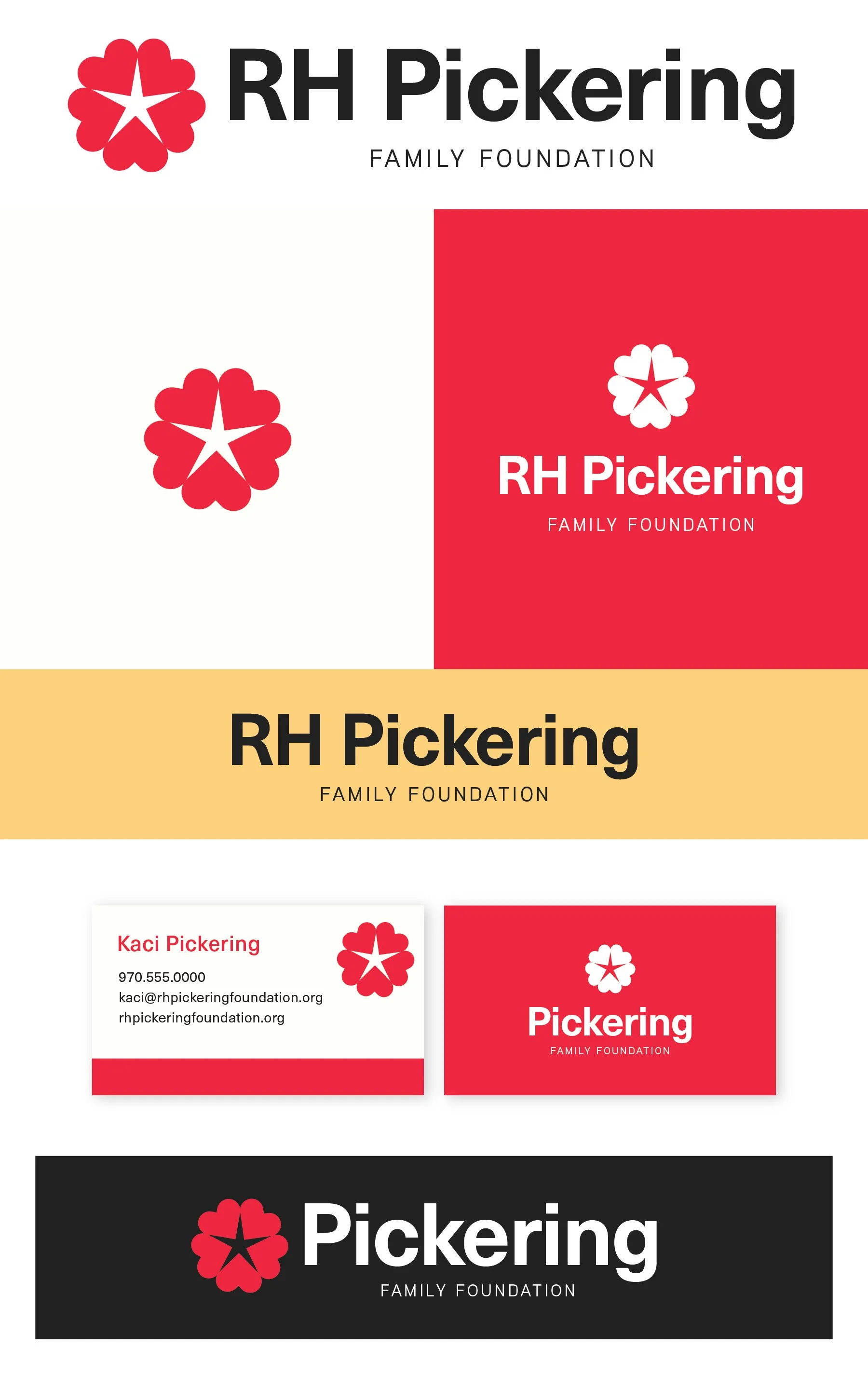
Horizontal Logo
Logo Mark
Vertical Logo
Text Only on Color Background
Business Card Mockup
Alt Version Sans RH on additional color
Note
While each of these designs are meant to show a developed idea of each concept, each will be refined and the chosen concept will be carefully considered and added to until the brand is the strongest representation it can be.
Business card concepts and the homepage mockup are meant to show how the brand can progress beyond the logo alone and will be refined along with the logo. Additionally, the information shown is placeholder information.
**The taglines are placeholder info and can be updated in revision rounds.
Moodboard
Revisions
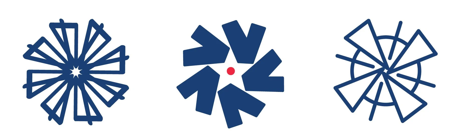
Windmill 1 - Layered, distinct, bold
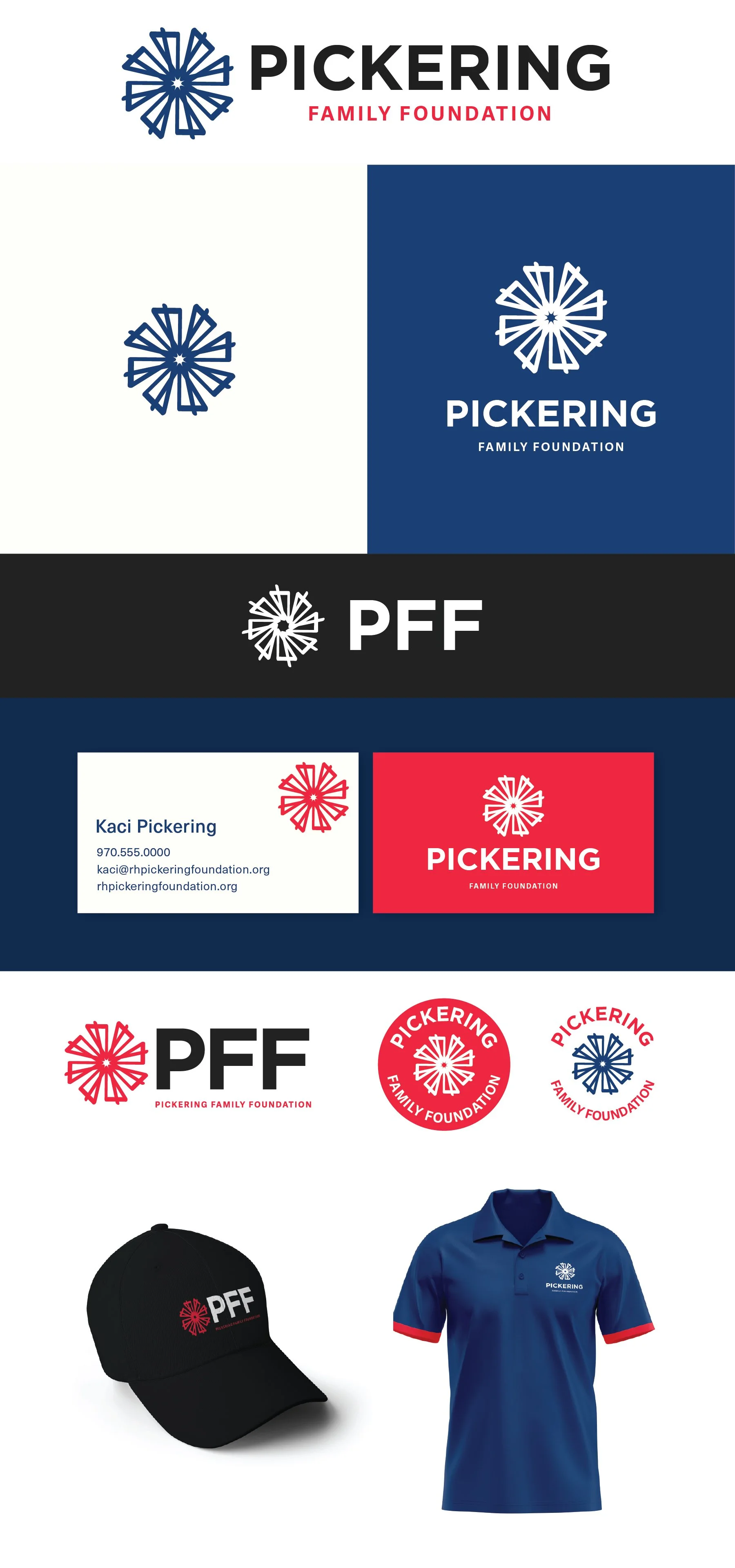
Windmill 2 - Subtle windmill shape, with a distinct nod to a Lone Star for Texas
Windmill 3 - Clear windmill shape, most closely tied to an agricultural background.
Side by Side Comparison

Initial Concepts
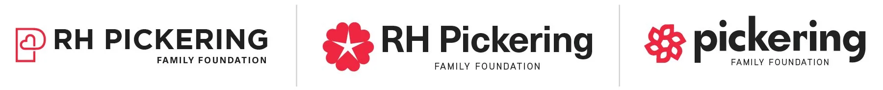
Concept 1
Community-focused and
brings attention to the P, so the focus shifts from RH to Pickering as a whole.
Modern, clean, streamlined
The simple, bold text is clean, modern, streamlined, and appropriate for various philanthropic areas of interest. The heart in the P will work well for a standalone mark and indicates that there’s a “give-back” focus to your business without feeling cheesy, forced, or overdone.
Concept 1.2
Same design as above, but with more blue in the color palette

Concept 2
Simple, inviting, distinct
The heart works well as a standalone mark and the radial design works well with a family foundation. It had a nod to the ongoing nature of the generational family structure.
Versatile and appropriate for a wide range of communities.
The abstract but friendly shape primarily focuses on the hearts, but with a secondary details of a star, or a bloom is really versatile. It is bold and a single color so it will work well in any application.
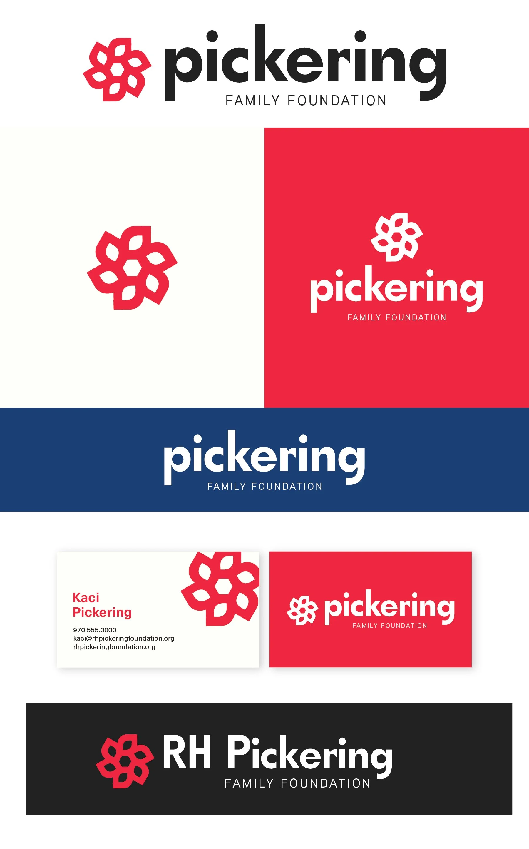
Concept 3
The only option with lowercase letters - there’s a nice symmetry in the p and g with the lowercase, and feels modern and inviting.
The shape is open-ended and abstract and can easily draw on the idea of growth, blooming, and progress. It has the same kind of circular pattern that, again, has a nice nod to a generational legacy. It has the same strong suits of being a single color and bold so it will work well in all applications.
This one feels the most playful of the three, I could see this evolving well with the foundation overtime.