Oh Snap Macros
Design Round 2
Fun, Bright, Energetic Concepts
Note: While each of these designs are meant to show a developed idea of each concept, each will be refined and the chosen concept will be carefully considered and added to until the brand is the strongest representation it can be.
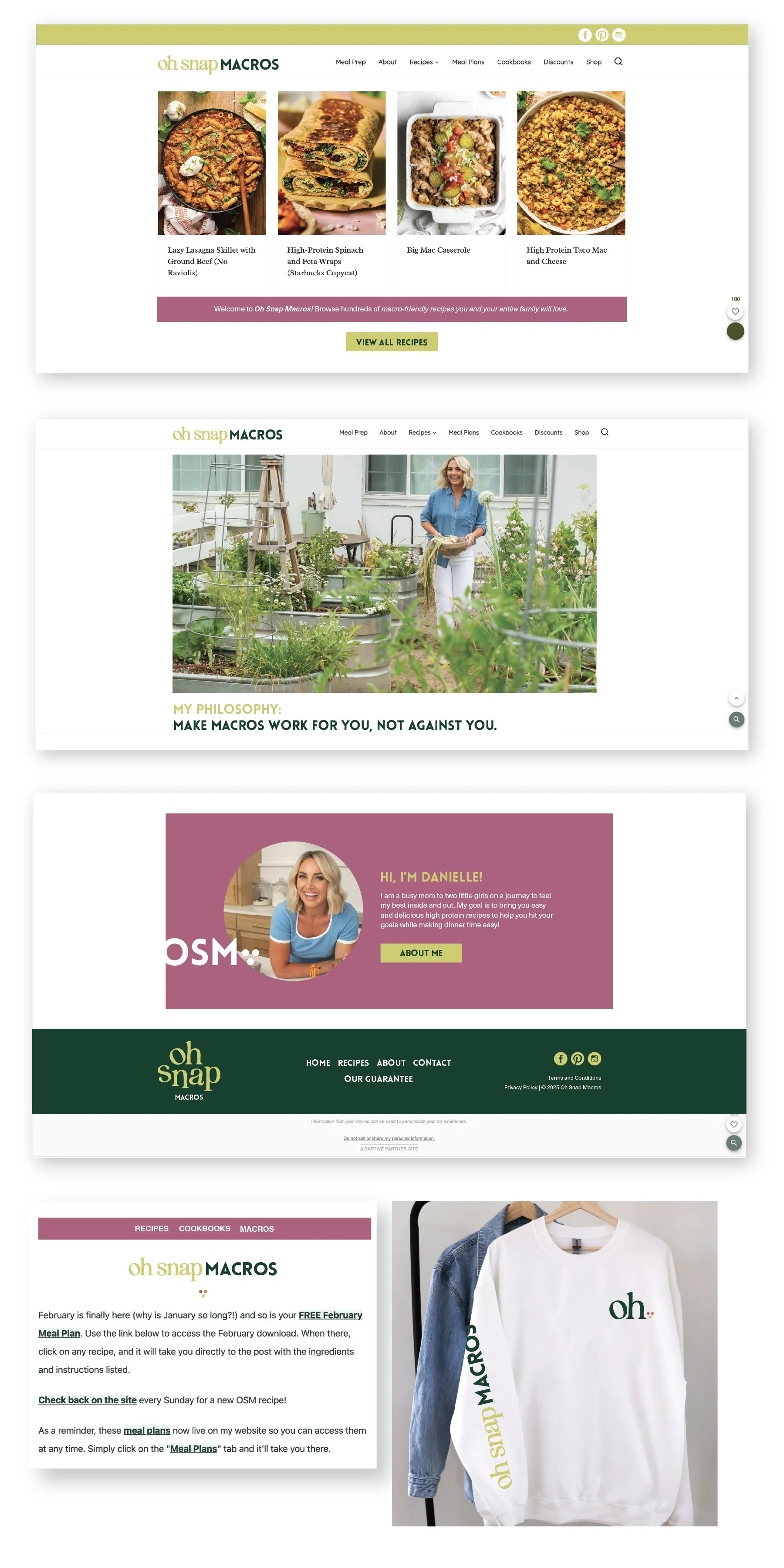
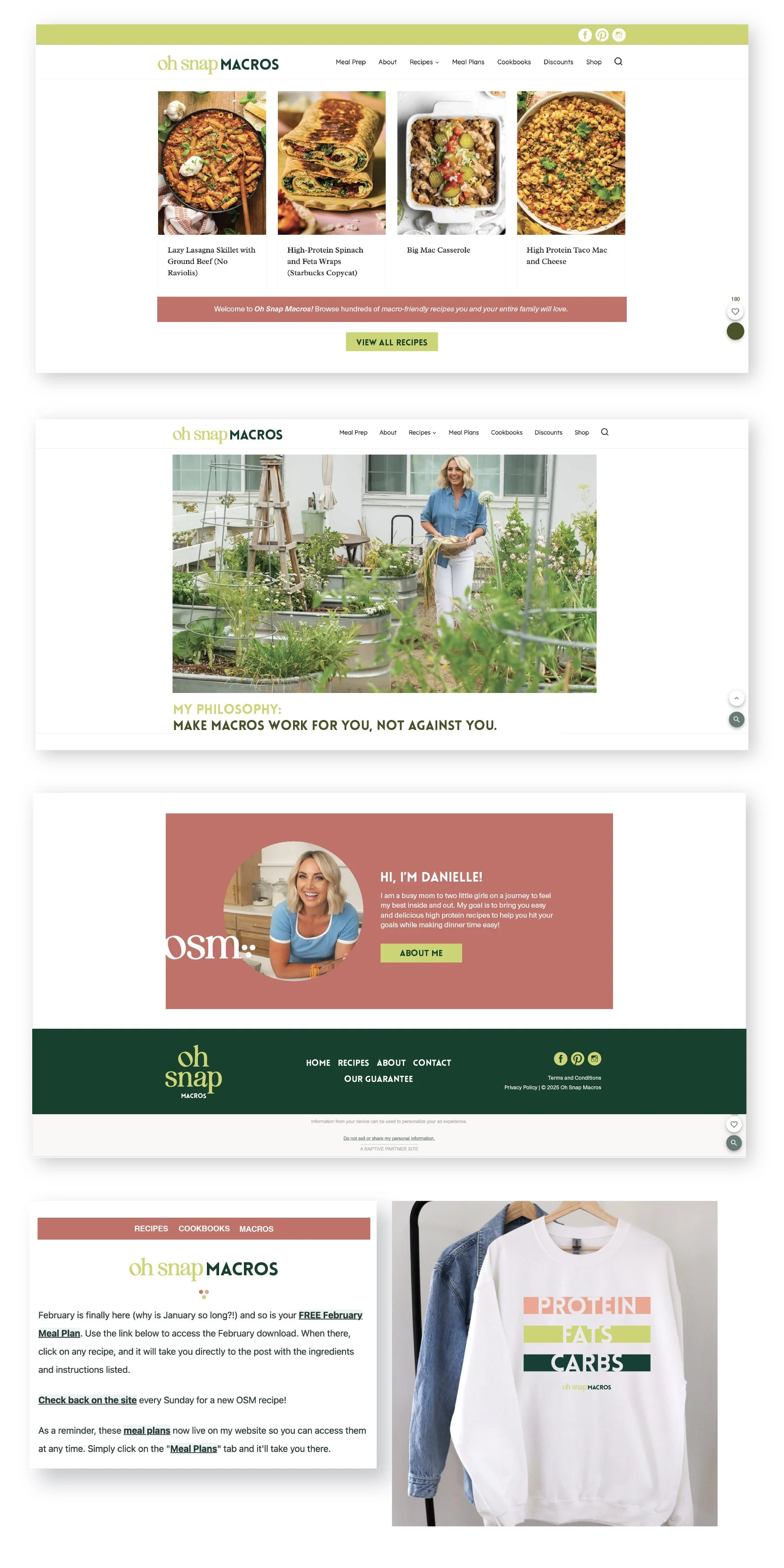
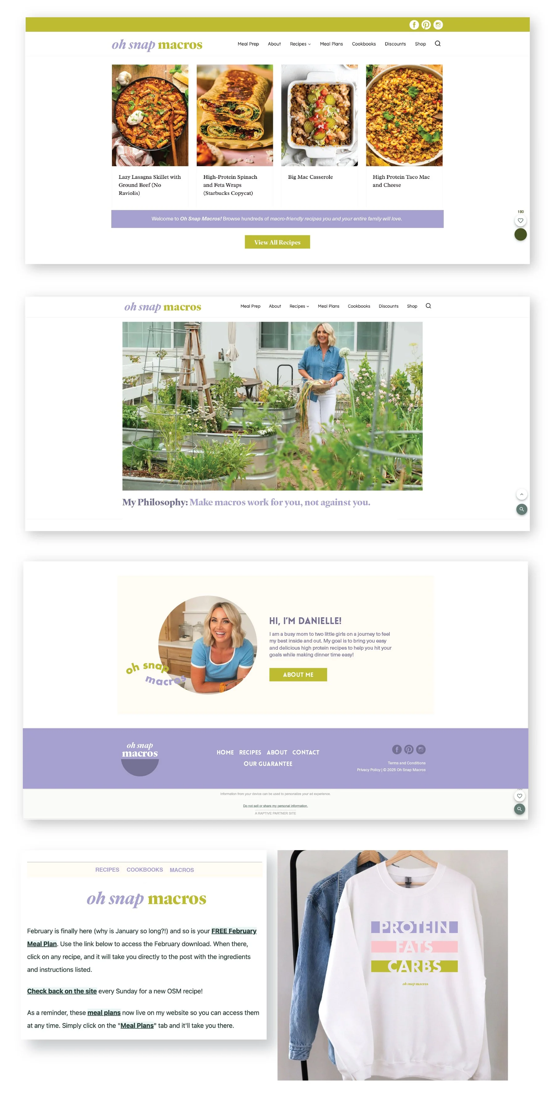
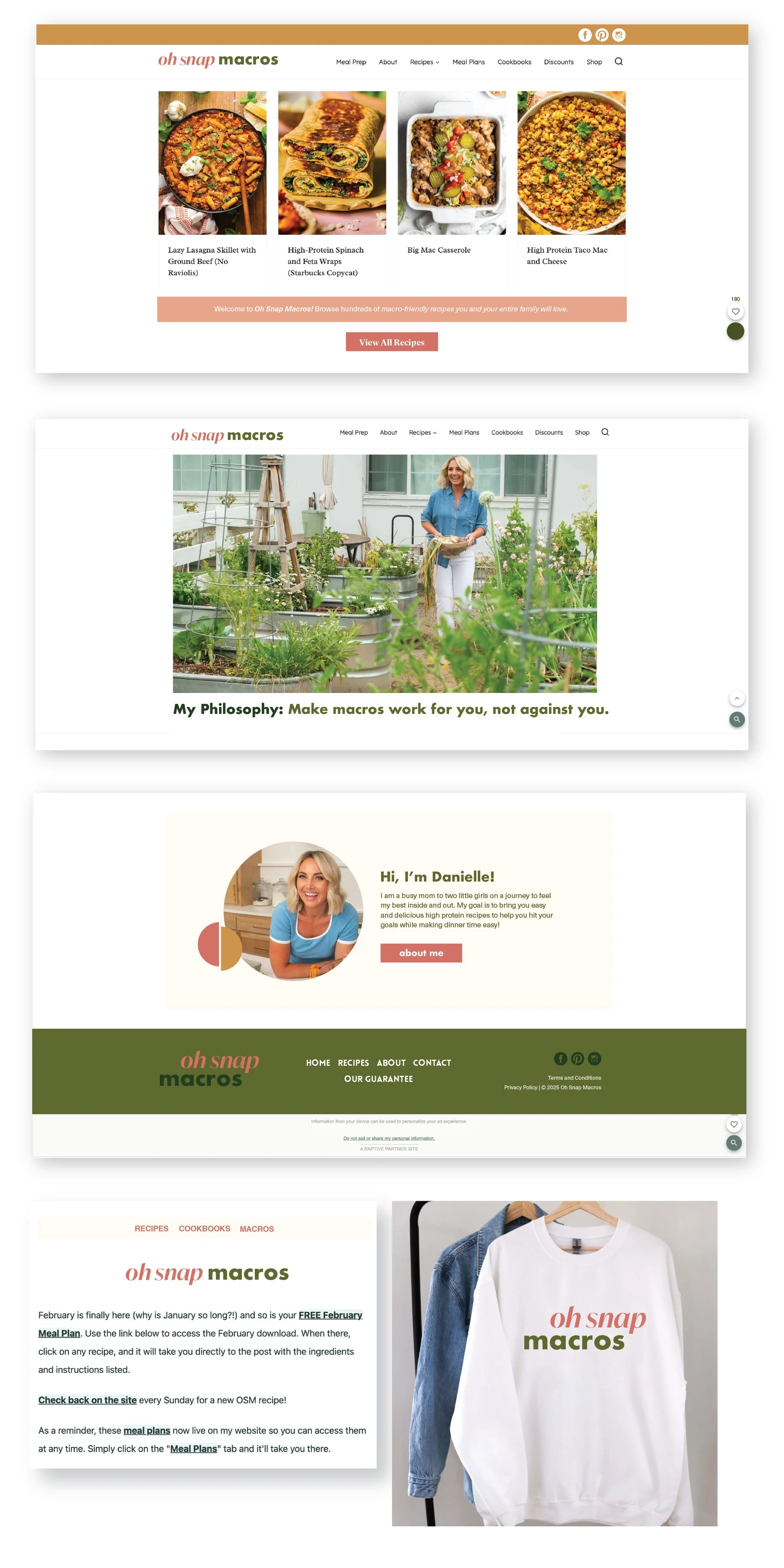
Business card concepts and the homepage mockup are meant to show how the brand can progress beyond the logo alone and will be refined along with the logo. Additionally, the information shown is placeholder information.
Color Palette with Darker Green + Purpley Pink
Color Palette with Darker Green + Orangey Pink
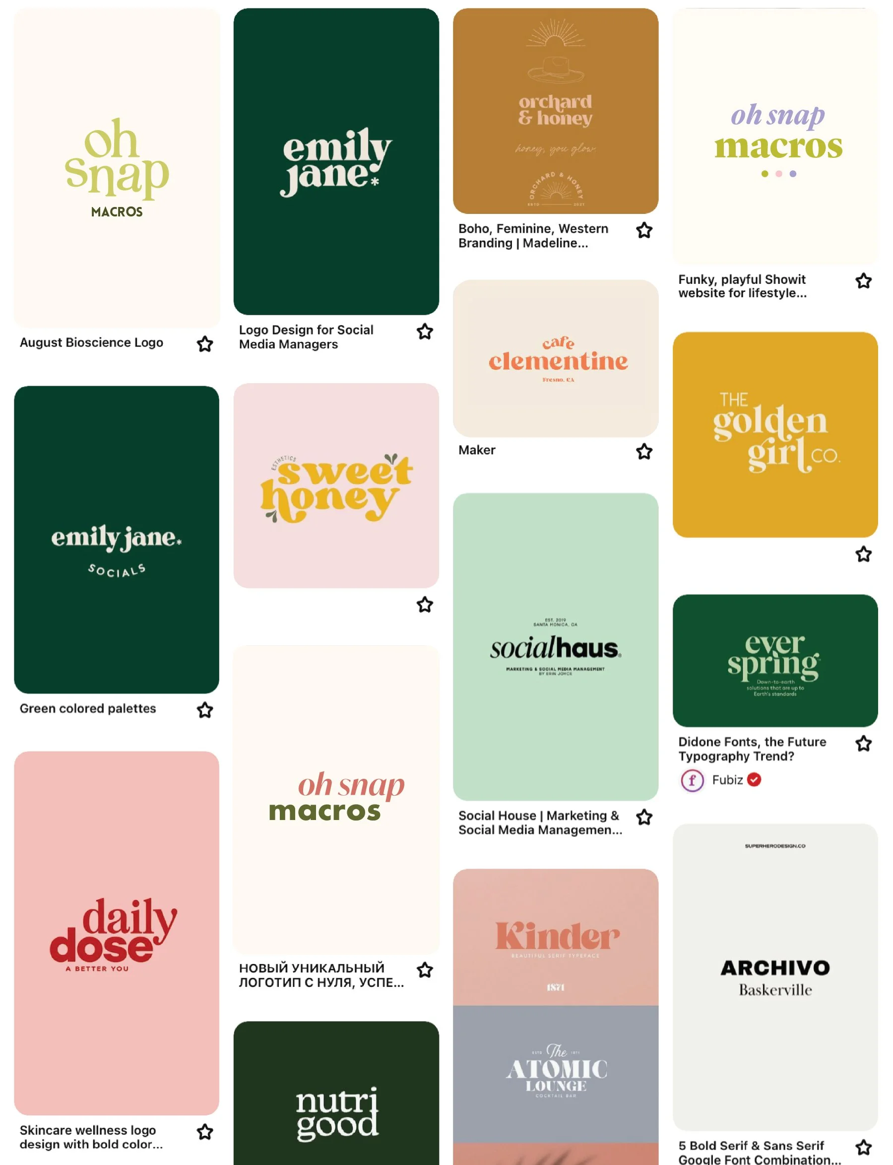
Pinterest board screenshot - with new logo concepts integrated!

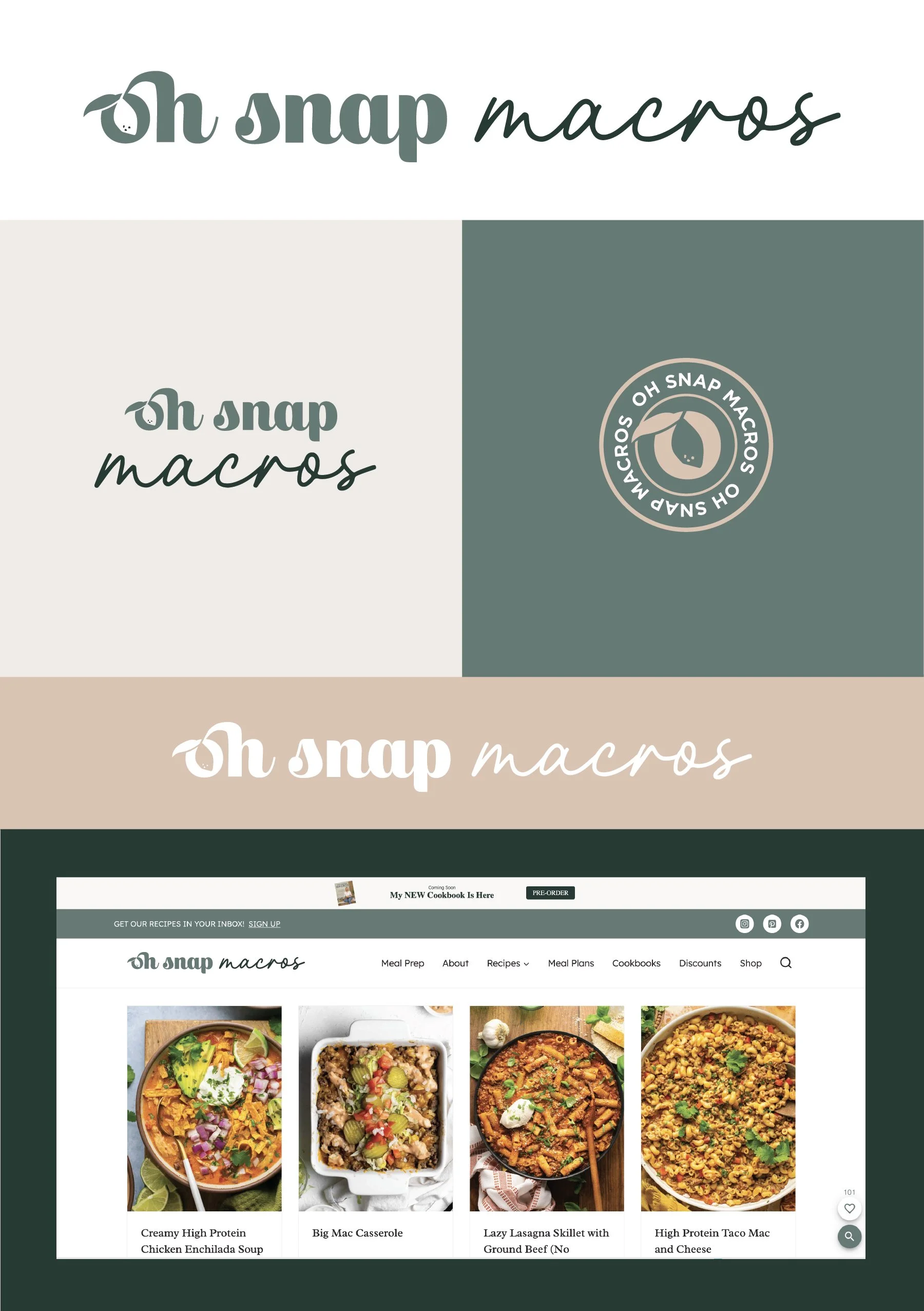
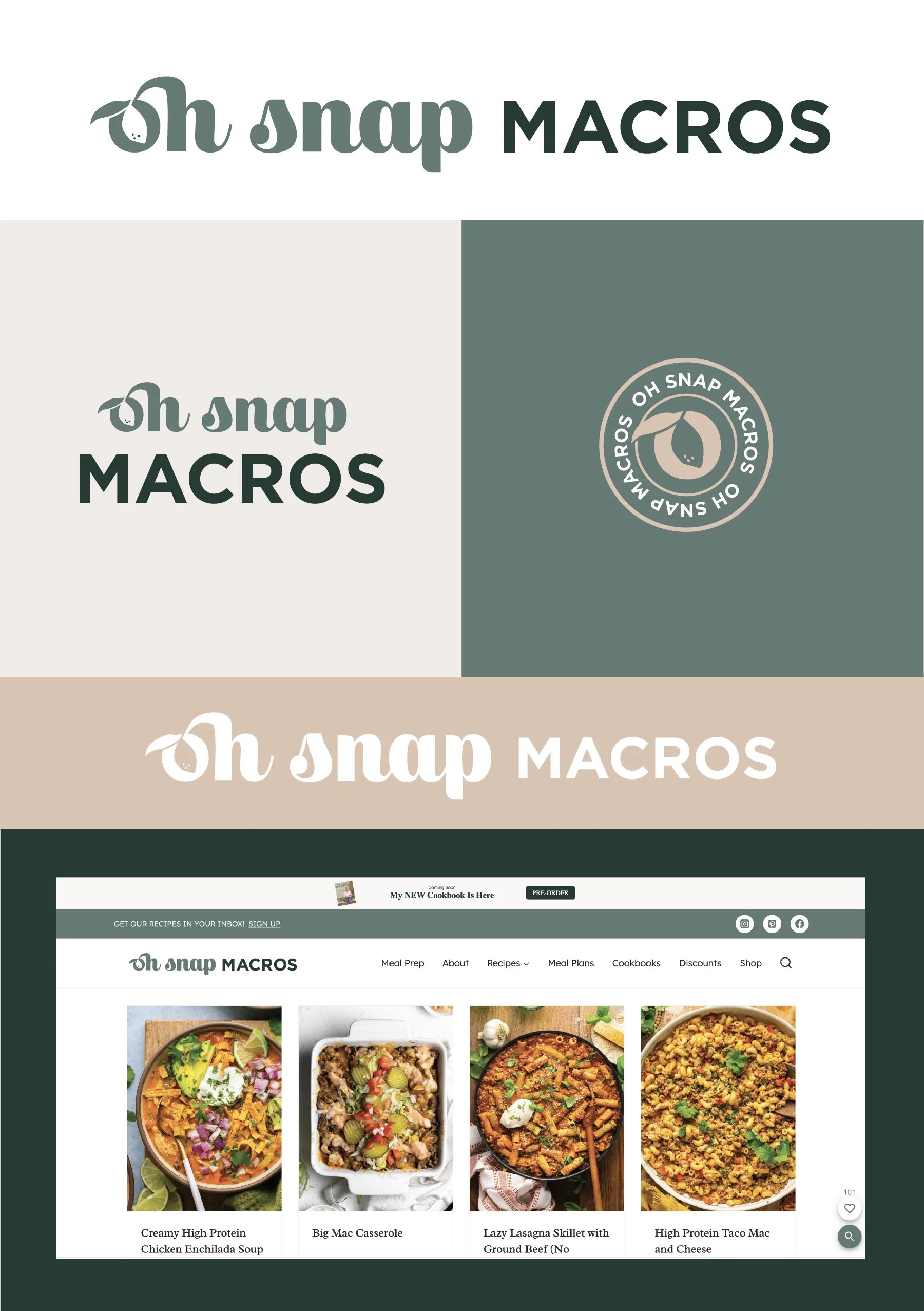
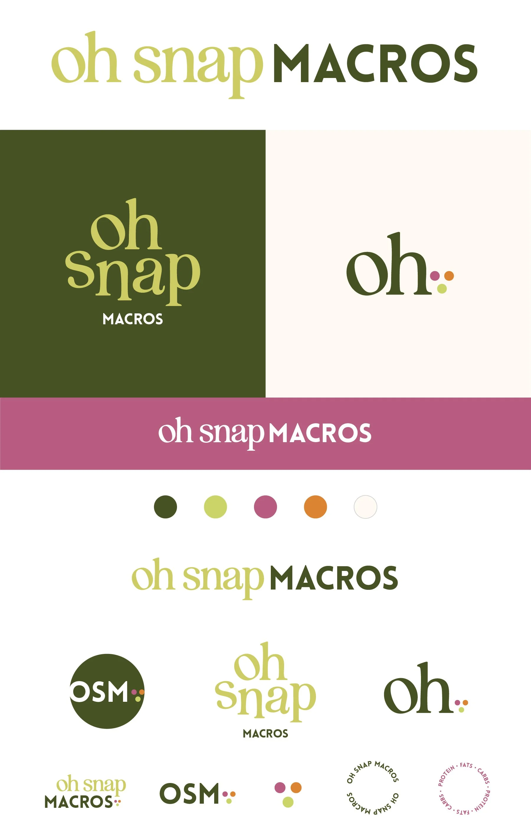
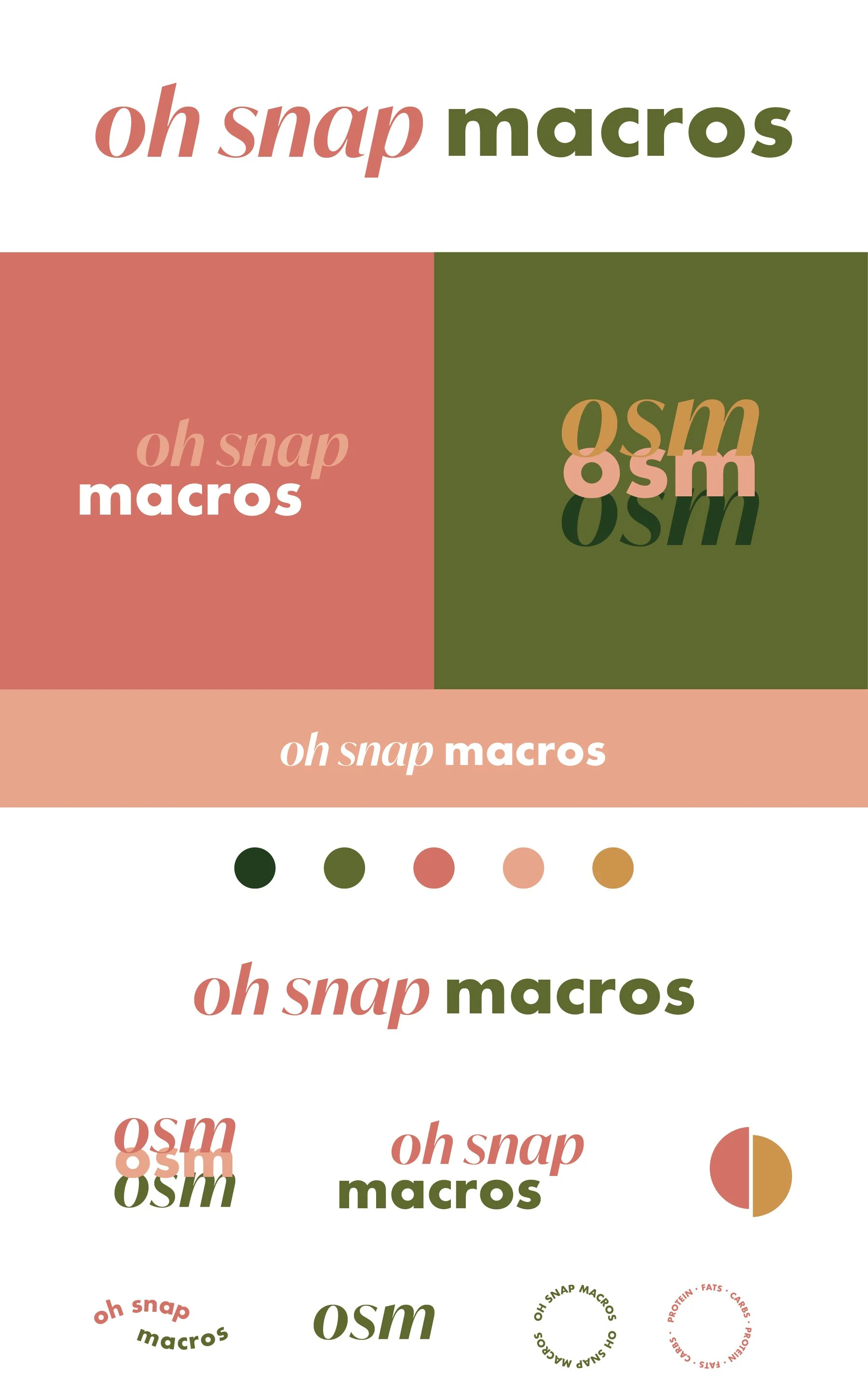
Concept 1.2
fun, quirky, playful
Key characteristics (mostly closely aligned with Daily Dose/Emily Jane example):
Distinct font pairing - with a little bit of customization to the tilted “o” to add a little bit of playful character
The greens would be the dominant which are often associated with health, but the pink and orange bring in a bold, distinct flair
The three dots in a triangle feel like they are integrated and “work together” and can be a subtle inclusion of proteins, fats, and carbs. It can be used on its own or paired with pretty much any of the text logos when you want an additional pop of color or visual element, but it can also be left off and the text logos work just as well.
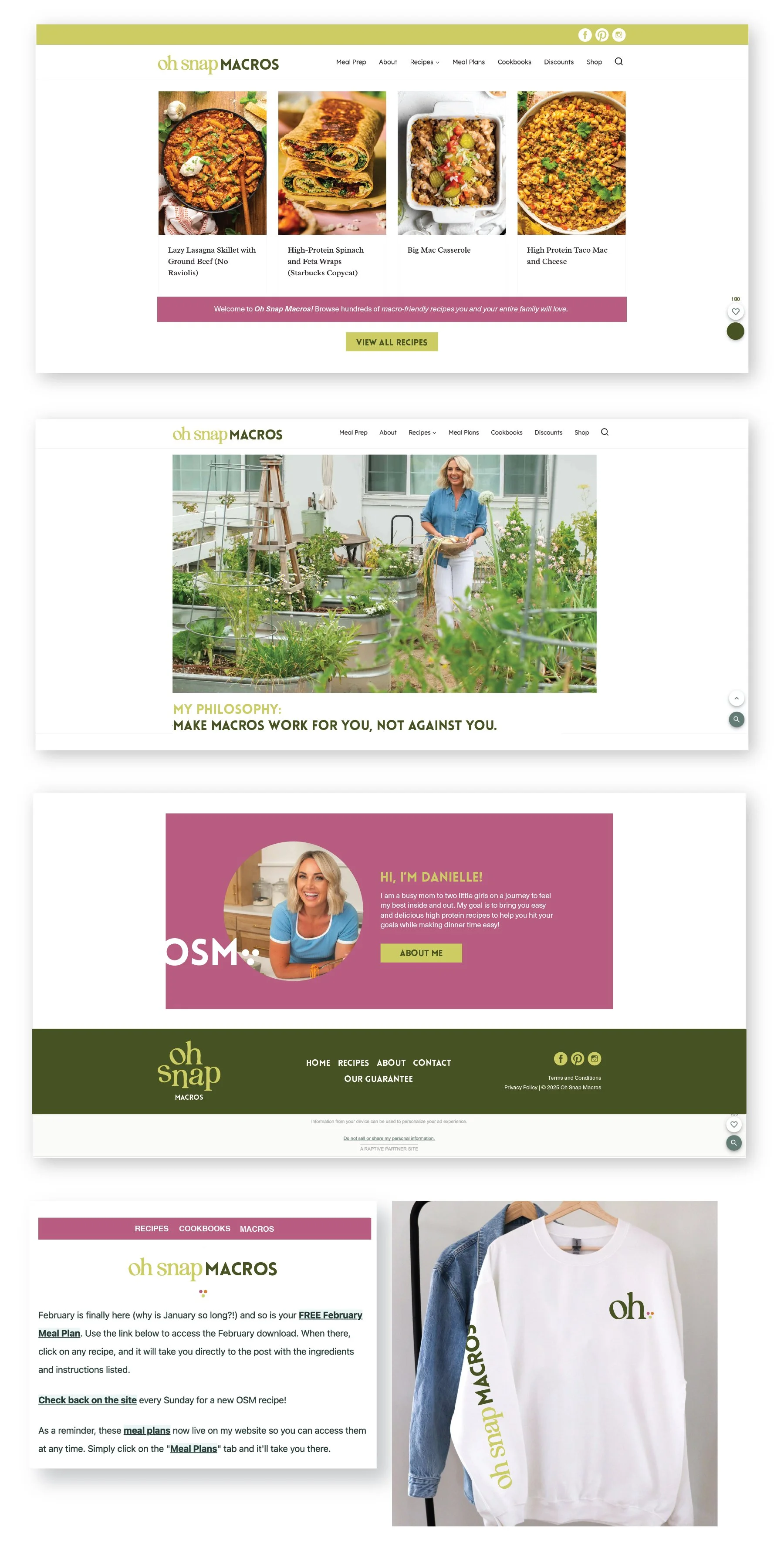
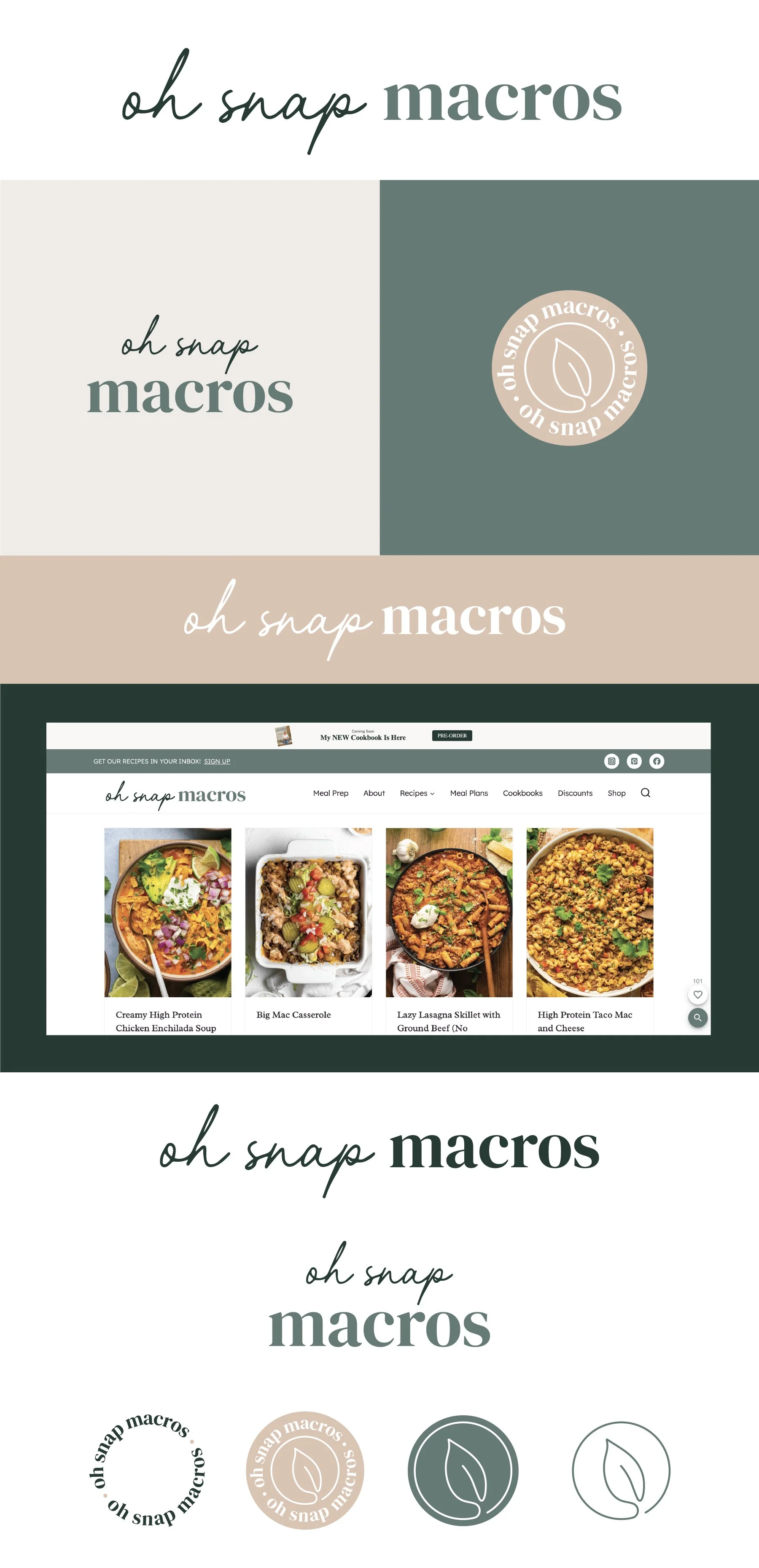
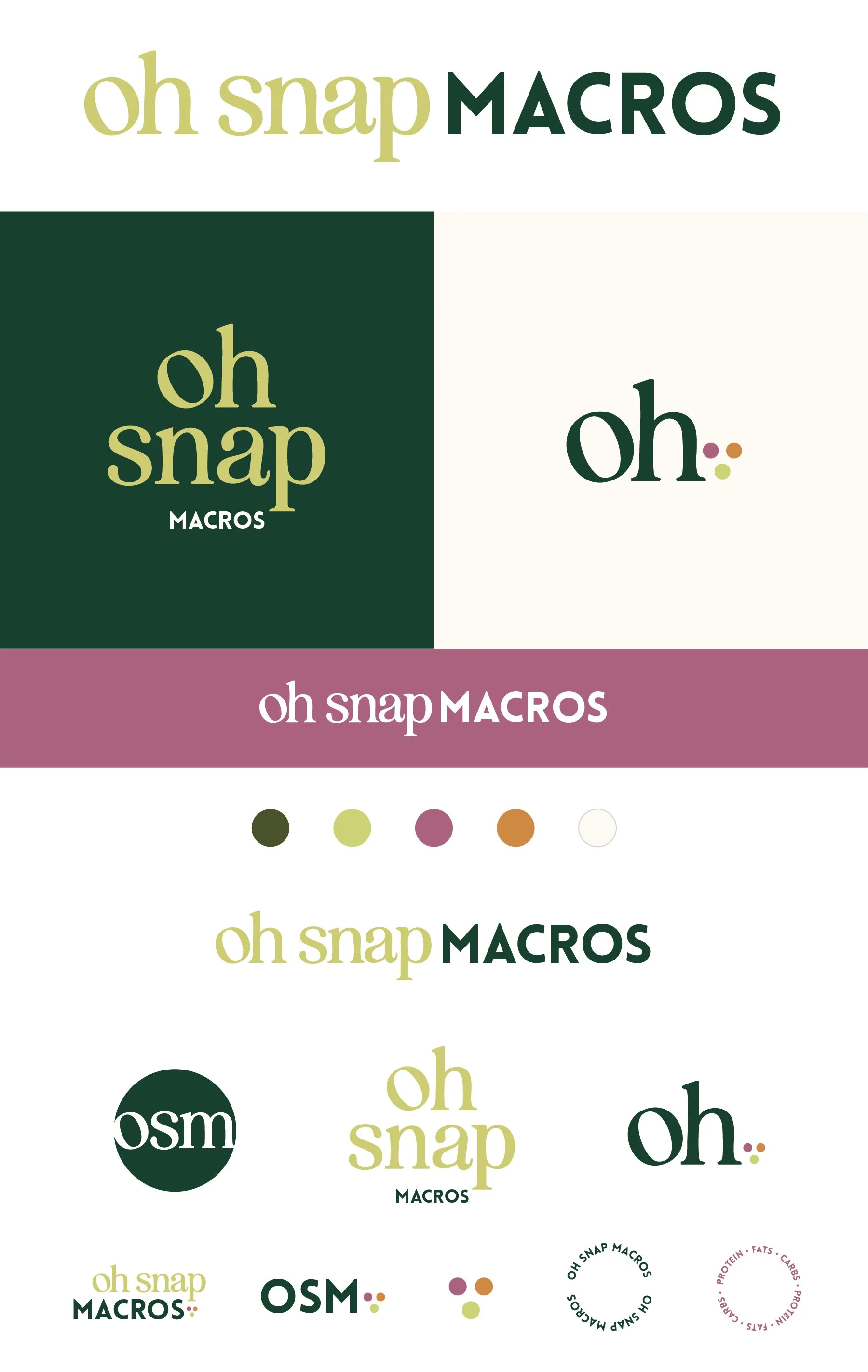
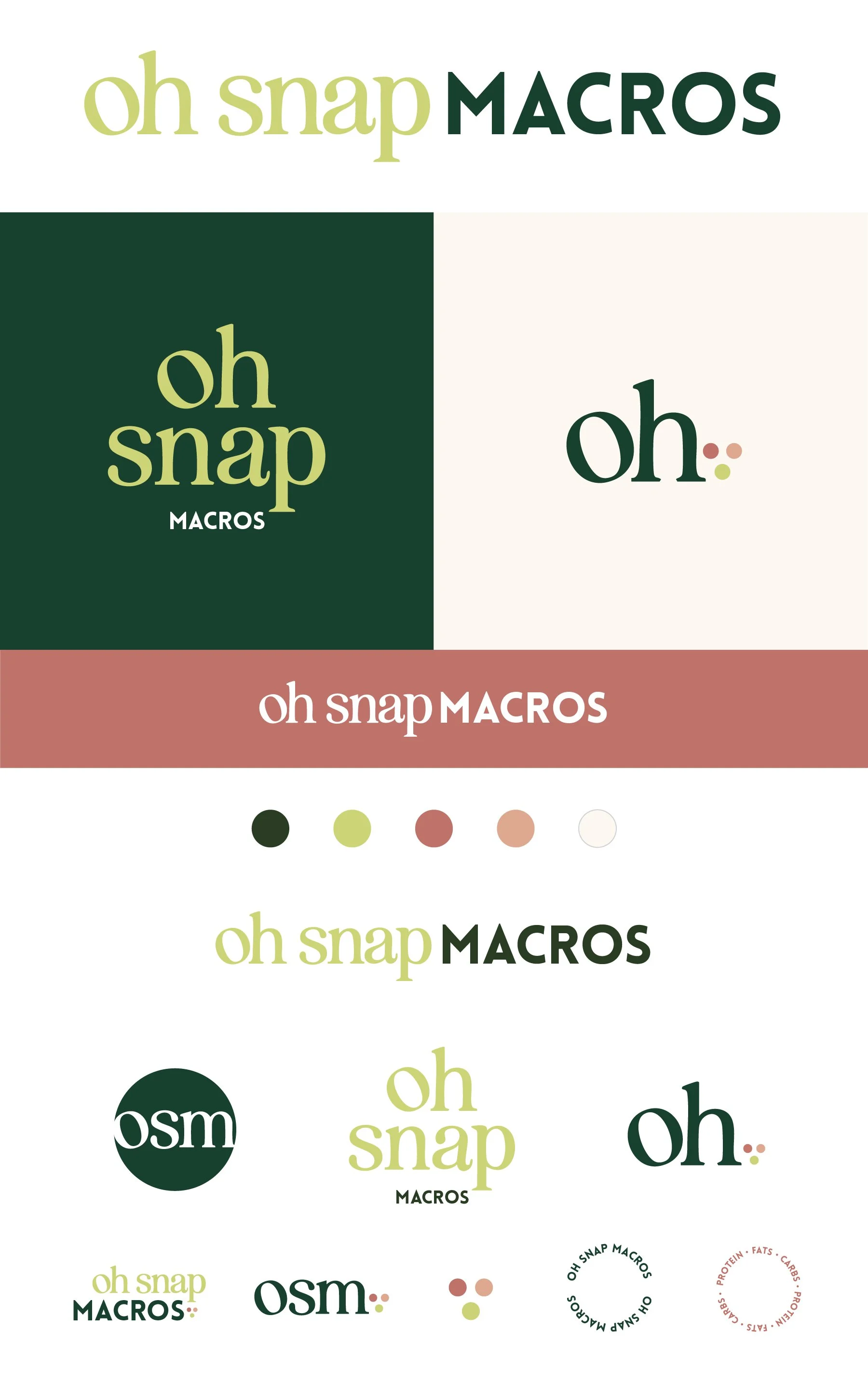
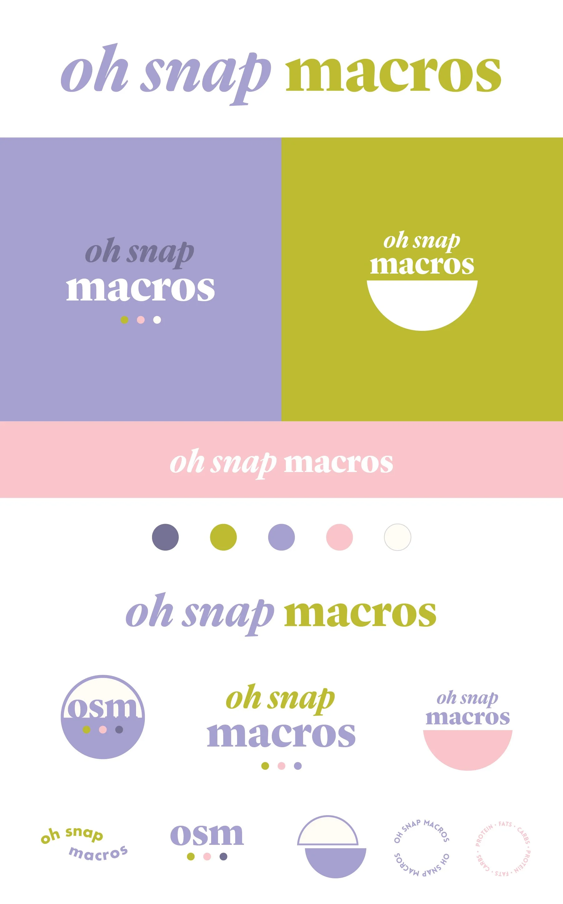
Concept 2.2
Fresh, modern, fun
Key characteristics (mostly closely aligned with Emily Jane/Cafe Clementine example):
The color scheme is very playful! This one reads as more feminine, but because of that I also think it reads as having a really bold personality behind it. I imagine green and purple would be the dominant colors on the website. The pink would be used only as an accent color, but I think it’s a nice addition for things like apparel that you can see in the sweatshirt mockup.
I would say this version feels the most youthful and playful, but the font itself feels timeless and established so it balances the playfulness well.
This one plays on circles and half circles as visual elements. The group of three circles can play on the three components of macros but in a subtle way. I also love that in the vertical version with a half circle, it almost looks like a bowl, but again in a subtle way and sticks with the geometric theme.
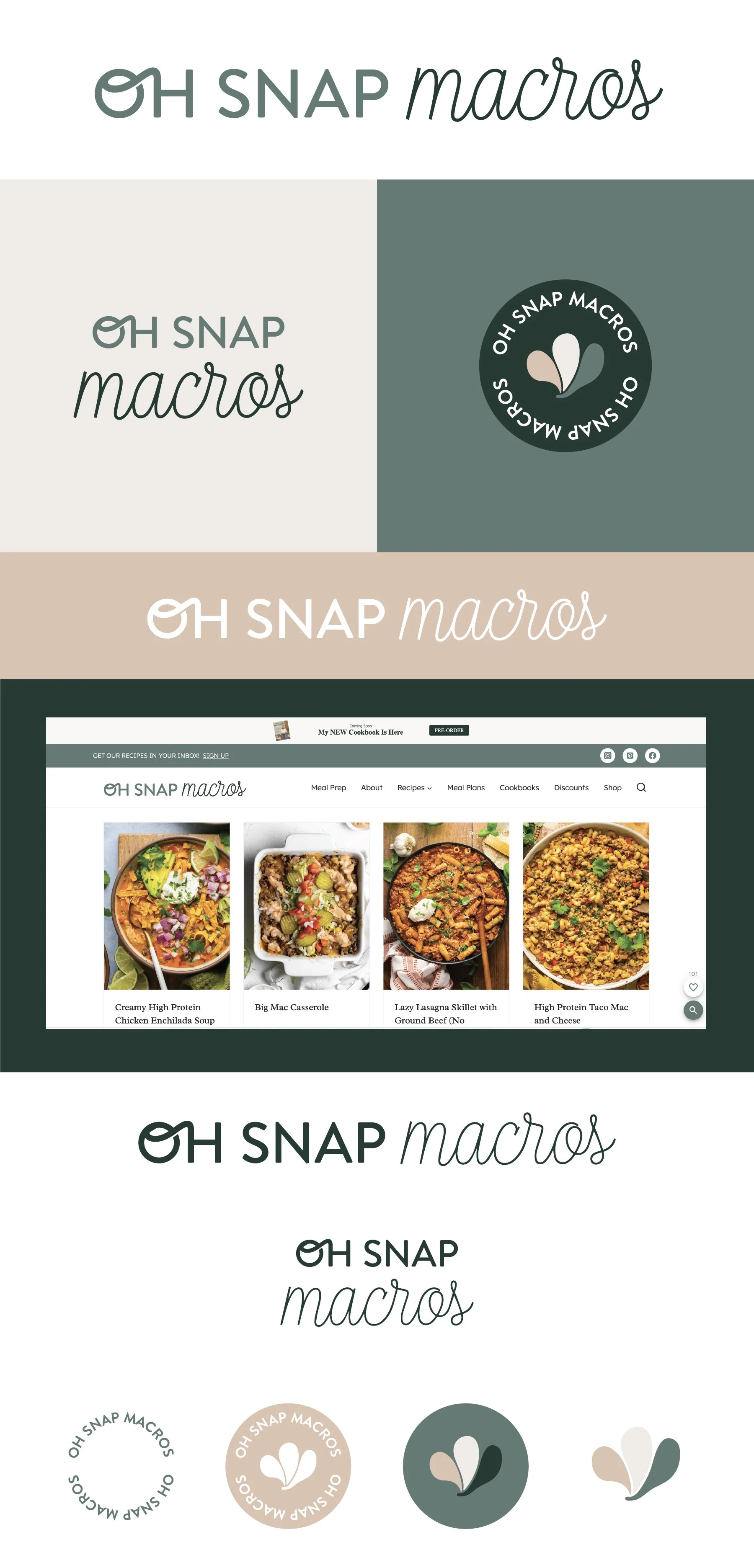
Concept 3.2
Chic, modern, inviting
Key characteristics (mostly closely aligned with Social Haus example):
Clean, modern, streamlined
The clean lines make this one versatile and easy to use, but probably has the least additional elements to play with.
The colors feel really warm and welcoming. The palette leans feminine but the greens make it feel fresh and food-related.
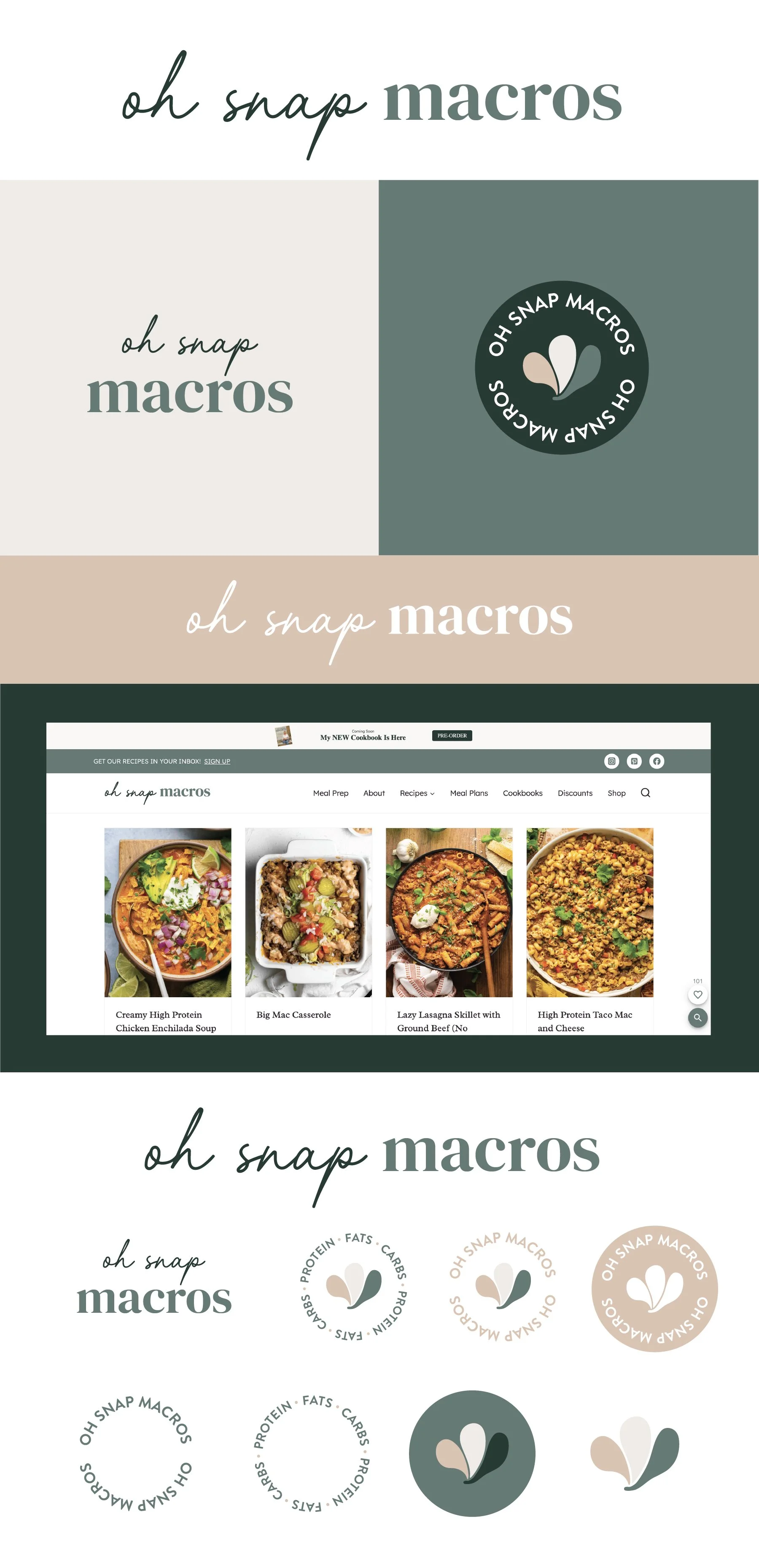
Initial Concepts

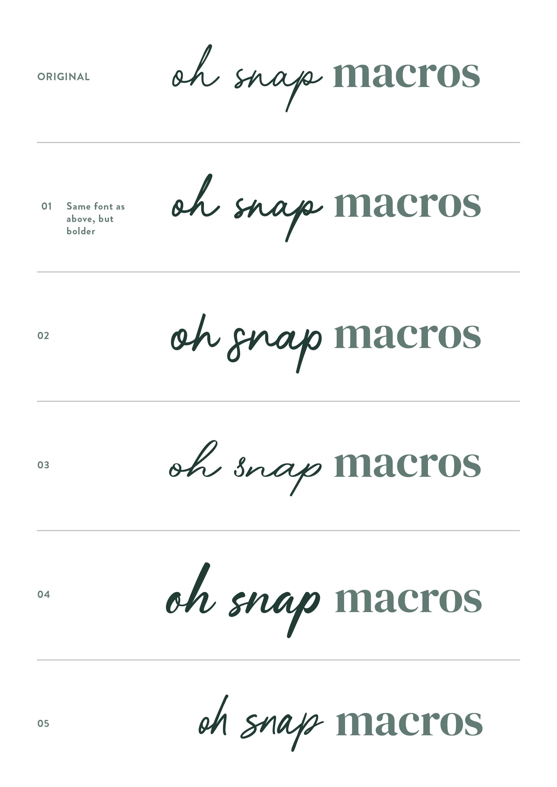
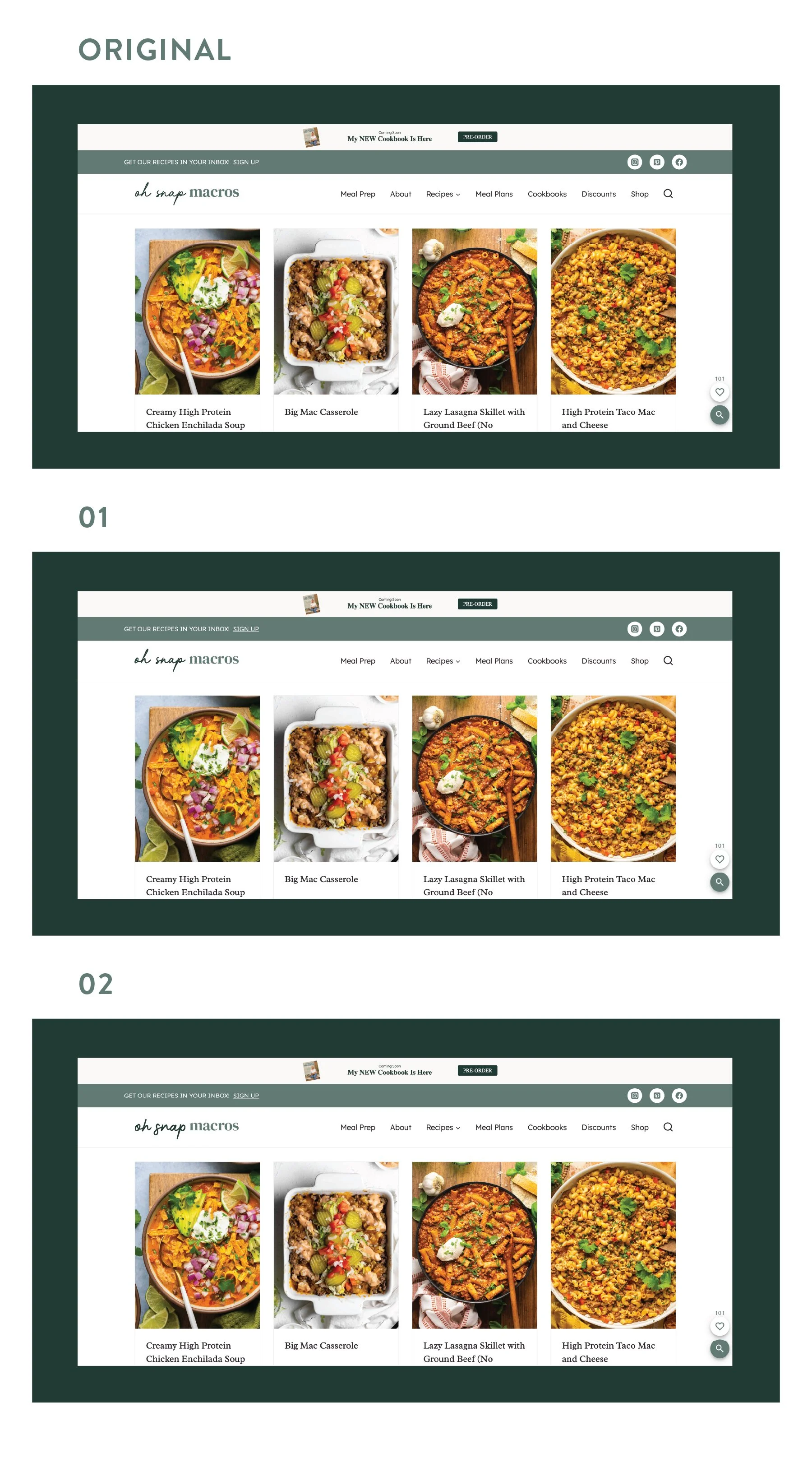
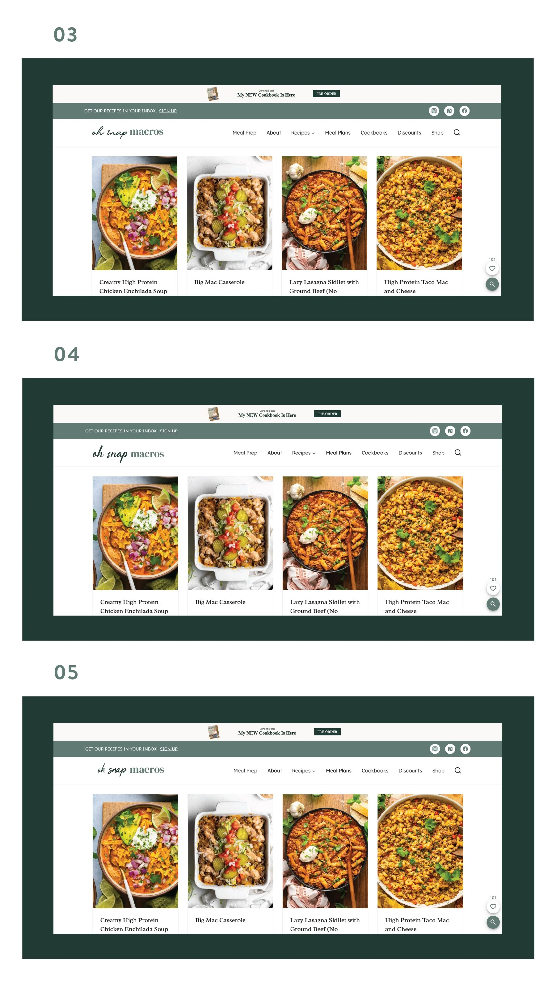
Revisions 2
Revisions
Concept 1
Abstract 3 leaf icon (instead of single leaf icon)
Plus Protein, Fats, Carbs circular text
Concept 2
Lowercase Script Macros