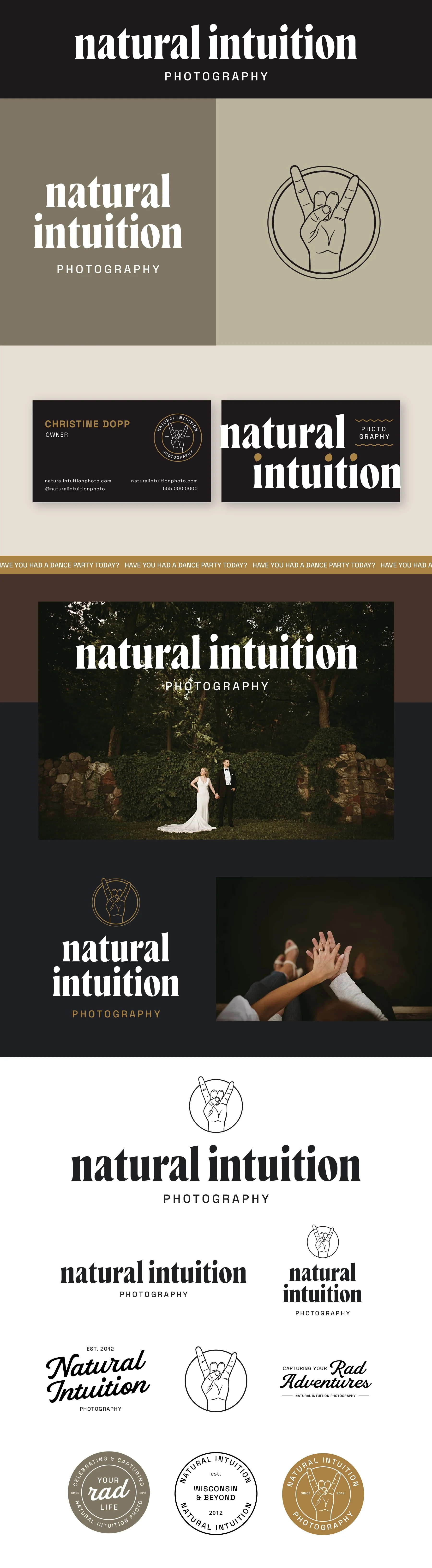
Natural Intuition Photography
Summary
Natural Intuition: Wisconsin-based husband and wife photography team! Christine and Justin aim to provide a rad experience with epic photography. Their photography style is to capture true-to-life moments so their clients can relieve their sweetest memories - from their wedding day to a phase of life with their families.
Their rebrand and website redesign was prompted by their website host eliminating their subscription model. But it presented an opportunity to dial in their style and create a more distinct brand reflective of their personality.
The brand goals are to hone in on a style that feels bold, fun, modern, timeless, and refined. To keep a strong tie-in to Justin and Christine, the brand also incorporates elements of play, casual, cool, and laid-back.
**The taglines are placeholder info and can be updated in revision rounds.
Below each of the three concepts shows the
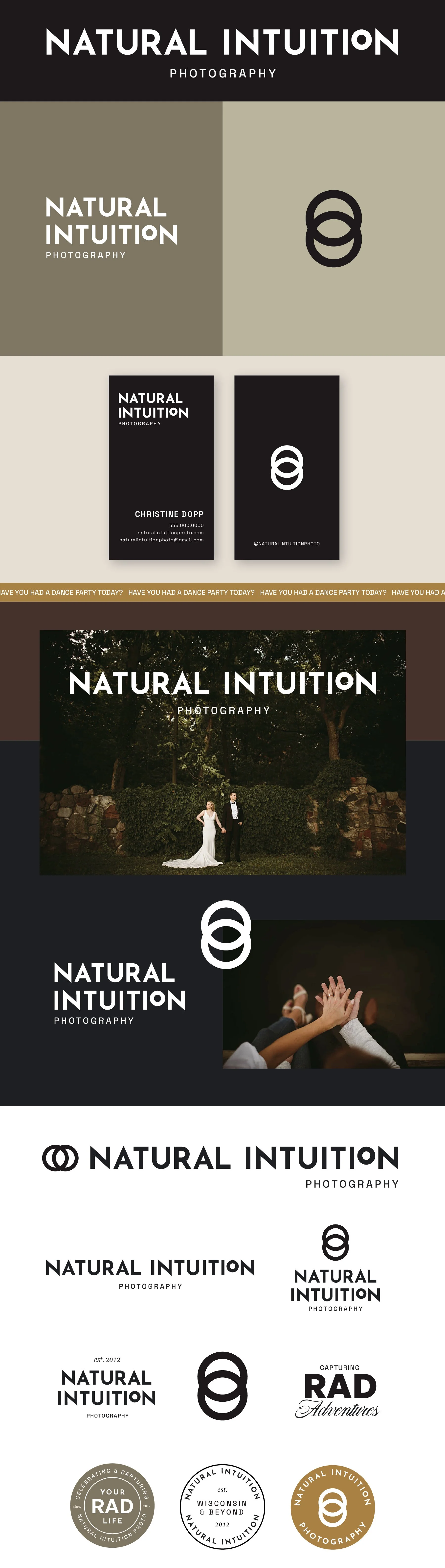
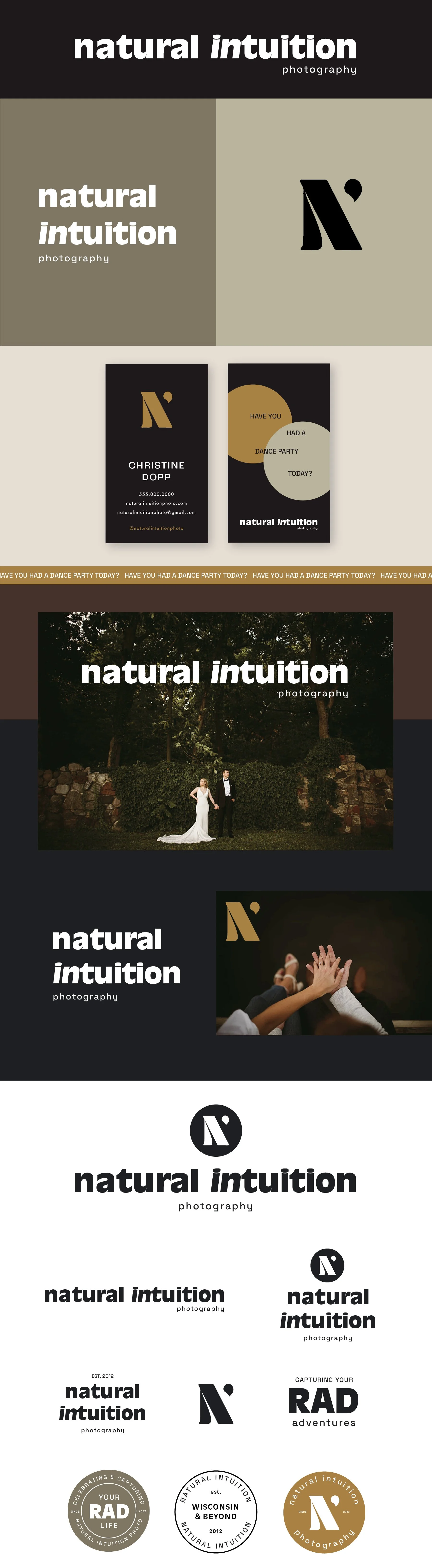
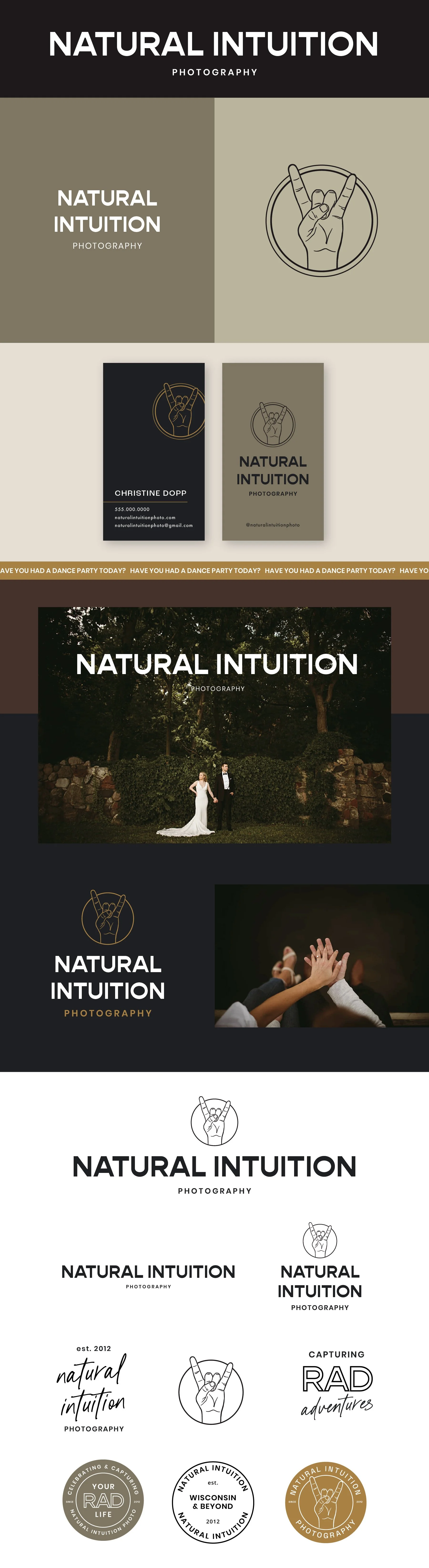
Primary, Horizontal Logo
Vertical Logo
Monogram Mark
Horizontal Extended Logo
Business Card Mockup
Photo Overlays
Logo Suite
Note
While each of these designs are meant to show a developed idea of each concept, each will be refined and the chosen concept will be carefully considered and added to until the brand is the strongest representation it can be.
Business card concepts and the homepage mockup are meant to show how the brand can progress beyond the logo alone and will be refined along with the logo. Additionally, the information shown is placeholder information.
Moodboard

Initial Concepts
Concept 1
Bold, streamlined type, still with a distinct personality.
I love the personality that the rocker brings to the brand. The font has enough personality to stand alone, so the logo mark can be included selectively so that it conveys your fun, laid-back personality and maintains a high level of polish. I think the logo mark capitalizes and aligns with your current brand tone with a key brand word being RAD!
Concept 2
Same notes as Concept 1 for the logo mark BUT I wanted to provide another option with a different font feeling. This is a little more friendly and funky kind of bold font. The timelessness of this concept has a slight nod to a more vintage style of timeless.
Concept 3
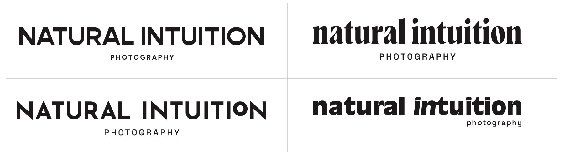
Key descriptors: modern, streamlined, cool, confident