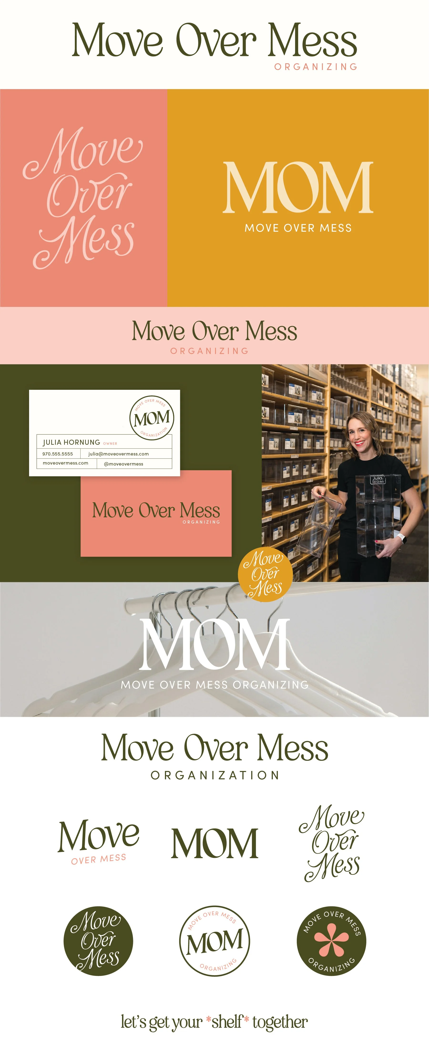
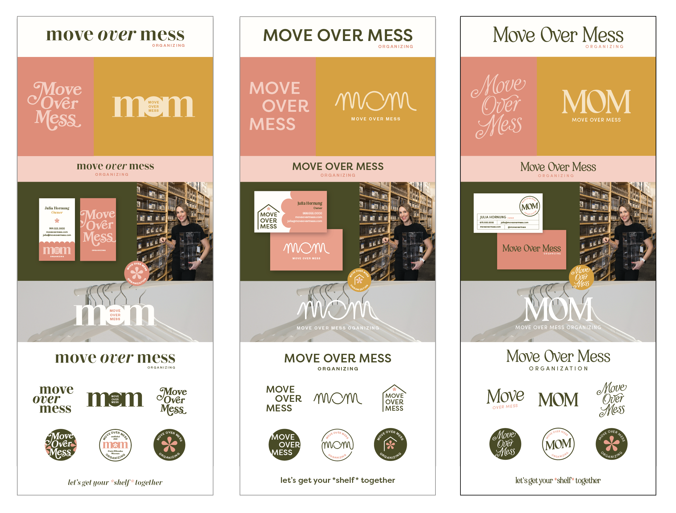
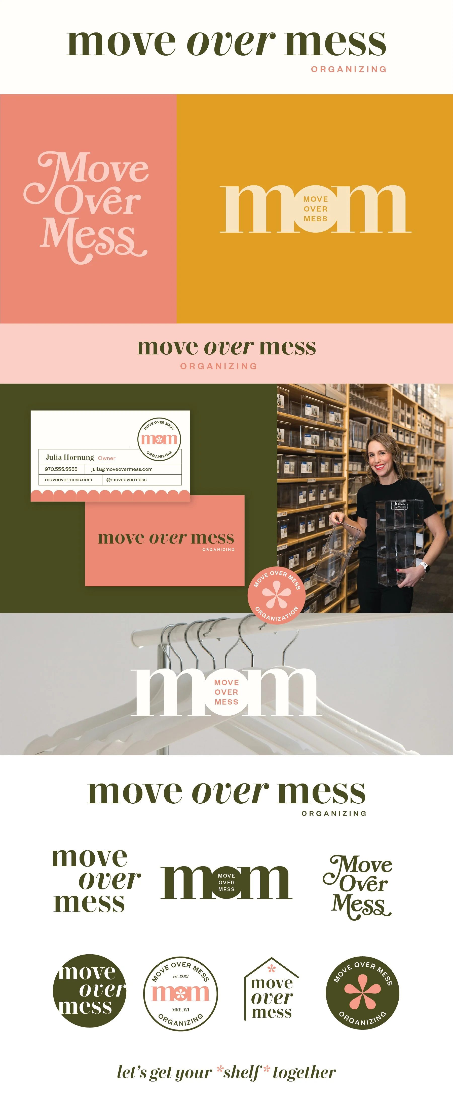
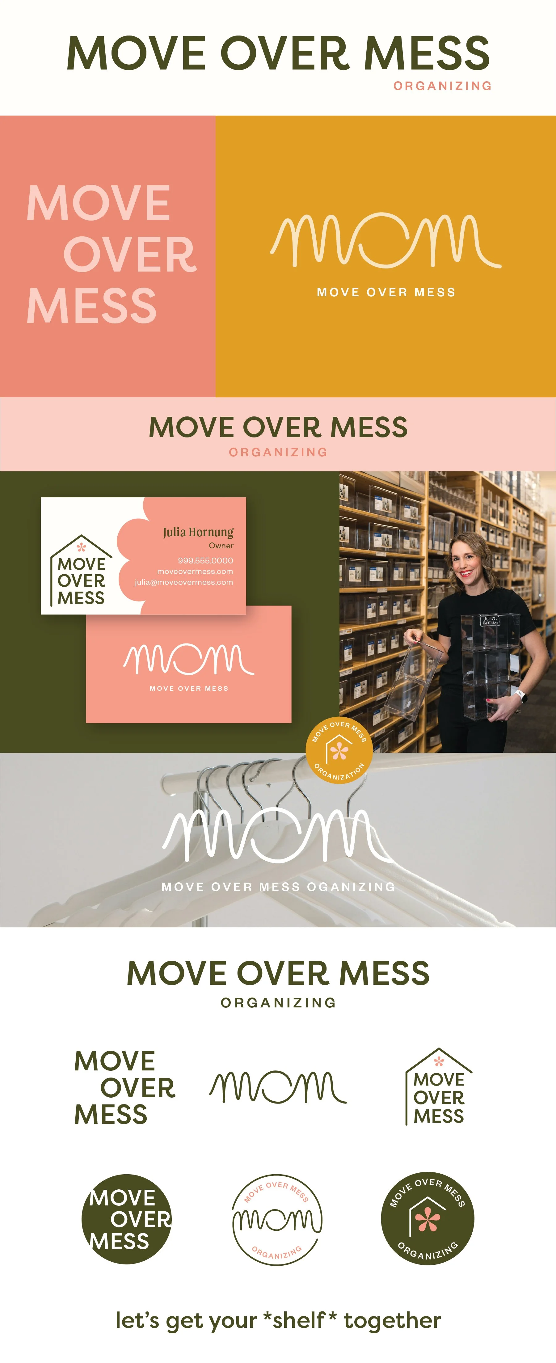
Move Over Mess
Below each of the three concepts shows the
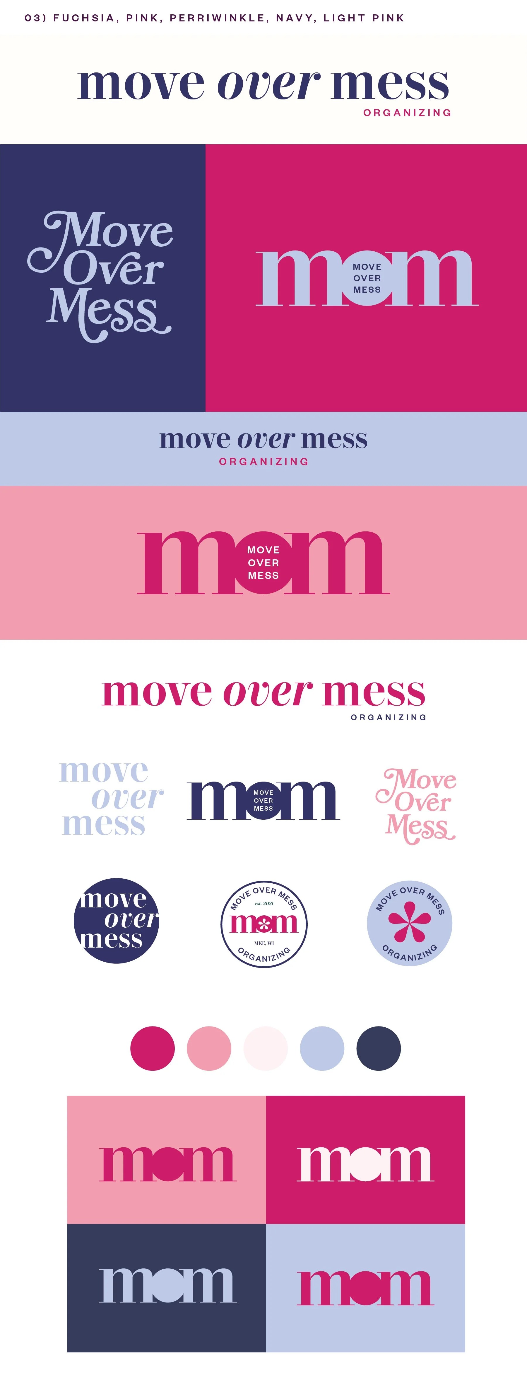
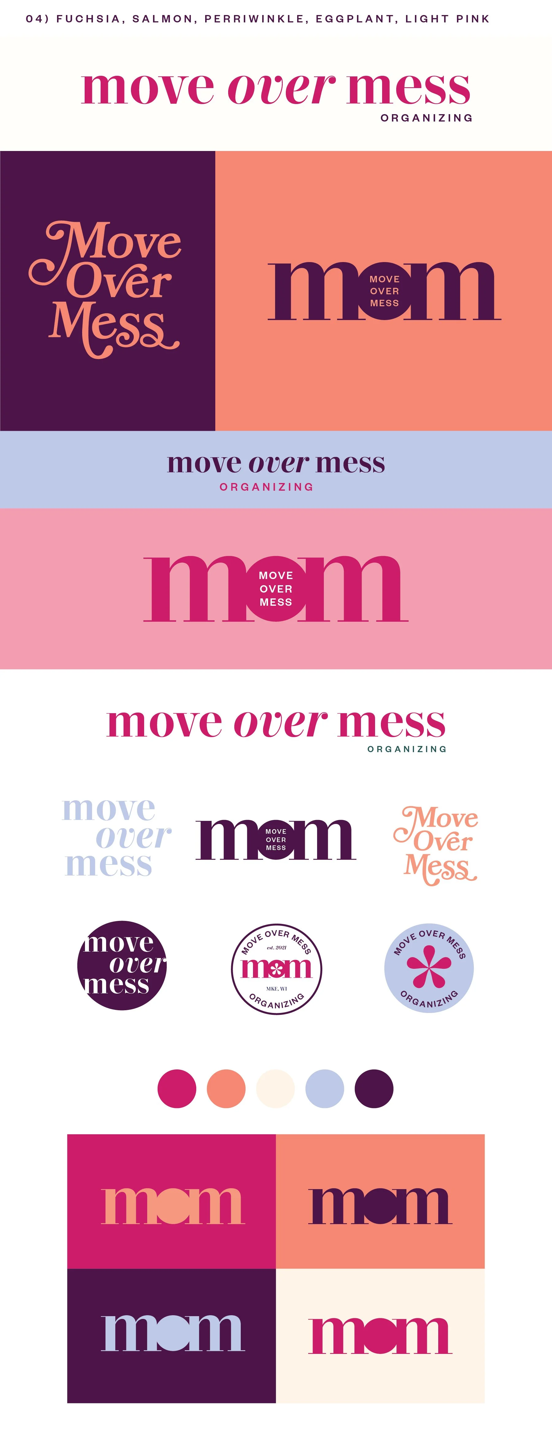
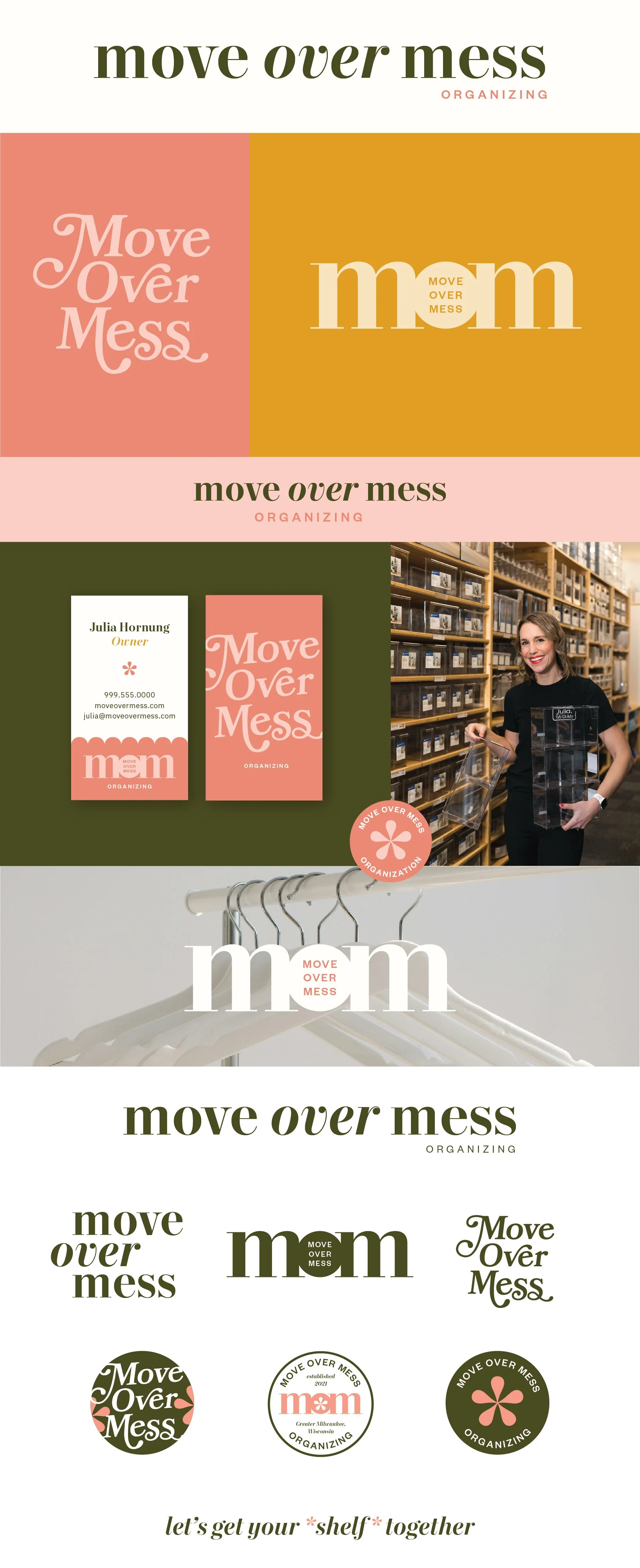
Primary, Horizontal Logo
Vertical Logo
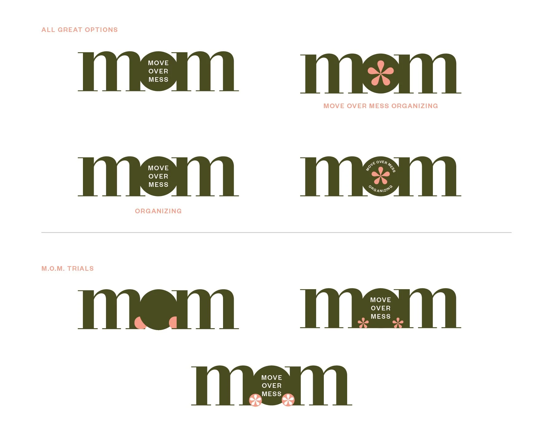
Monogram Mark
Horizontal Extended Logo
Business Card Mockup
Photo Overlays
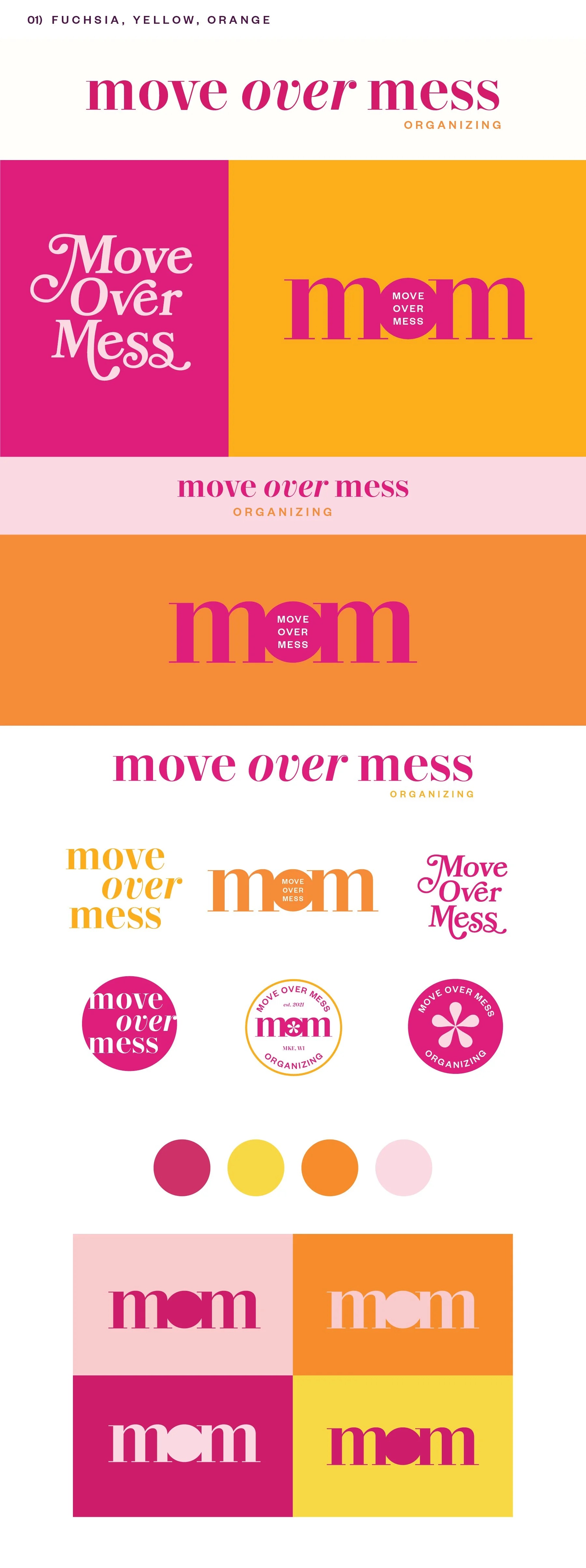
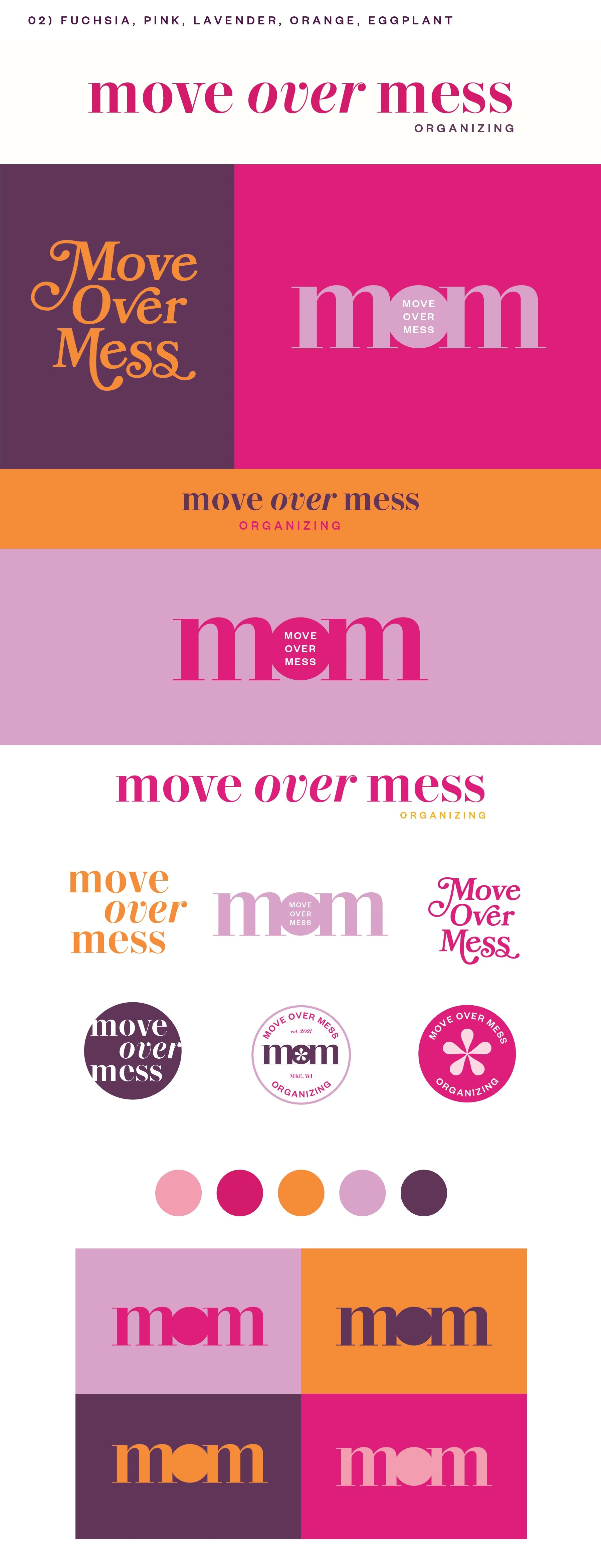
Logo Suite
Note
While each of these designs are meant to show a developed idea of each concept, each will be refined and the chosen concept will be carefully considered and added to until the brand is the strongest representation it can be.
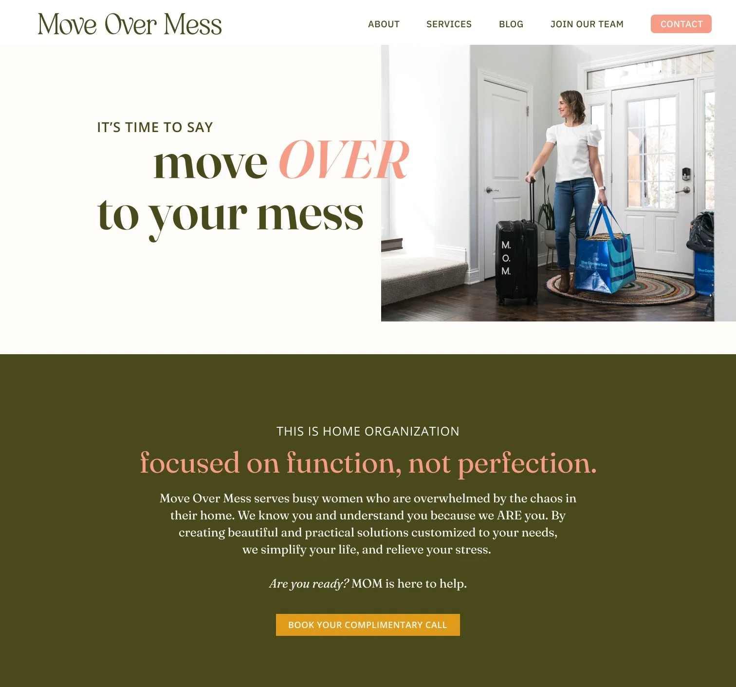
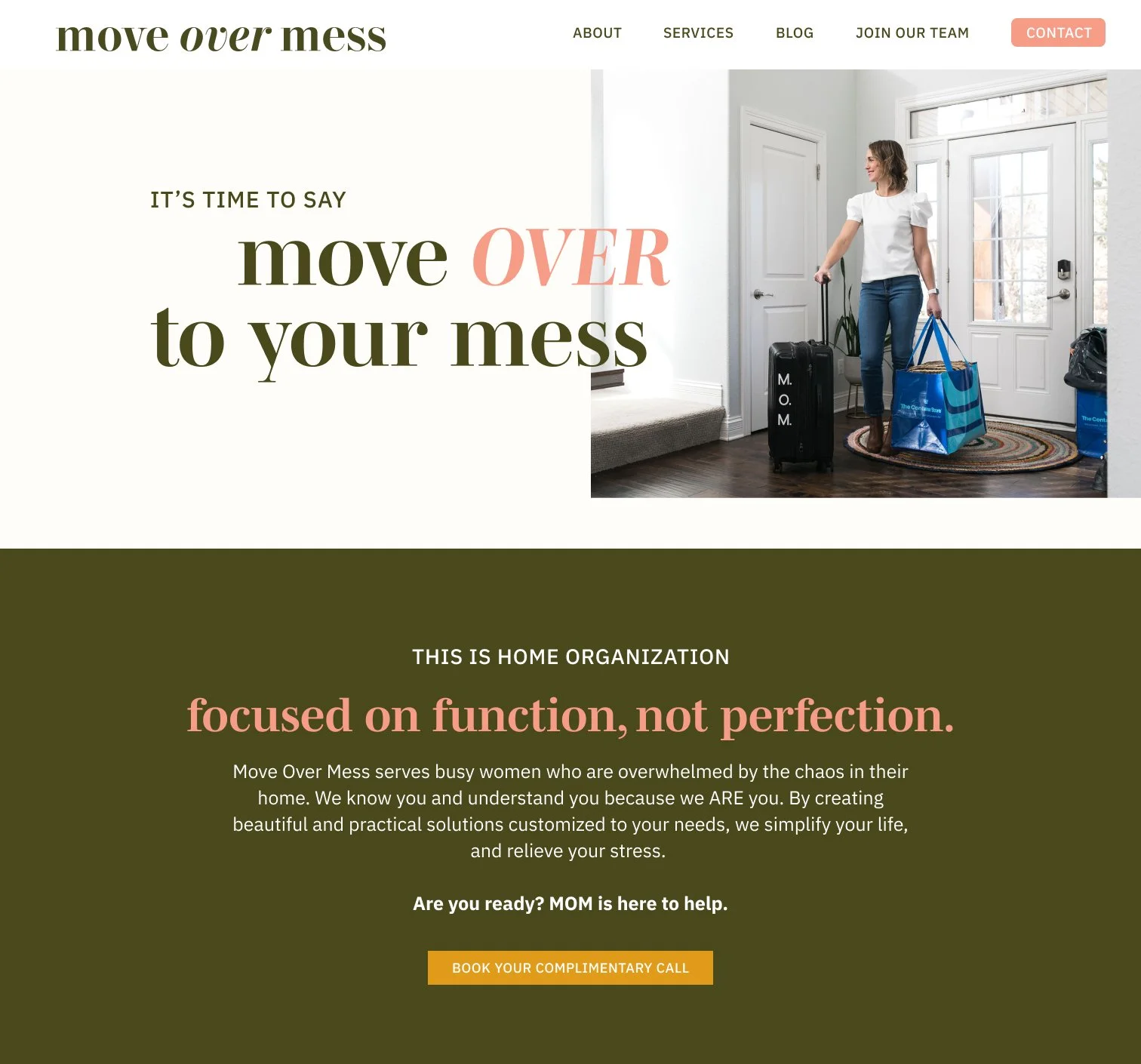
Business card concepts and the homepage mockup are meant to show how the brand can progress beyond the logo alone and will be refined along with the logo. Additionally, the information shown is placeholder information.
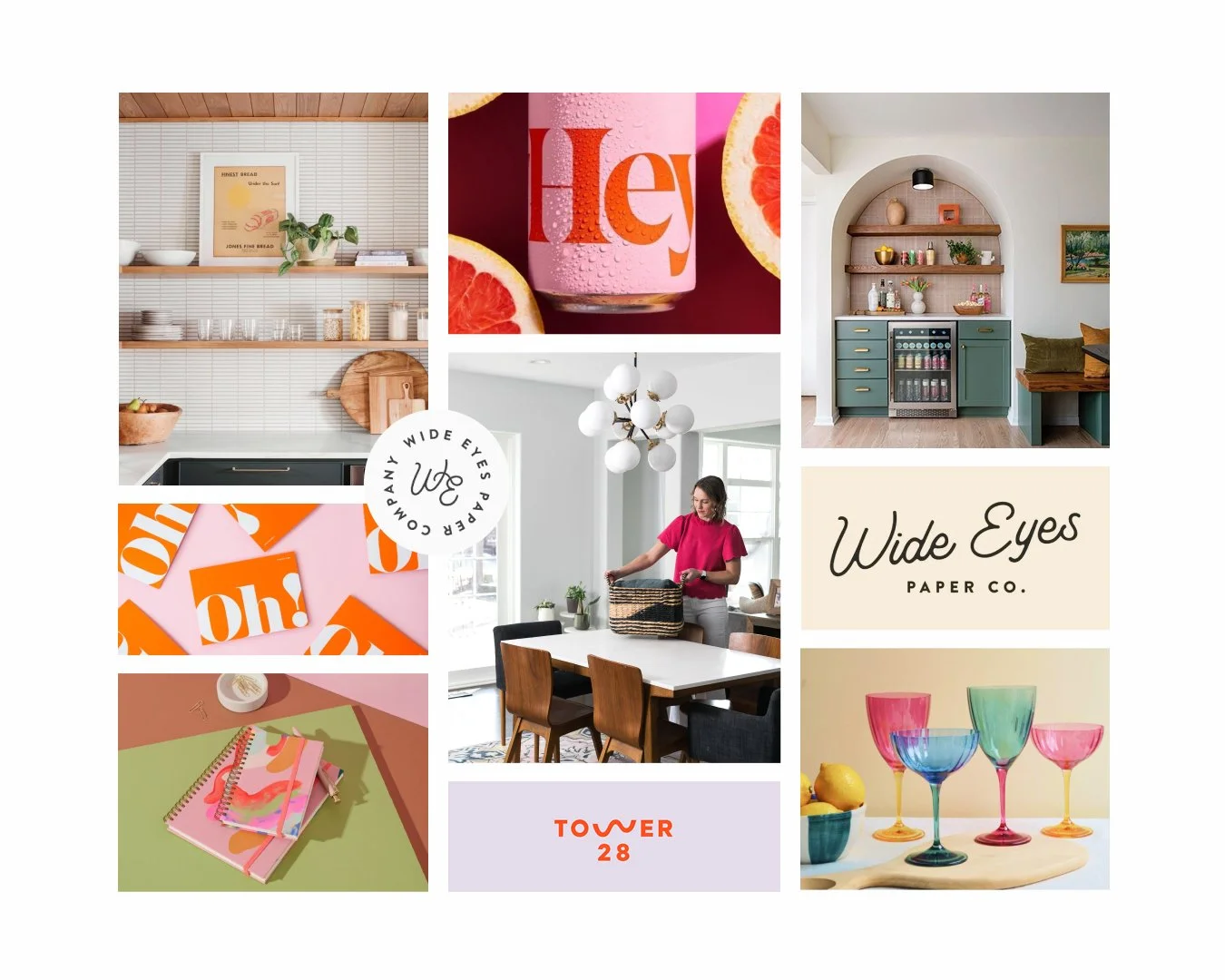
Moodboard
Initial Concepts

Design Draft 2
Color Options

Design Draft 1
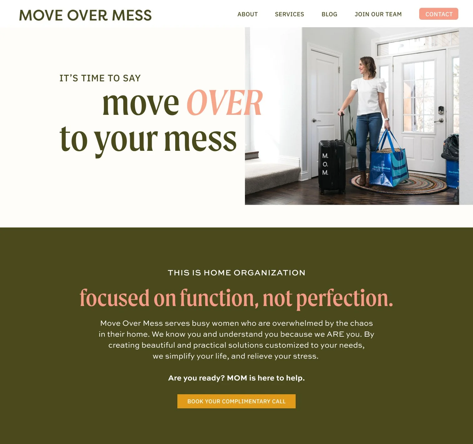
Concept 1
Classic, spunky, bold, feminine, energetic, personable
This concept feels modern and energetic but maintains a warm, inviting personality. I like the subtle motion and energy of having “Over” italicized. All of those elements are reinforced in the stacked, playful vertical version. The ornamental parts of the letters all feel very intentional and create a distinct text mark that I think would be great on shirts or totes for your team. I could see this being on the back of the t-shirts and being a really fun playful part of your branding and a bright first impression for clients when you arrive to their home. The MOM mark is also a strong, bold mark that will be versatile and easy to use. It canbe used with or without “Move Over Mess” in the “o”. EAch of the letters can also be a different color when you want extra pops of color.
Concept 2
Modern, soft, clean, minimal, versatile
This concept really focuses on clean lines and breathing room around each of the elements, which is great for an organization company! The primary version of the logo is text-based, but to add some distinct details, there is a very simple house icon included in some of the secondary marks which I think would provide variety and the ability to layer your brand pieces well.
The MOM mark is another really distinct piece of this concept. The simple flow to the letters can hep reinforce the ease of your process.
Option 3
Classic, feminine, playful, refined
This concept has a lot of similar strong suits to Concept 1 but with a slightly different style. If the first one is classic in an energetic and bold way, I would say this one feels more traditional and established. But the rest of the strong suits feel similar, like the more straightforward primary version of the logo and a more intricate, visual stacked version for stickers, apparel, etc.