Modern Management
Summary
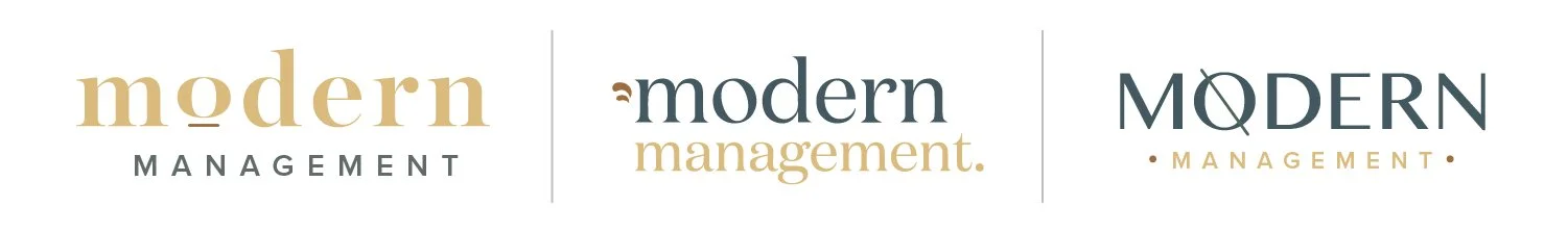
My main goal within all three concepts was to really harness the modern retro vibe and create an overall inviting and professional brand in the primary logo and color scheme. I also really love the idea of an “abbreviated” version of the logo with the text Mod Mgt, so I played with that as well as an initial mark for each version.
I think a fun, upbeat look works really well for you and your descriptor brand words, so I also wanted to make sure there was some degree of playfulness included. I think one of the main things to consider will really just be what works best with your properties and your staging style.
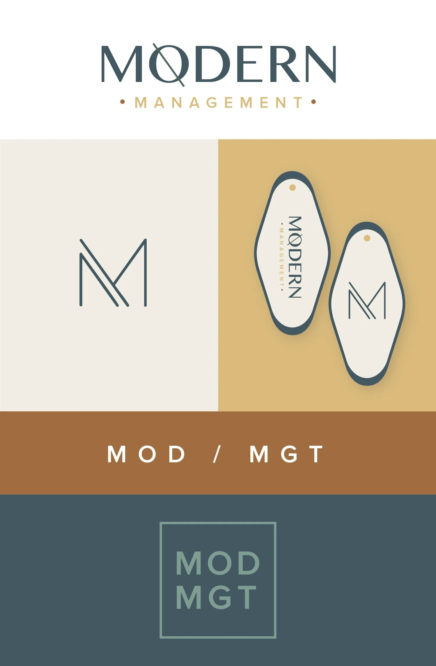
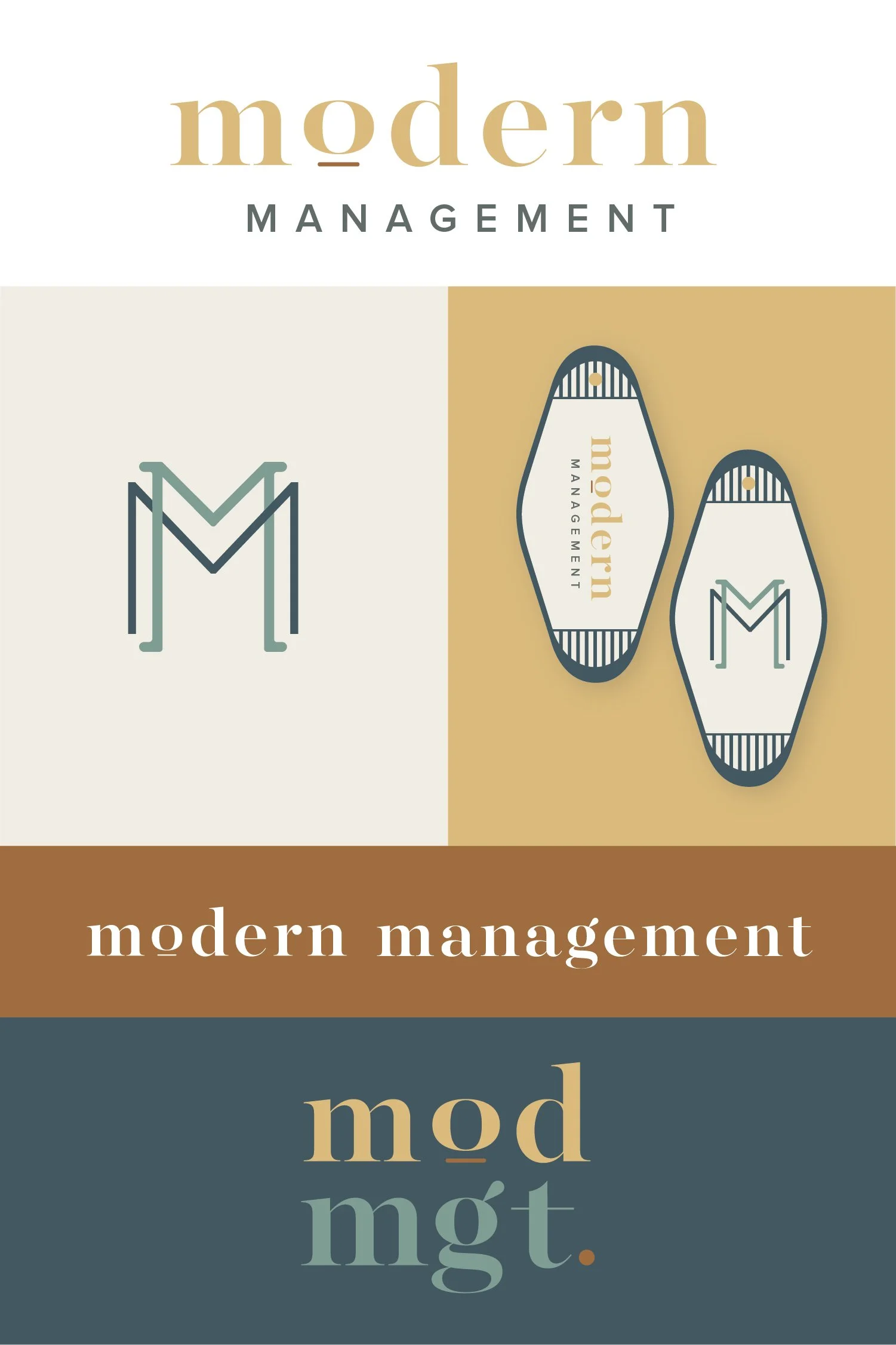
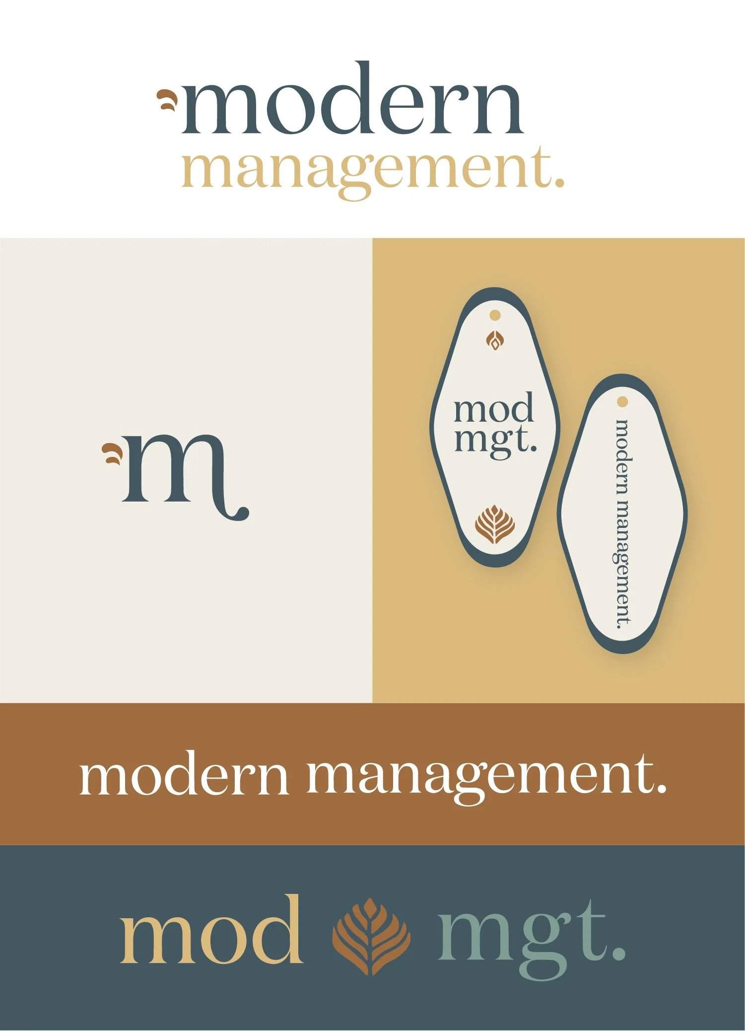
Below each of the three concepts shows the
Primary, Vertical Logo
Initial/Logo Mark
Alternate Logo Composition (on a keychain mockup)
Horizontal Logo
Abbreviated Logo
Note
While each of these designs are meant to show a developed idea of each concept, each will be refined and the chosen concept will be carefully considered and added to until the brand is the strongest representation it can be.
Business card concepts and the homepage mockup are meant to show how the brand can progress beyond the logo alone and will be refined along with the logo. Additionally, the information shown is placeholder information.
Moodboard
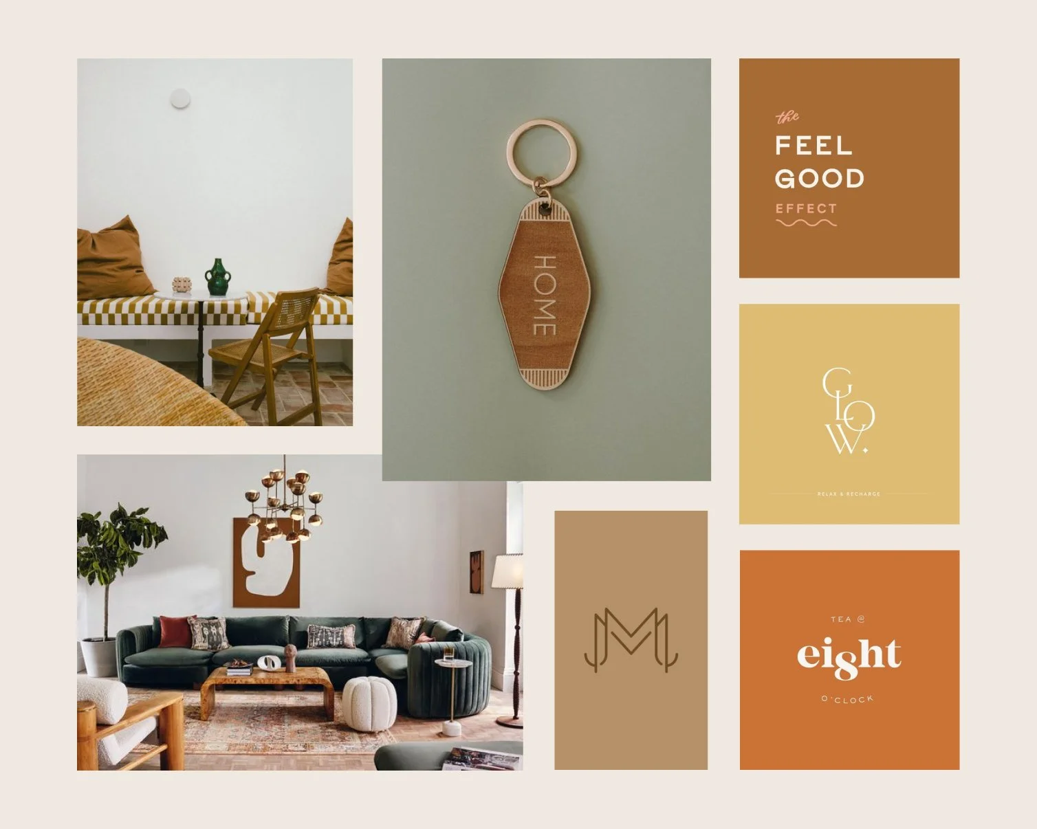
positive, upbeat, customer service oriented, happy, friendly, reliable, dependable
Initial Concepts
Concept 1
Key Words: Chic, memorable, broad appeal
I would describe this version as modern with classic elements, like the MM monogram. It is really versatile and I love the little details like the line under the “o” and the period after mgt in the condensed, vertical mod mgt version at the the bottom. I think this version feels very current and fits in with the Fort Collins vibe really well.
Concept 2
Keywords: Playful, semi-bohemian
This version has a few extra playful elements and is very inviting! Knowing you (and your warm personality!), I think this works really well to bring your personality into the brand. It is probably the most feminine of the three, but I don’t think it’s over the top and still has a lot of versatility.
Concept 3
Keywords: Modern, clean, angular
This version leans more heavily into the modern side than the other two. It’s really fresh and takes on a lot of modern characteristics without feeling impersonal. The MM monogram/mark is more subtle with the singular M having two sides to come together for the double M.