Keep Law
Summary
Keep Law is a law firm based in Fort Collins, Colorado specializing in estate planning and firearms education. For the purpose of this rebrand, the designs primarily focus on the estate planning side of the business, but are still appropriate for all the services offered by Keep Law.
The logo and brand designs were inspired by a medieval theme, specifically the Kosteilenberg Castle to reference family history. The branding alludes to this connection by utilizing themes of protection with a shield and castle references in the logo design.
Below each of the three concepts shows the
Primary Logo
Secondary Logo/Logo Mark
Logo Variations
Business Card Design
Note
While each of these designs are meant to show a developed idea of each concept, each will be refined and the chosen concept will be carefully considered and added to until the brand is the strongest representation it can be.
Business card concepts are meant to show how the brand can progress beyond the logo alone and will be refined along with the logo. Additionally, the information shown is placeholder information.
Initial Concepts

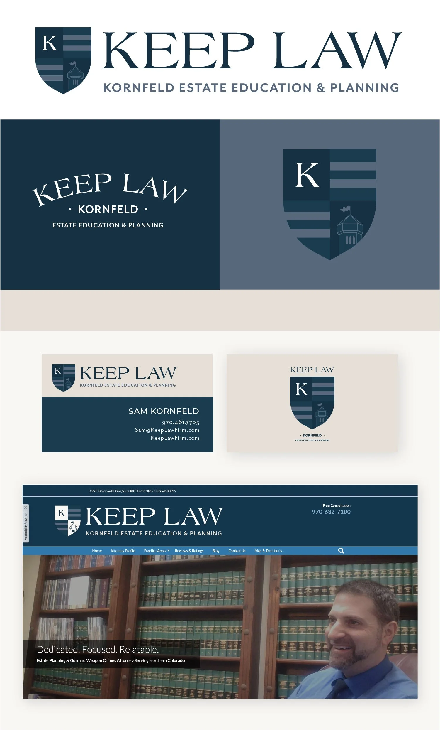
Concept 1
Key Features and Qualities:
Reads as traditional for a law firm by utilizing columns as one of the main imagery elements
Still has a tie-in with the protection aspect in a subtle way using the shield as the surrounding shape for the column and the nod to a castle tower top shape at the top of the shield to provide more dimension.
Traditional font options
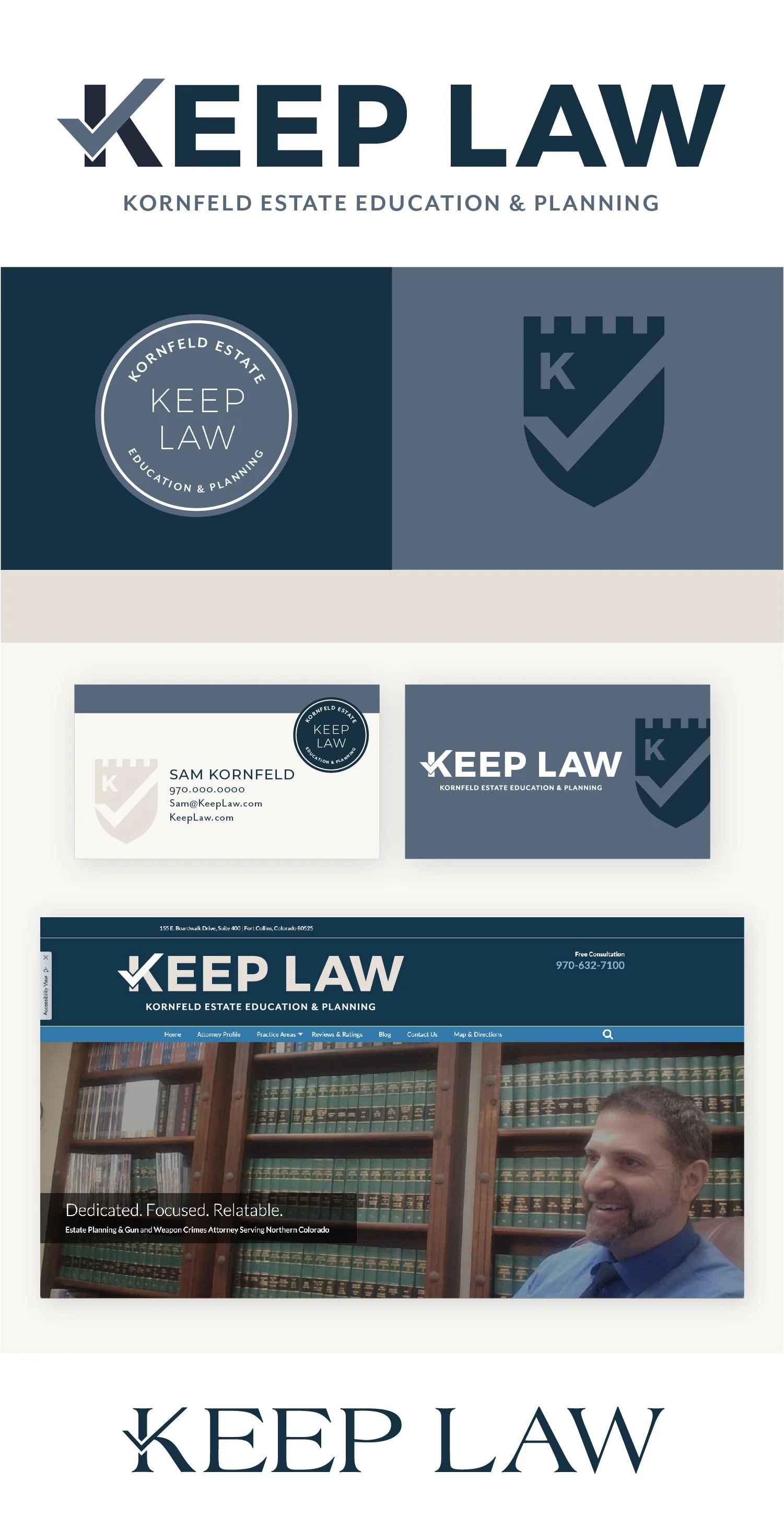
Concept 2
Key Features and Qualities:
Most modern and bold of the three options
Since you specialize in estate planning, I wanted one option to really highlight the planning aspect of your firm. Since checkmarks are often associated with lists/making plans, I thought that was a good way to create a distinct, customized approach to the type in your name as well as incorporate the checkmark to create a unique element in the shield logo mark.
The simplicity and the font choice stand out from a traditional law firm branding
*alternative font choice available
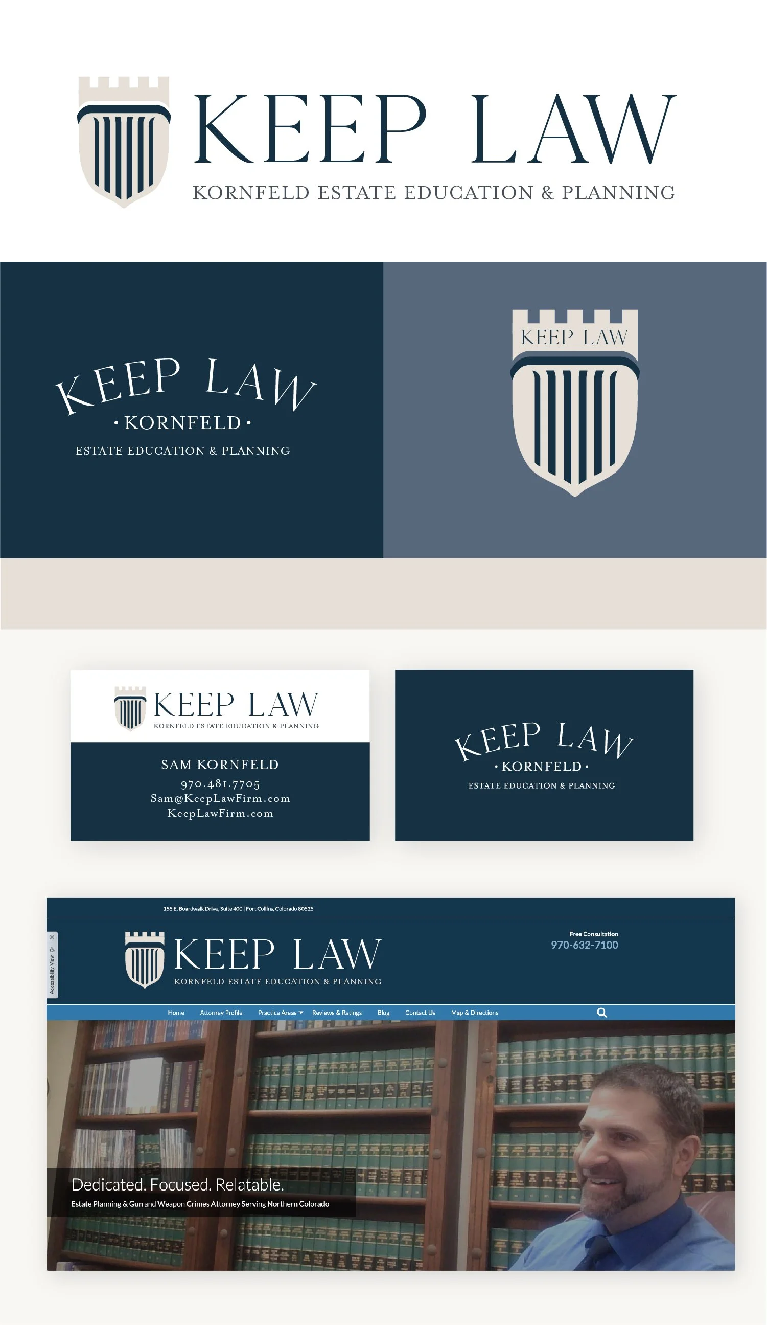
Concept 3
Key Features and Qualities:
Distinct font that incorporates more of the medieval/castle theme
Most direct reference to the Konigsberg Castle with the pointed castle turret rather than the squared-off shape.
I wanted to start with a pretty subtle approach to the castle. With multiple pointed turrets, I didn't want to overwhelm the logo by being too busy, so I started with just the general shape so there is a direct reference, but included it as a part of the shield rather than on its own. I think the pairing of the turret with the K initial creates a strong, distinct look.