Heritage & Home
Summary
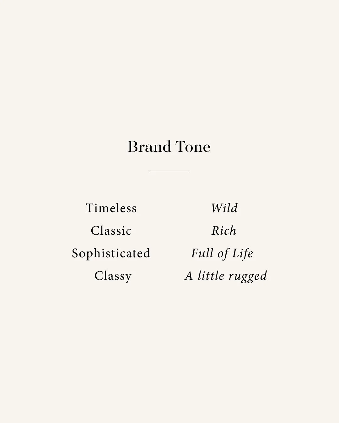
Heritage & Home will specialize in vintage-inspired luxury home decor and design. My main goal within all three concepts was to really harness a sophisticated, classic, elegant, luxury style while still allowing for an inviting vibe. One of the ways this brand evolved was to show more of the “luxury” side at the forefront and include some of the more “rough around the edges” elements in the details. Another focus was to ensure you will have a lot of different compositions to work with and to show how these elements will come together in a storefront setting.
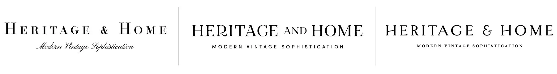
**The taglines are placeholder info and can be updated in revision rounds.
Below each of the three concepts shows the
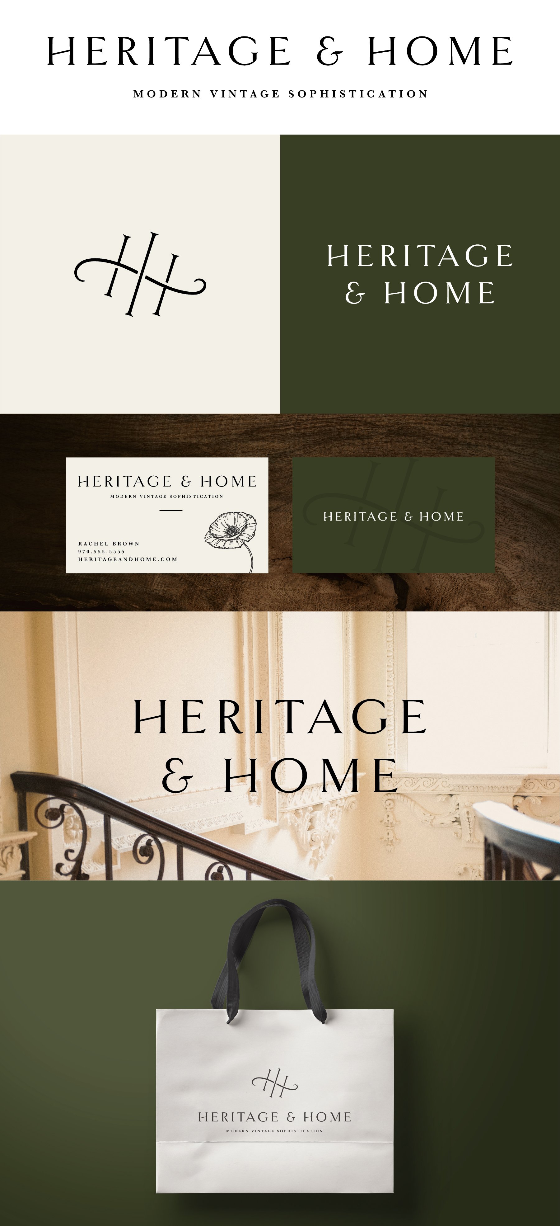
Primary, Vertical Logo
Initial/Logo Mark
Alternate Logo Composition
Business Card Mockup
Photo Overlay
Shopping Bag Mockup
Logo Suite
Note
While each of these designs are meant to show a developed idea of each concept, each will be refined and the chosen concept will be carefully considered and added to until the brand is the strongest representation it can be.
Business card concepts and the homepage mockup are meant to show how the brand can progress beyond the logo alone and will be refined along with the logo. Additionally, the information shown is placeholder information.
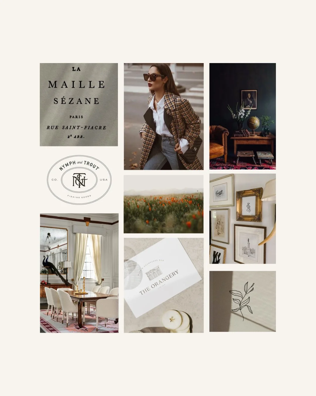
Moodboard
Initial Concepts
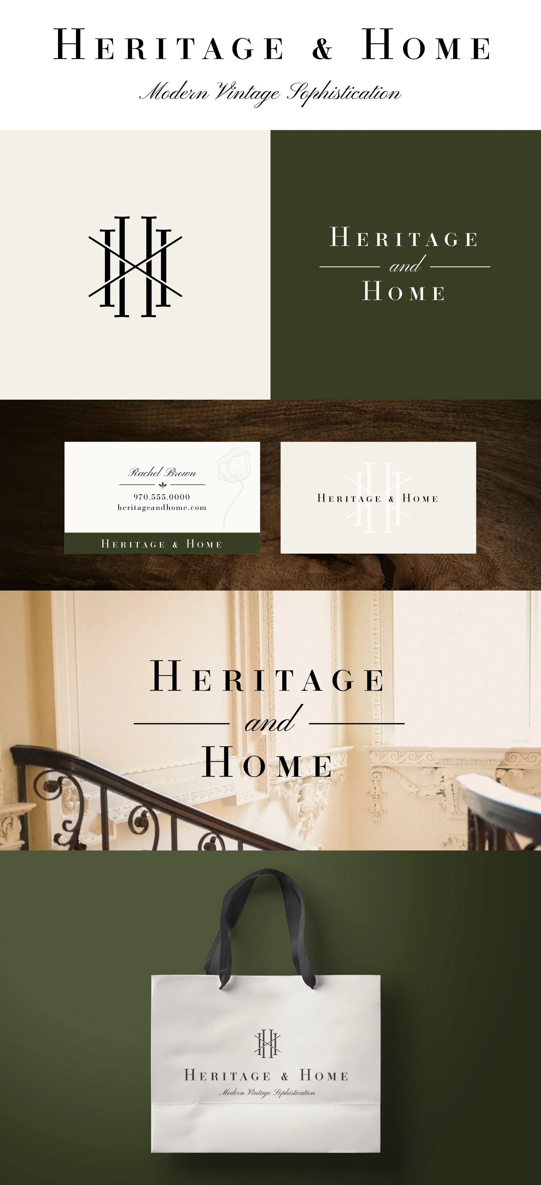
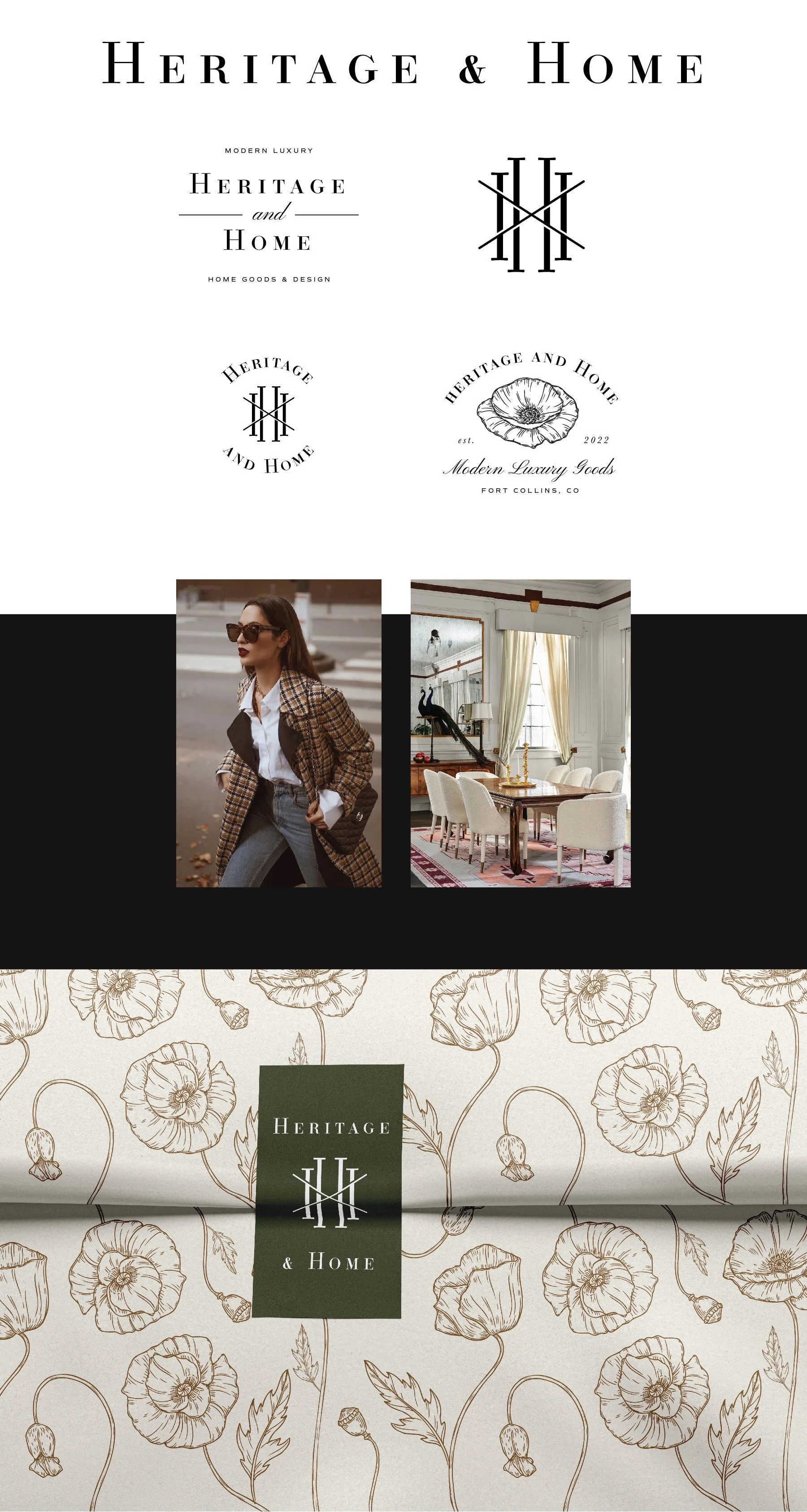
Concept 1
Key Words: Chic, sophisticated, timeless, luxury, bespoke
I would describe this as having the most high-end, luxury appeal. The overall appearance positions itself as a very classic style and has a degree of having a desirable, luxe quality.
For the monogram mark, I wanted to use the HH initials, in a similar style to classic designer brands like Chanel or Louis Vuitton, but I loved what you said about the Heritage aspect being the “interweaving of our stories” so I wanted to utilize an overlapping, woven aspect as well. The crossed lines in the middle are meant to both create a distinct look for your monogram, but also subtly reference more of a woven, tapestry pattern.
This option lends itself easily to higher price point goods and services.
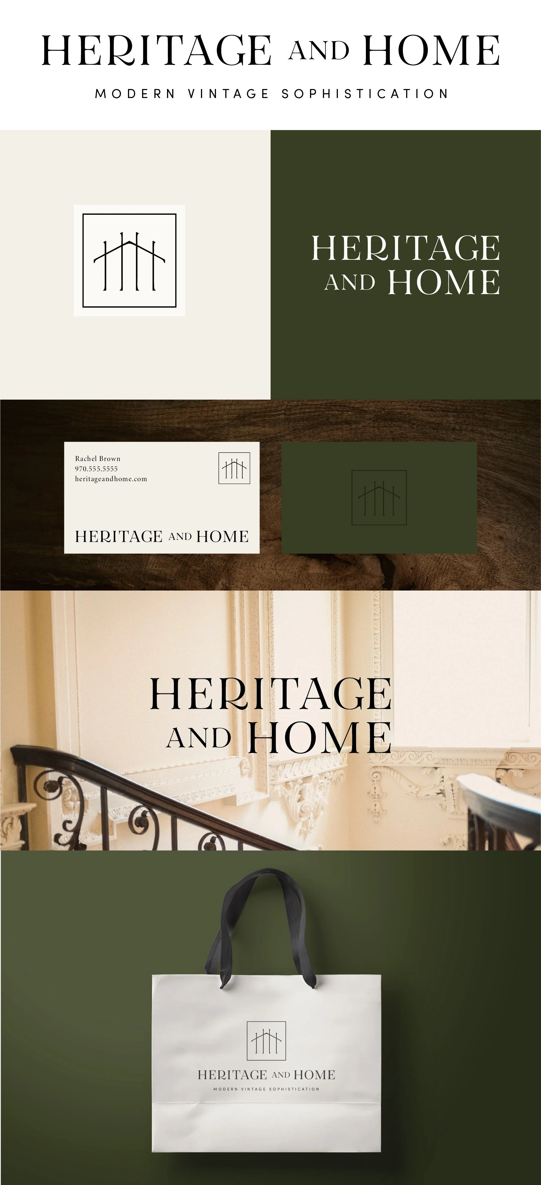
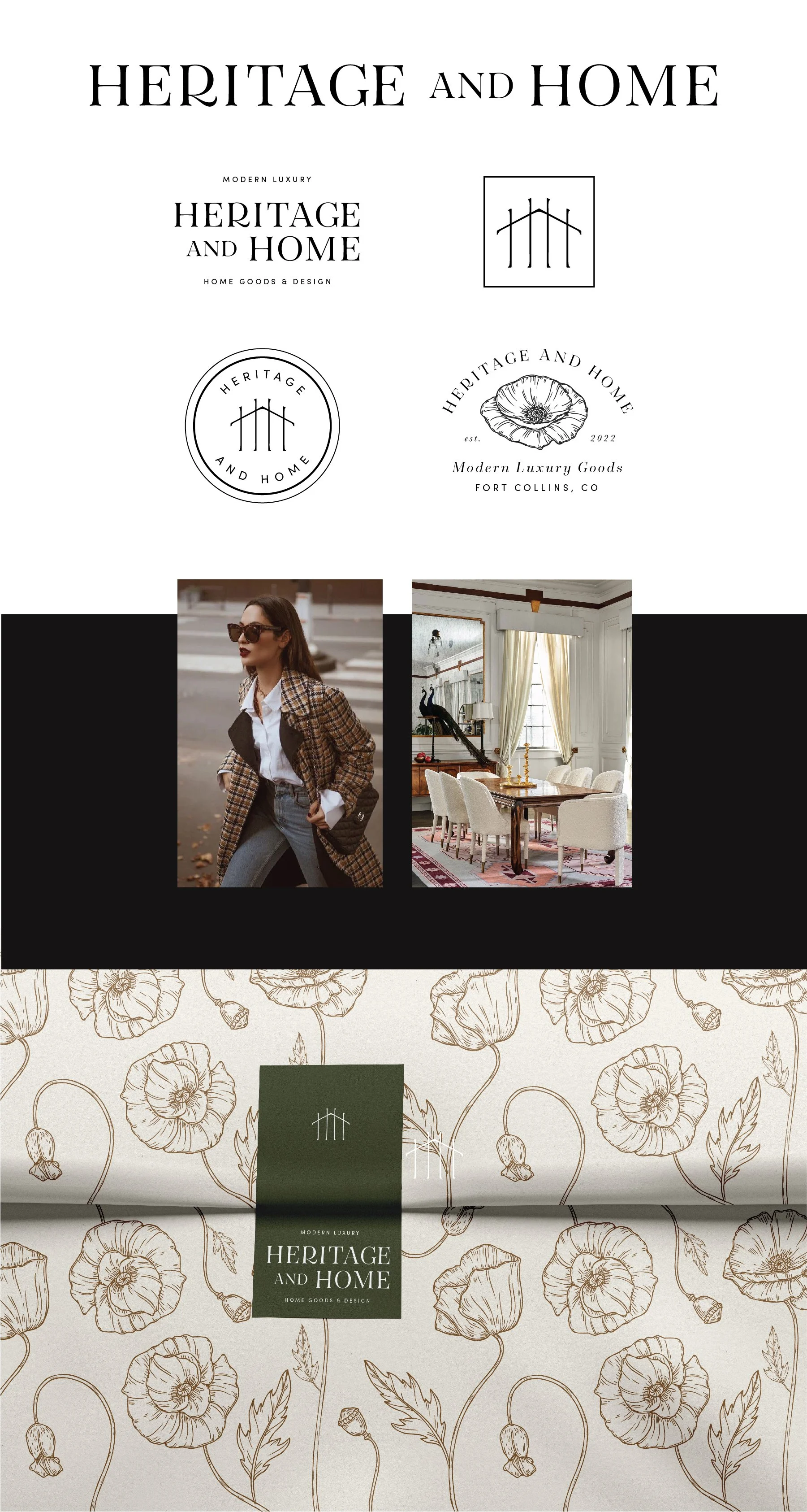
Concept 2
Keywords: High-end, approachable, interior design, more rustic/rugged, one-of-a-kind/vintage appeal
This version reads as warm, inviting, and high-end. There is a bit more softness to it than the first concept. While it still reads as custom and high-end, it feels a little more inviting to a broader audience.
The logo mark itself speaks more directly to interiors and home decor. It has a nice combination of vintage, upscale, and a little rugged appeal.
Concept 3
Keywords: Softer, timeless, a touch of femininity, soft around the edges
What I like about this version is the softness combined with the timelessness. The text is a little softer, but it still reads as a traditional, upscale brand. The logo mark itself has a feminine flair to it but also captures a kind of timeless, classic detail. It reminds me of a custom knob or door knocker. Because of the rounded, fluid nature of the logo mark, the poppy illustrations would naturally fit in well in brand collateral.