Hanna Commercial
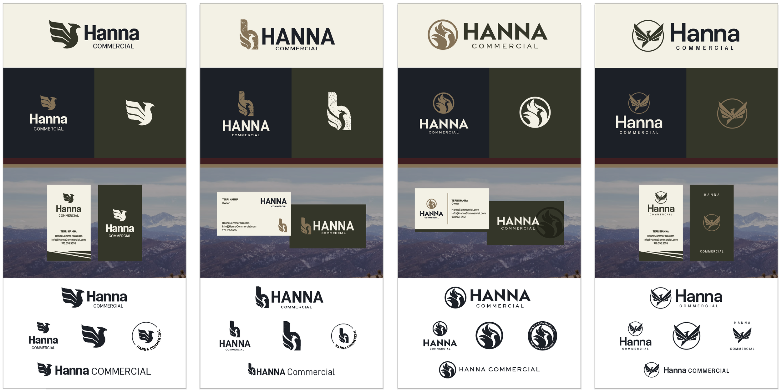
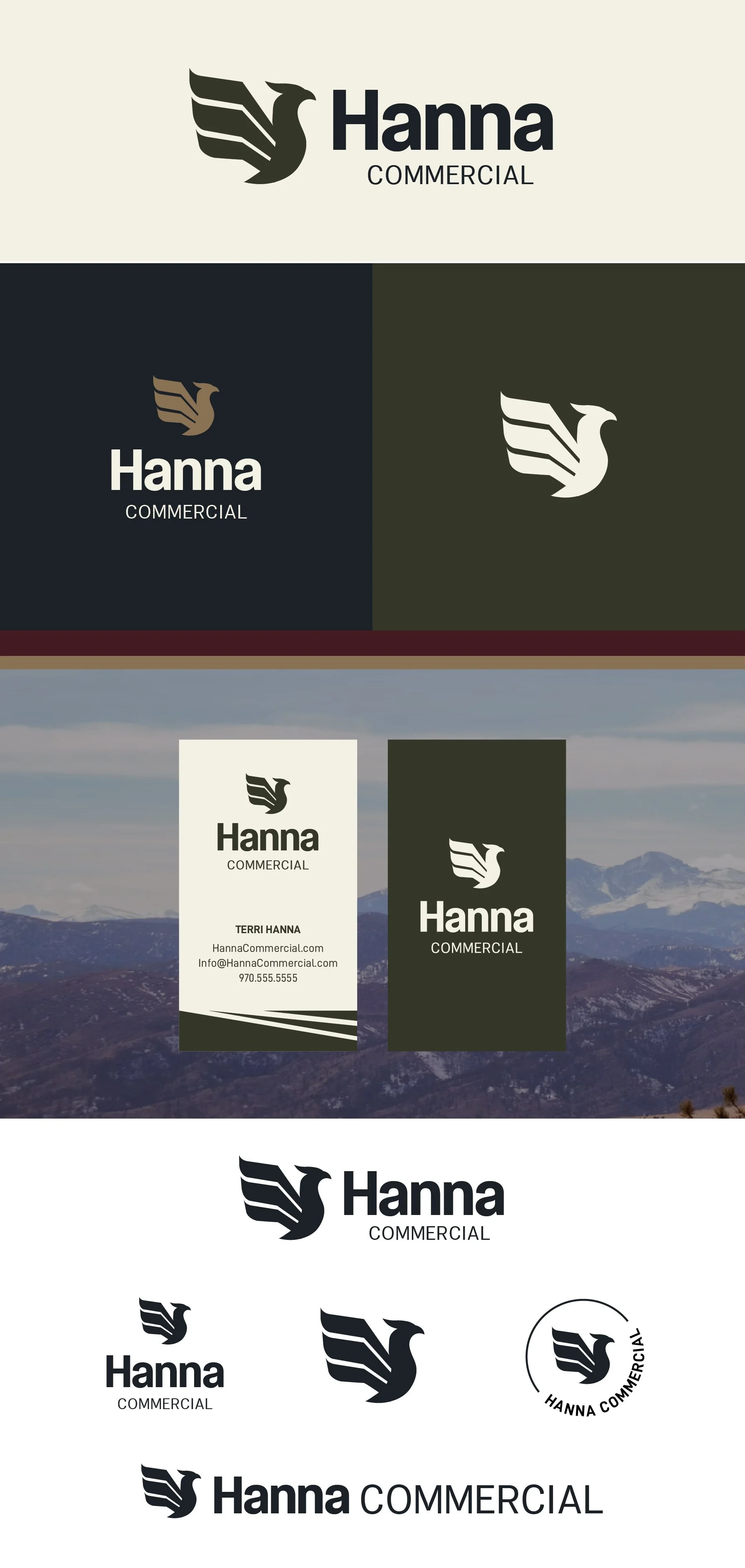
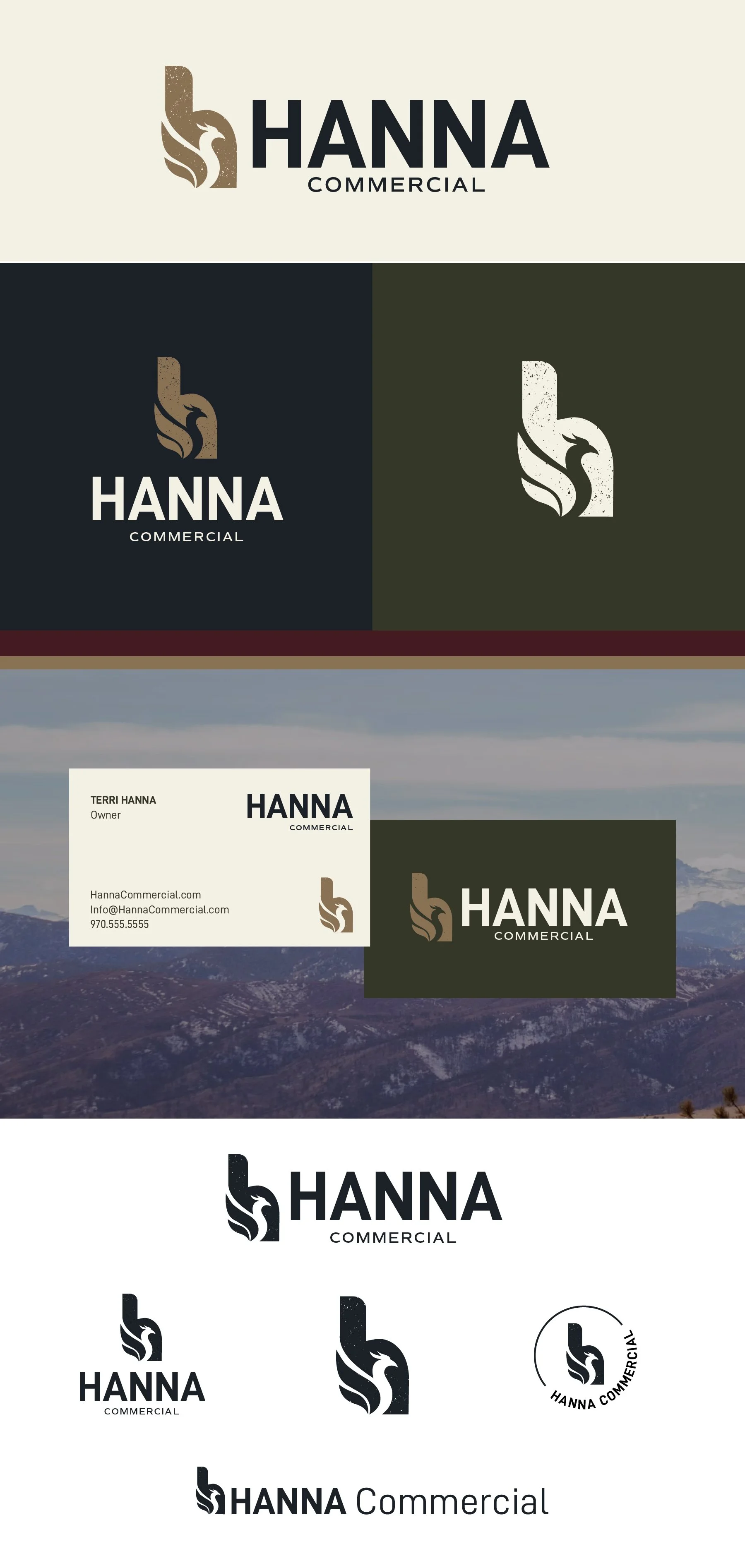
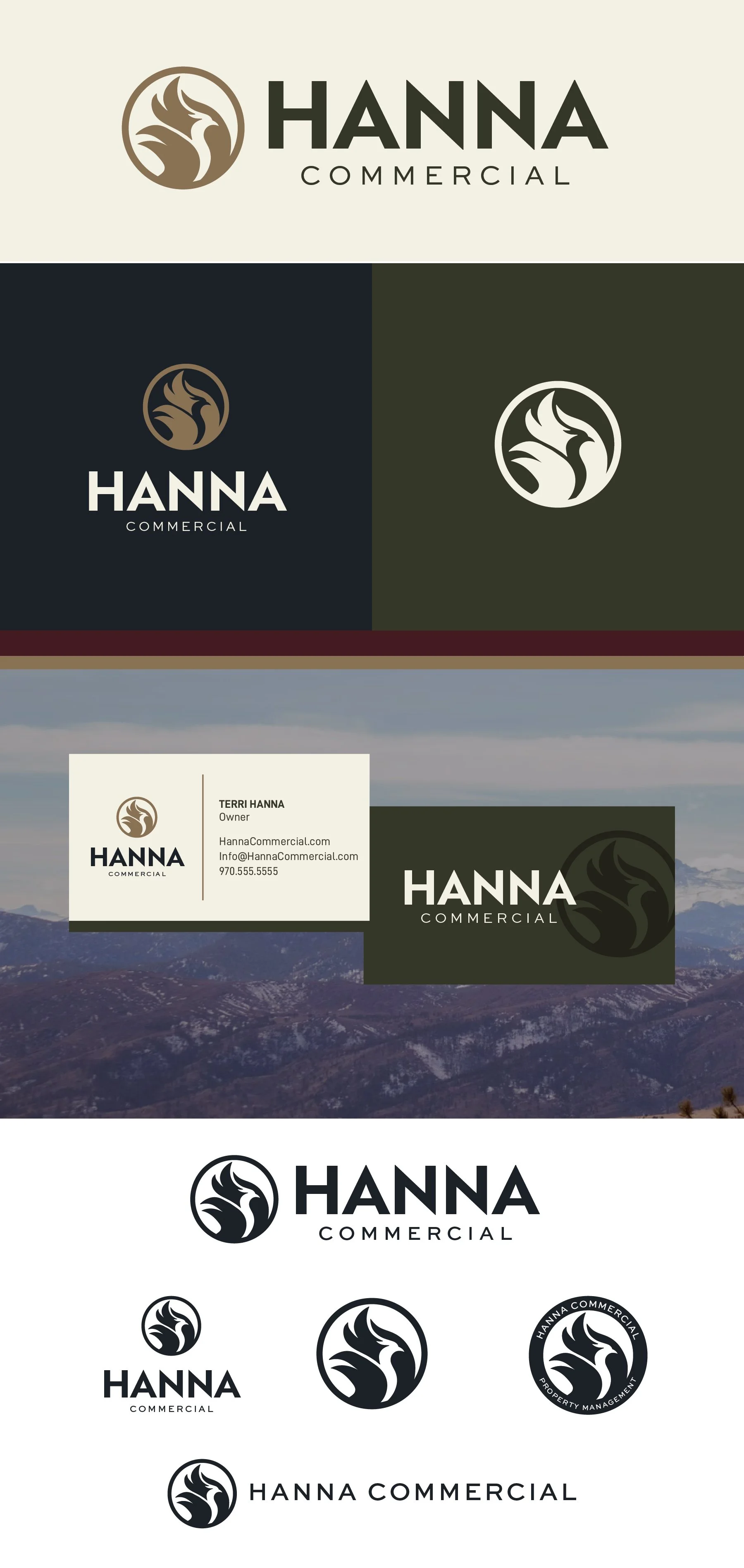
Below each of the three concepts shows the
Primary, Horizontal Logo
Vertical Logo
Monogram Mark
Horizontal Extended Logo
Business Card Mockup
Photo Overlays
Logo Suite
Note
While each of these designs are meant to show a developed idea of each concept, each will be refined and the chosen concept will be carefully considered and added to until the brand is the strongest representation it can be.
Business card concepts and the homepage mockup are meant to show how the brand can progress beyond the logo alone and will be refined along with the logo. Additionally, the information shown is placeholder information.
Moodboard
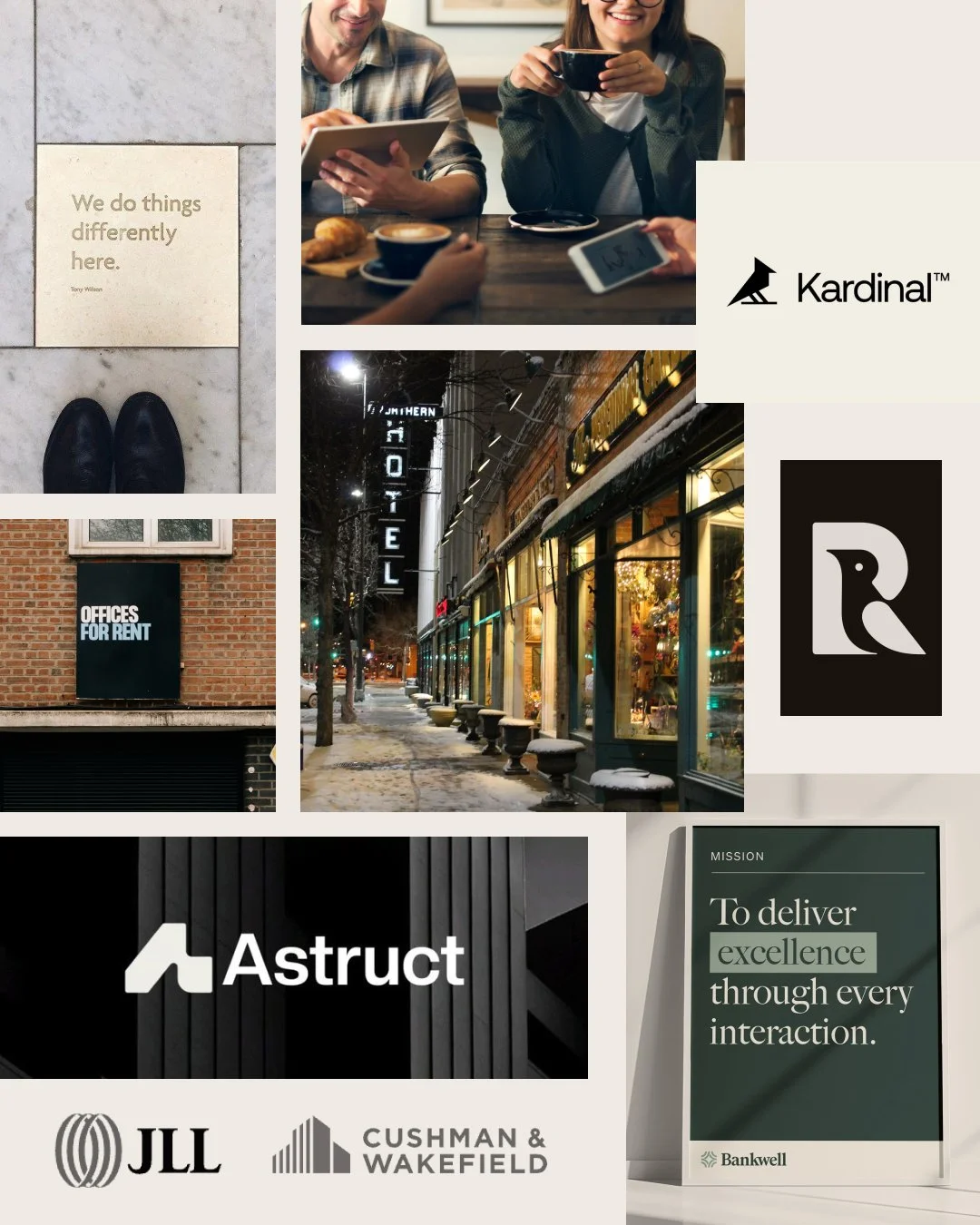
Brand Style:
Refined
Sophisticated
Timeless
Clean
Understated
Polished
Contemporary
Concept 1
Refined, clever, established
What I love about this concept is the subtle architectural detail built into the phoenix's wings, which gives the mark a dual meaning. The mark itself is strong and grounded, balanced by softer, more approachable type. It feels established from day one, and it will scale well as your business grows.
Concept 2
Distinct, memorable, timeless
This option brings together two elements: an initial mark and a phoenix. Either one would be interesting on its own, but together they create something truly memorable. The "h" can also read as a building, a quiet nod to the work you do.
Concept 3
Inviting, confident, strong
This mark puts the phoenix front and center. There's a lot of energy and momentum in it. It still carries strength, but the phoenix itself has a softer, more feminine edge that keeps it welcoming and keeps it from feeling overly corporate.
Concept 4
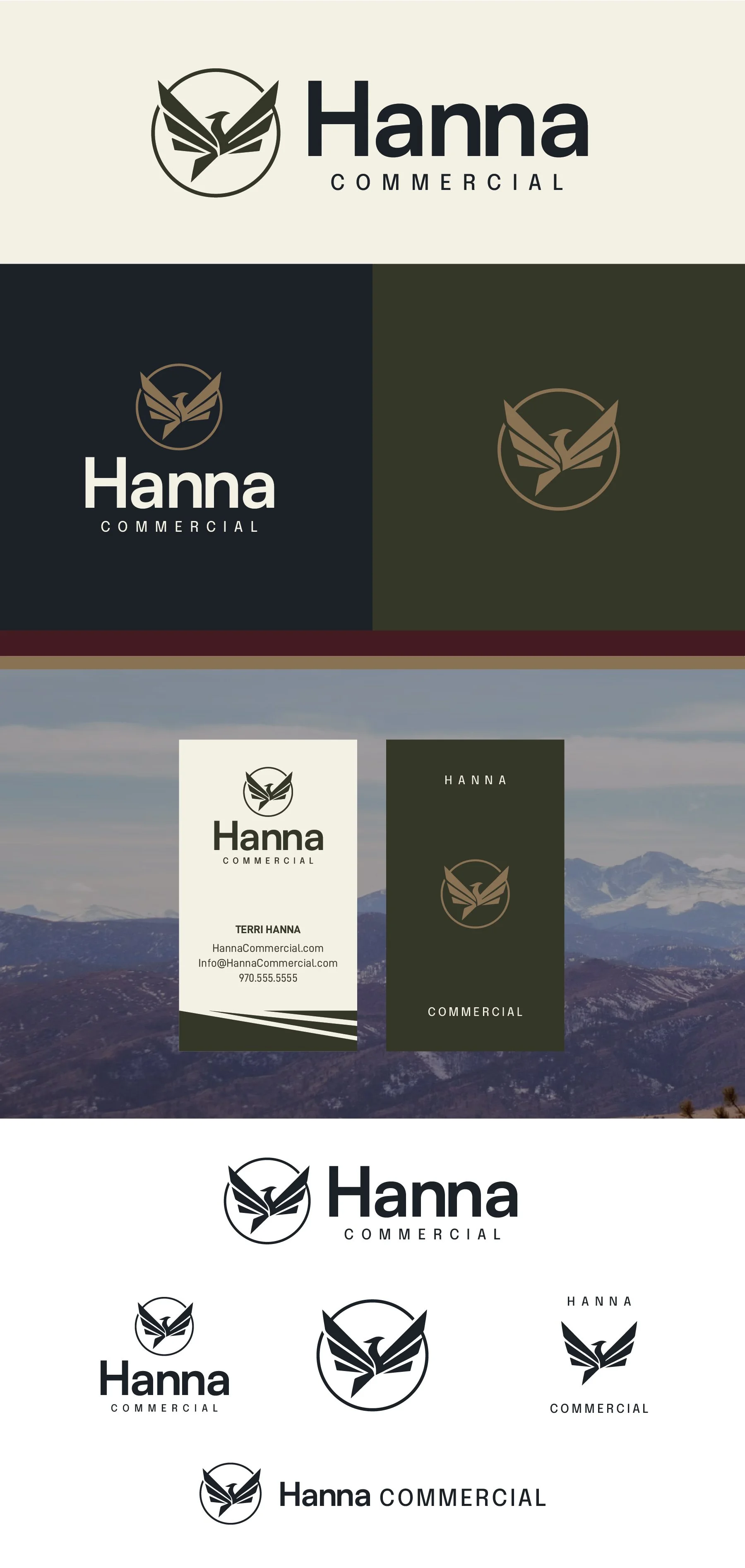
Sophisticated, timeless, Polished
Like option one, this phoenix weaves architectural lines into the wings. It feels the most in flight of all the options, with a real upward motion and a sense of growth and expansion. That's a strong message in commercial property management: you're a trusted resource here to help clients grow.