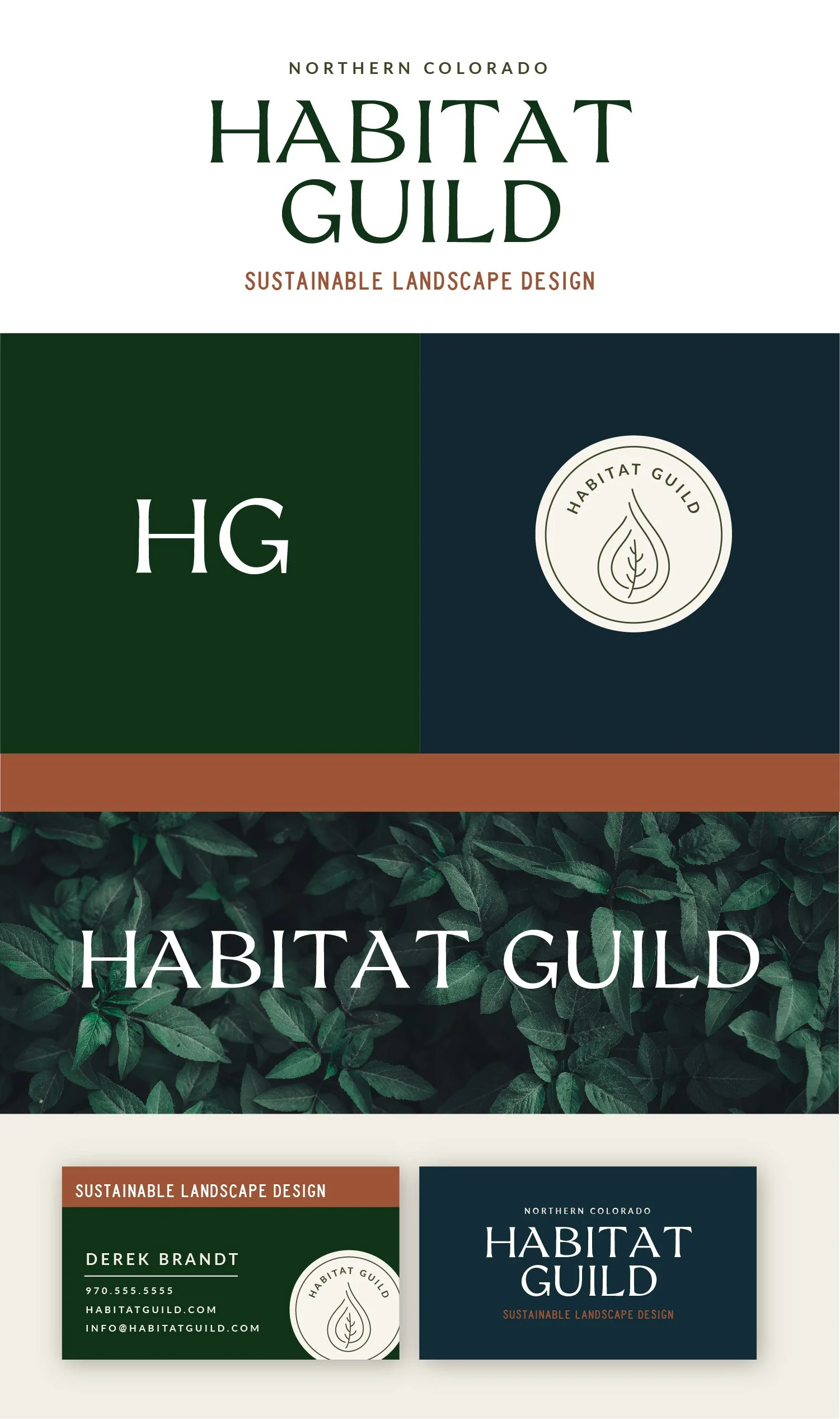
Habitat Guild
Summary
Habitat Guild is a landscaping company based in Northern Colorado. They are distinct from conventional landscape companies because of their commitment to sustainable landscape and ecological garden practices (i.e. no pesticides, low-water/water-smart, building soil health, organic methods). They provide a premium landscape service/product
Below each of the three concepts shows the
Primary Logo
Secondary Logo/Logo Mark
Logo Variations
Business Card Design
Note
While each of these designs are meant to show a developed idea of each concept, each will be refined and the chosen concept will be carefully considered and added to until the brand is the strongest representation it can be.
Business card concepts are meant to show how the brand can progress beyond the logo alone and will be refined along with the logo. Additionally, the information shown is placeholder information.
Moodboard
mindful, environmentally conscious, fringe, craft, organic, salt-of-the-earth, professional, sustainable, honest/truthful, genuine, ethical, authentic, equitable, unconventional, alternative
Initial Concepts
Concept 1
Key Features and Qualities:
Customized arch in the uppercase letter A - signifies both creating an internal space as well as considering the arc of the lifespan of the plant life.
Arc is mimicked in the HG initial mark
Friendly, inviting text
The welcoming approach is reinforced with the organic shapes surrounding the circular logo version and leaf drawing element on the back of the business card.
Ket words include: Inviting, organic, soft, natural
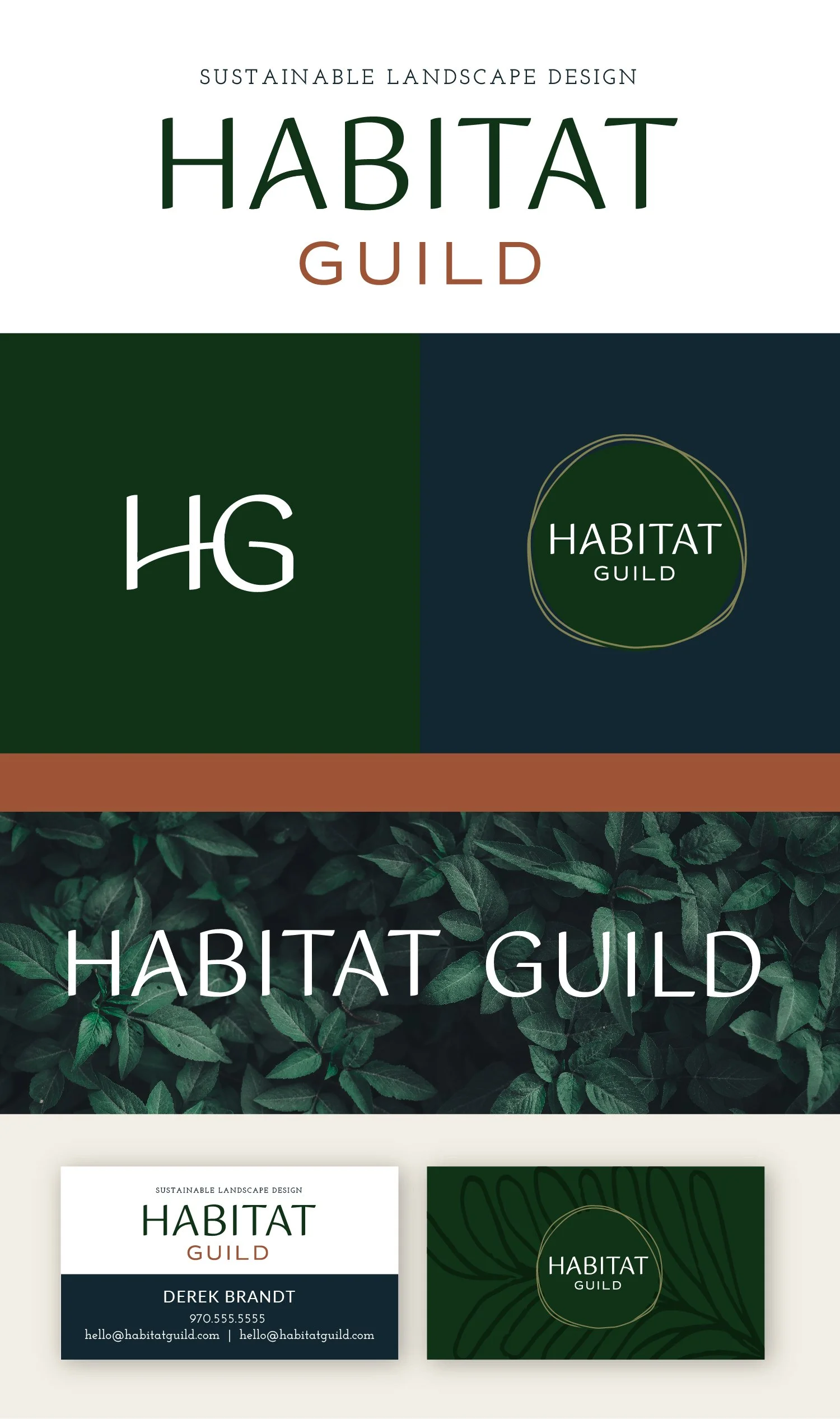
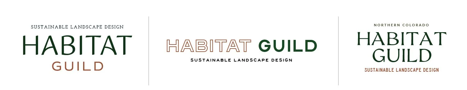
Concept 2
Key Features and Qualities:
Outline text paired with filled-in text - communicates the Habitat, the space you are creating.
Outlines as a recurring design element in the brand to reinforce the idea of creating spaces as well as the landscape plans and drawings
Subtle topographical line elements as well to bring in a more organic side of the linework
Key words include: modern, masculine, balanced

Concept 3
Key Features and Qualities:
Stong, directional angles and movement in the type - works well for landscape but also would work really well for home renovations in the future
Logomark to reference both the plant focus but also the focus on low water plants with a simple, modern line illustration style
Keywords I would use to describe this would be confident, established, professional, timeless
Revisions
Lighter, brighter color scheme - more energetic, more values
Updated tagline and tagline font
Small, accent circles on either side of the word Guild - this was just to create a little more balance between the two words, particularly when the tagline isn’t being used
Updated initial mark with intertwining letters using both of the brand fonts
Updated business card - I tried using a subtle pattern of tree rings rather than the topographical lines because I think that has a stronger tie-in and still works well for future purposes if you expand your services.
3 secondary logo options
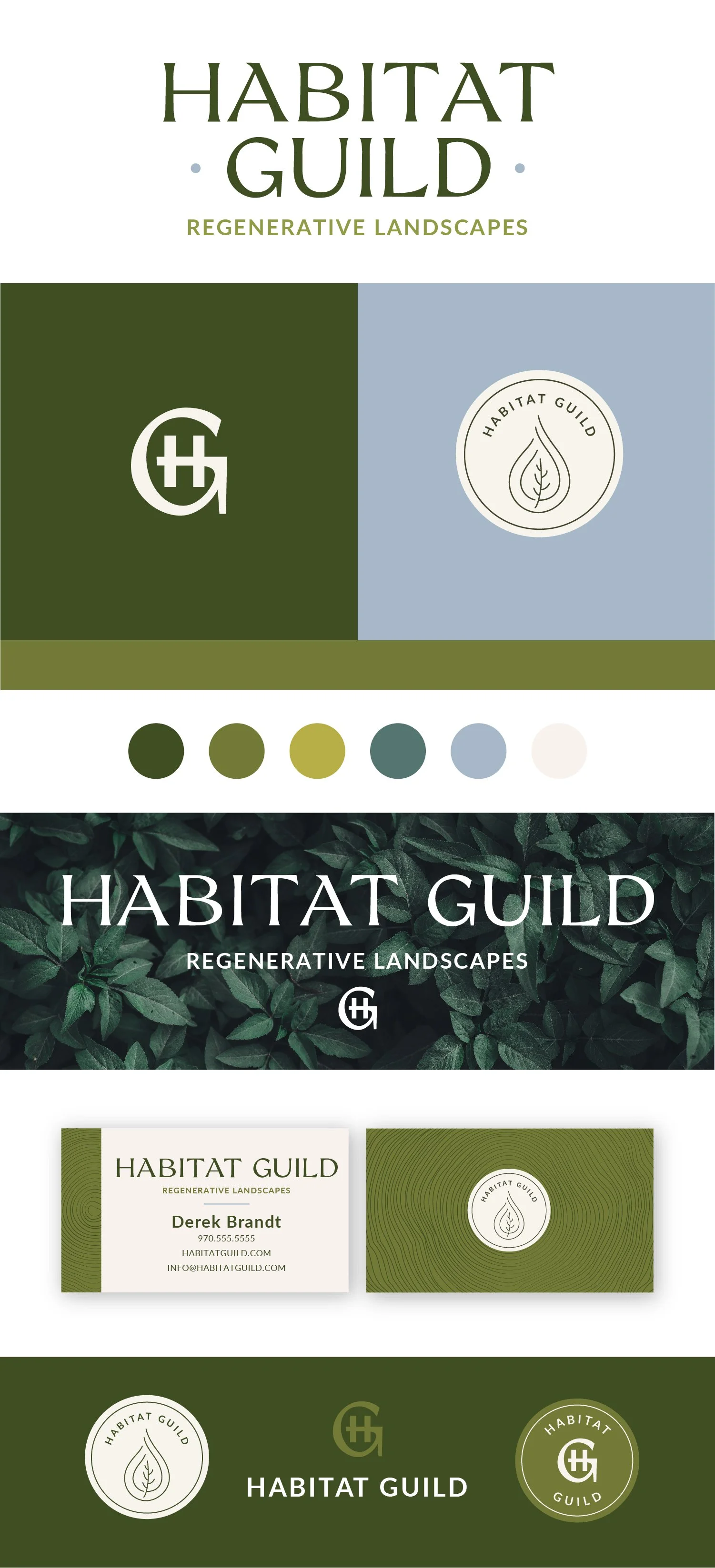
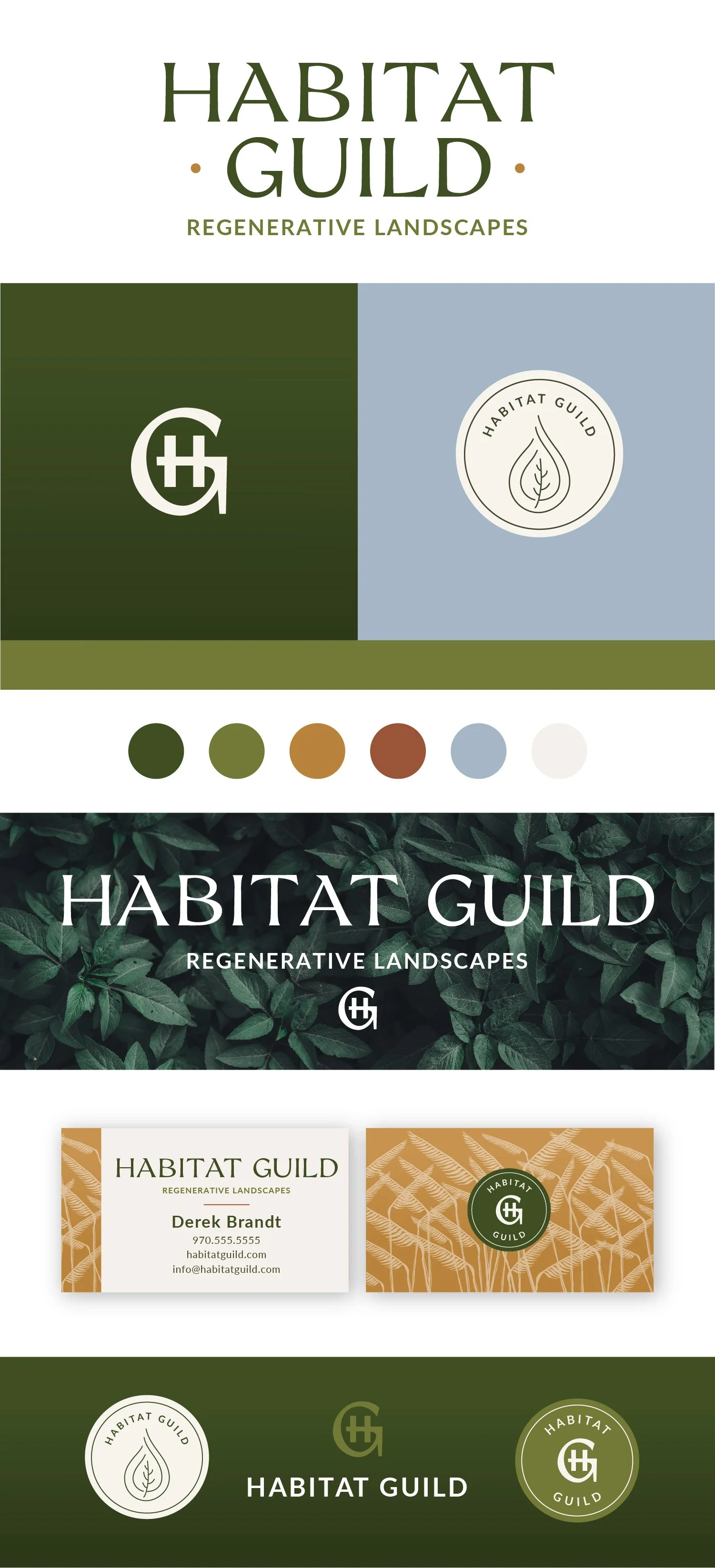
Revisions 2
Warmer Color Palette - More reflective of Colorado landscape. Brought the earth/rust color back and added a yellow/gold, which will work particularly well for the Call-to-Action on your website.
Updated pattern on the business card - blue gramma grasses to create texture, directly reference some of the naturally occurring plants in the area, and tie in the golden color
Very slight gradient added to the green and golden color palettes - creates a little more dimension and helps all of the colors to pop
Changed out the logo mark on the back of the business card - stands out more than the leaf/water droplet
Changed the contact info from uppercase