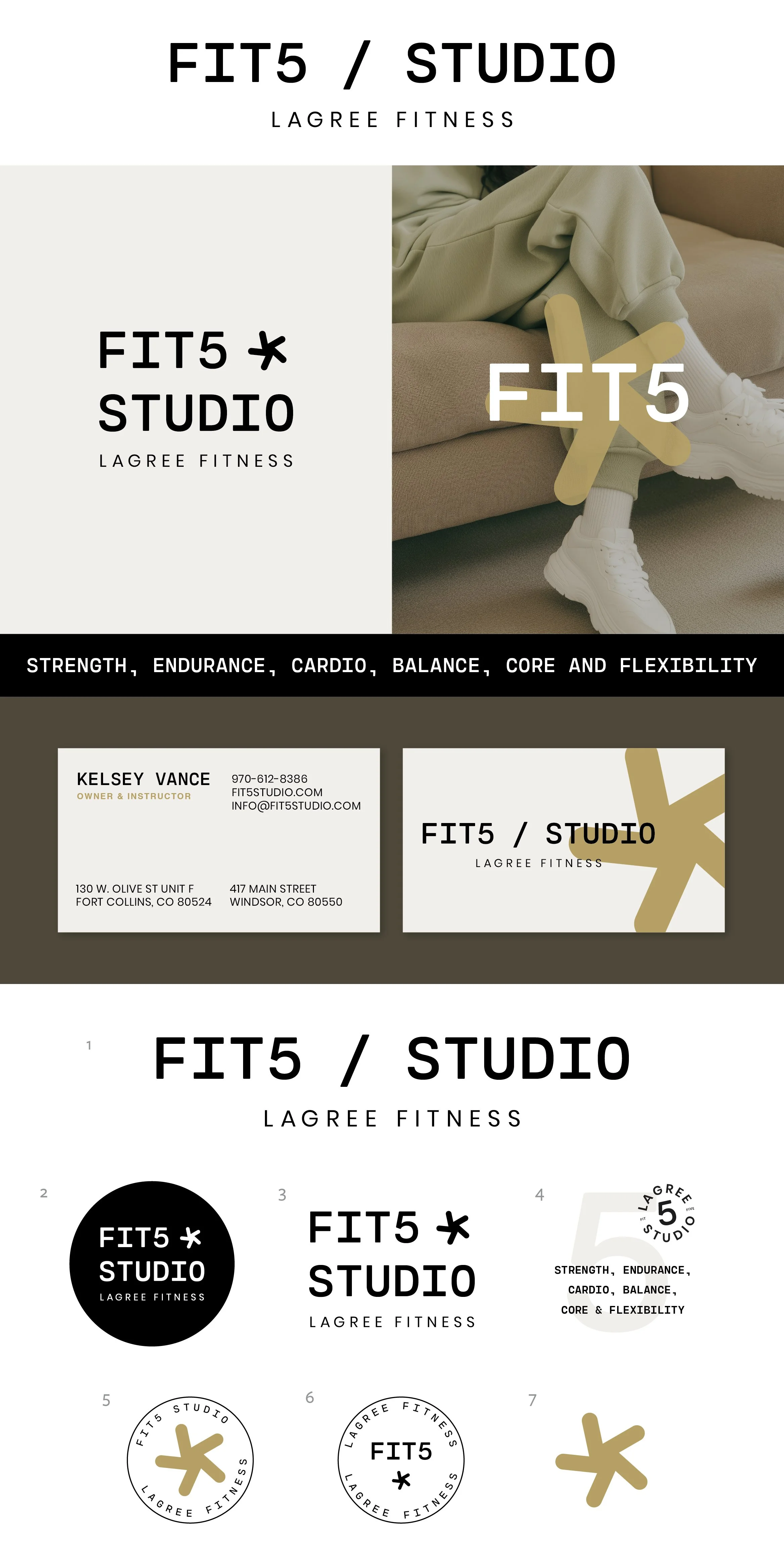
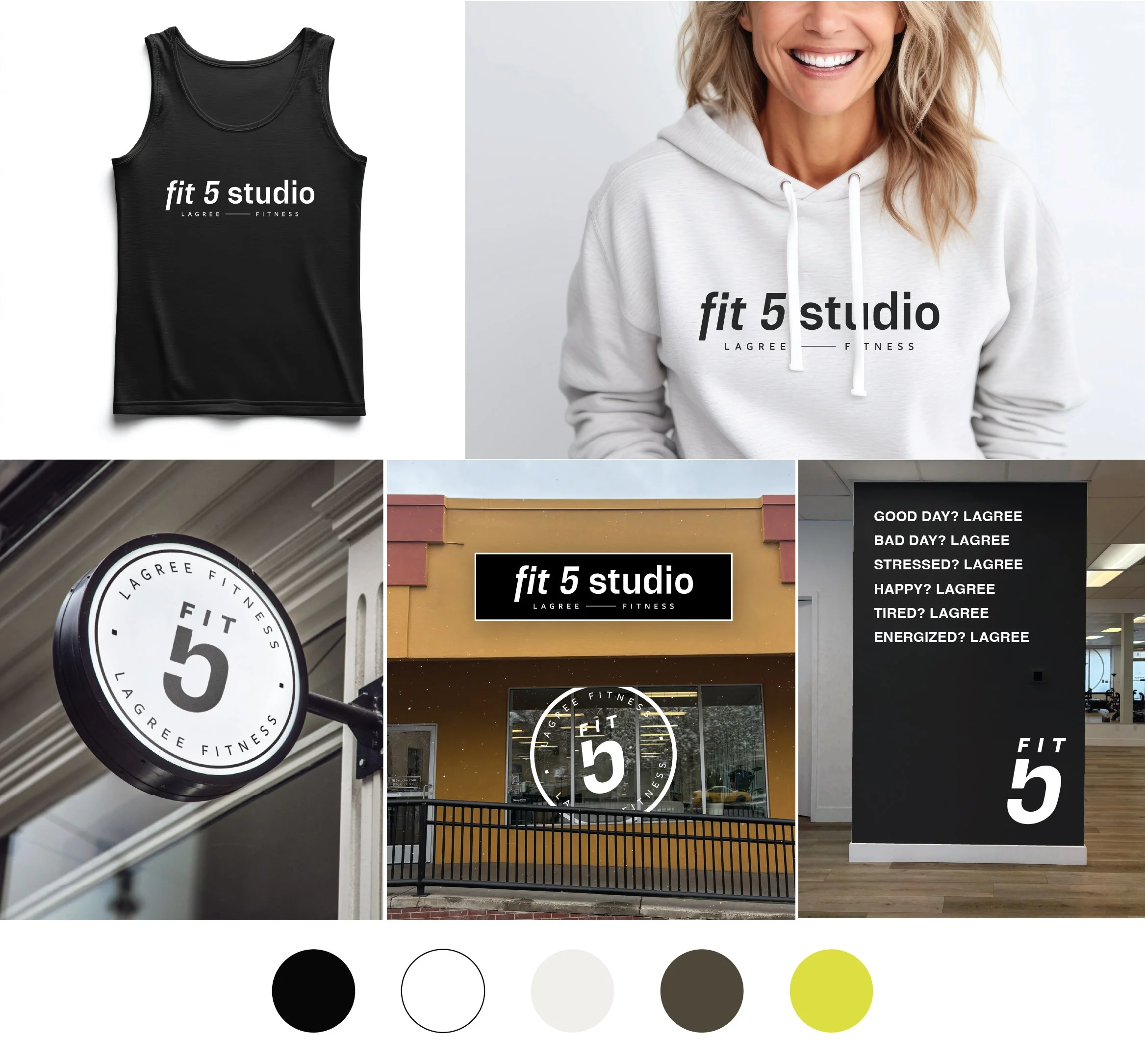
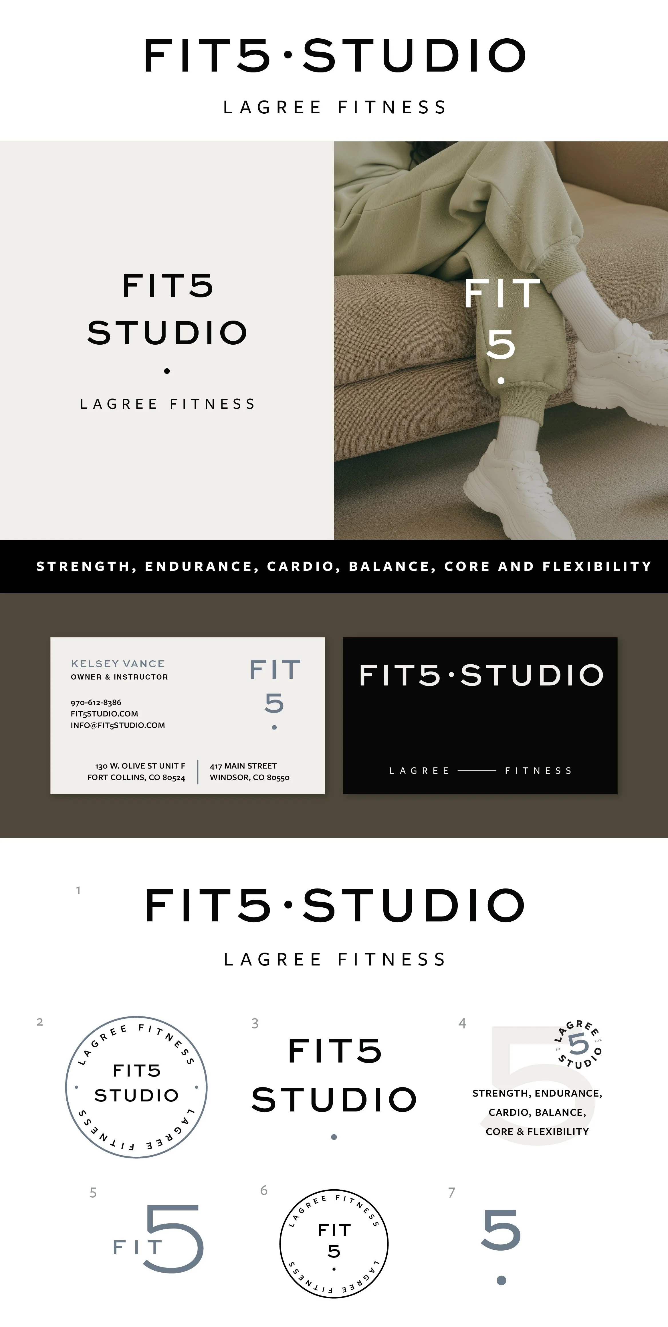
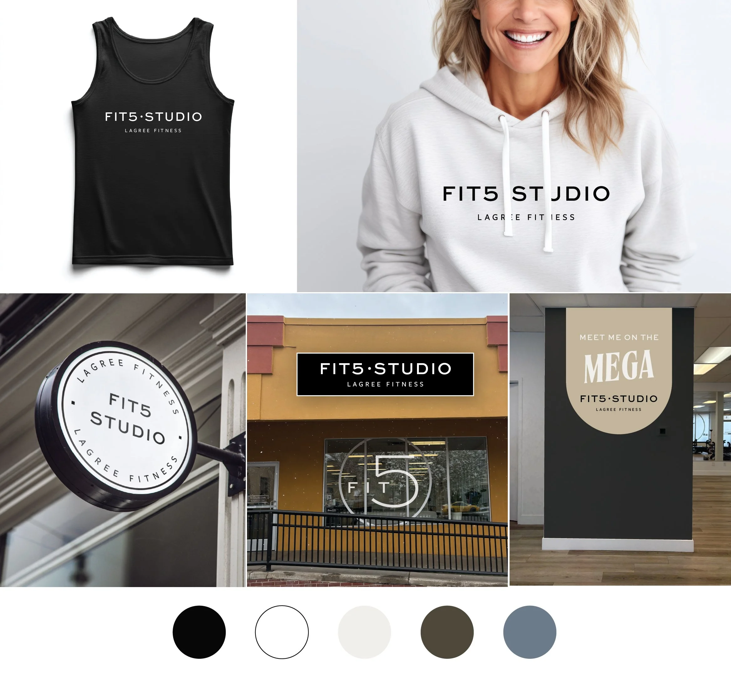
Fit5 Studio
Below each of the three concepts shows the
Primary Logo
Monogram Mark
Alternative Logo
Horizontal Extended Logo
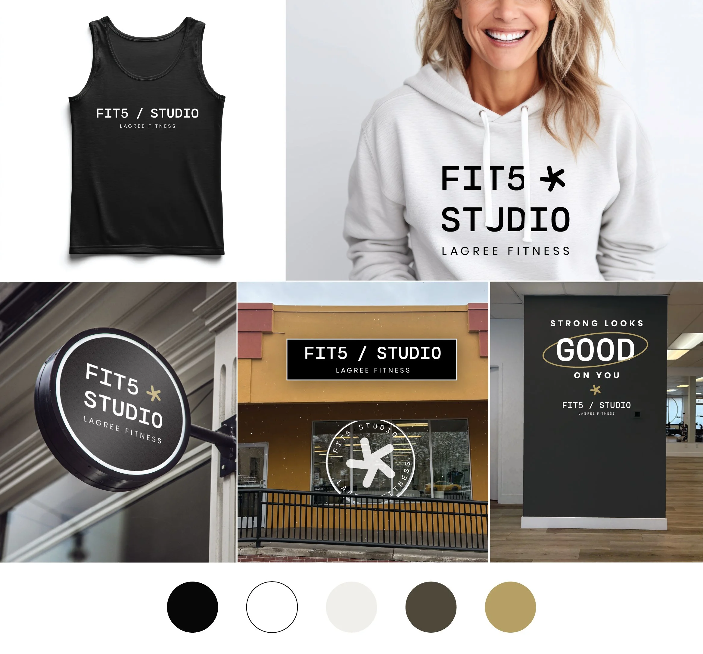
Photo Overlays
Business Card Mockup
Logo Suite
Note
While each of these designs are meant to show a developed idea of each concept, each will be refined and the chosen concept will be carefully considered and added to until the brand is the strongest representation it can be.
Business card concepts and the homepage mockup are meant to show how the brand can progress beyond the logo alone and will be refined along with the logo. Additionally, the information shown is placeholder information.
Moodboard

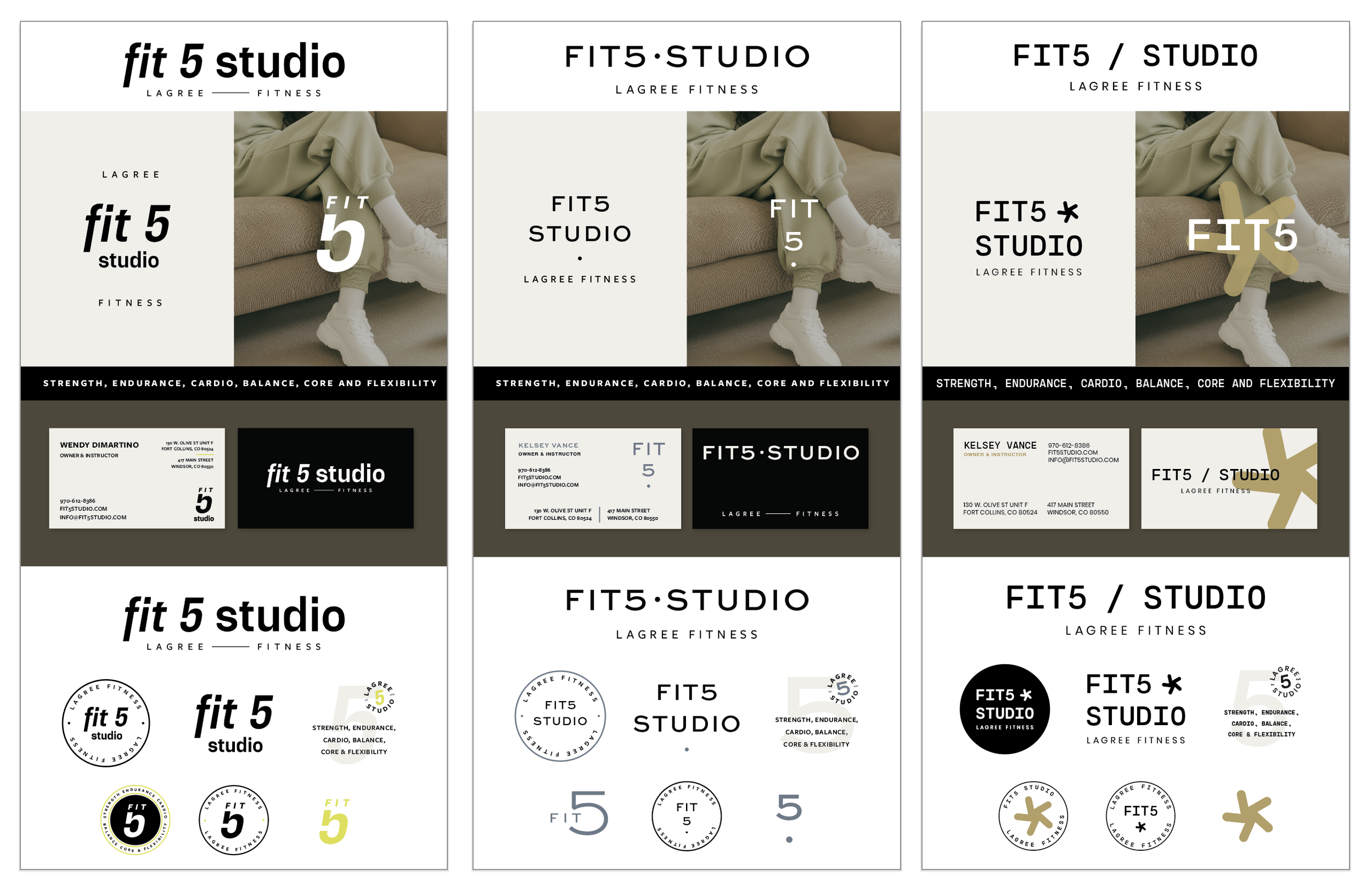
Revisions 2
Revisions
Concept R1
Concept R2

Concept R3
Initial Concepts
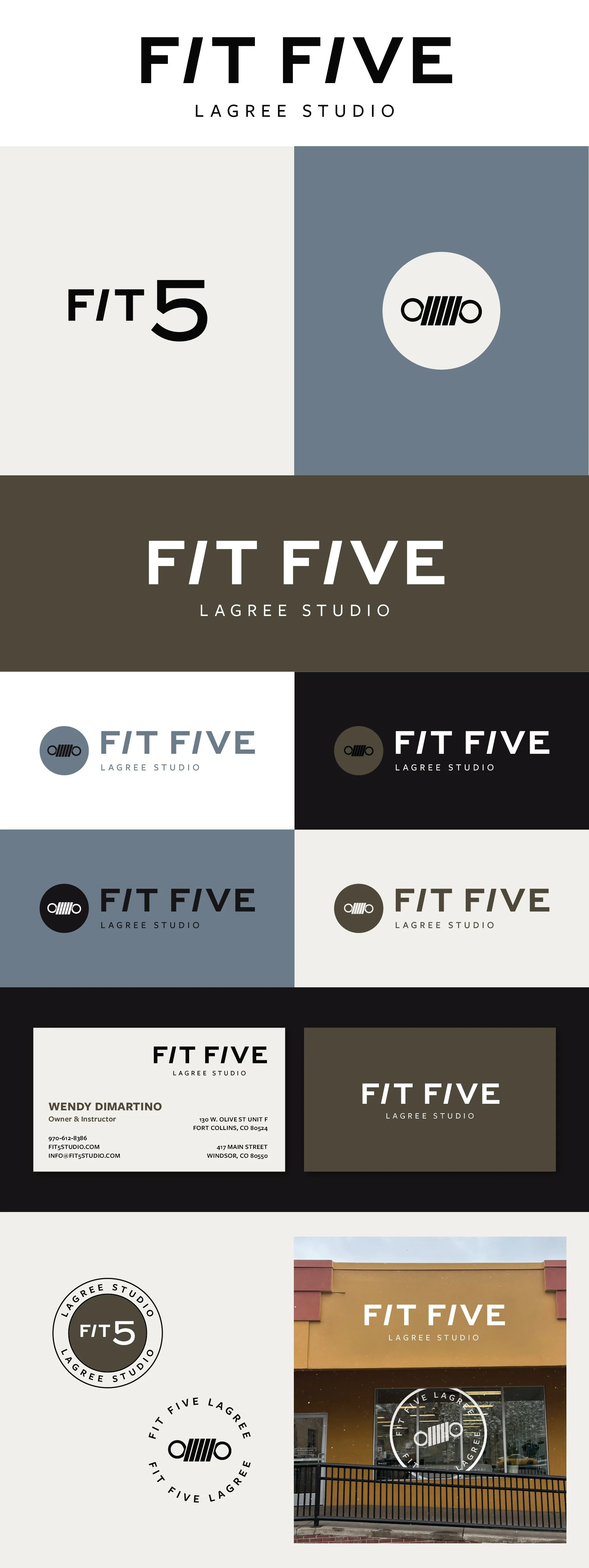
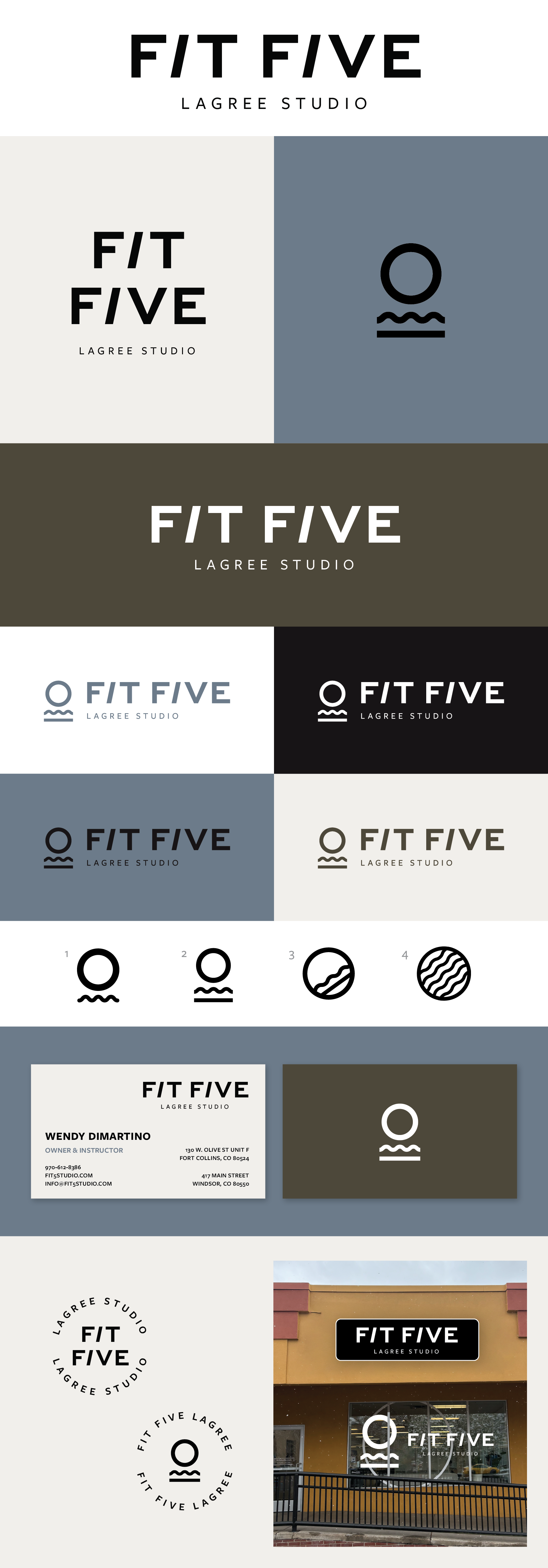
Concept 1
Bold, athletic, broad appeal
This concept feels like the most traditionally “athletic”. It’s bold and the italic letters bring in the idea of movement and momentum. The line between Lagree and Fitness could be incorporated elsewhere in your branding and it works well to imply balance or the platform of the megaformer.
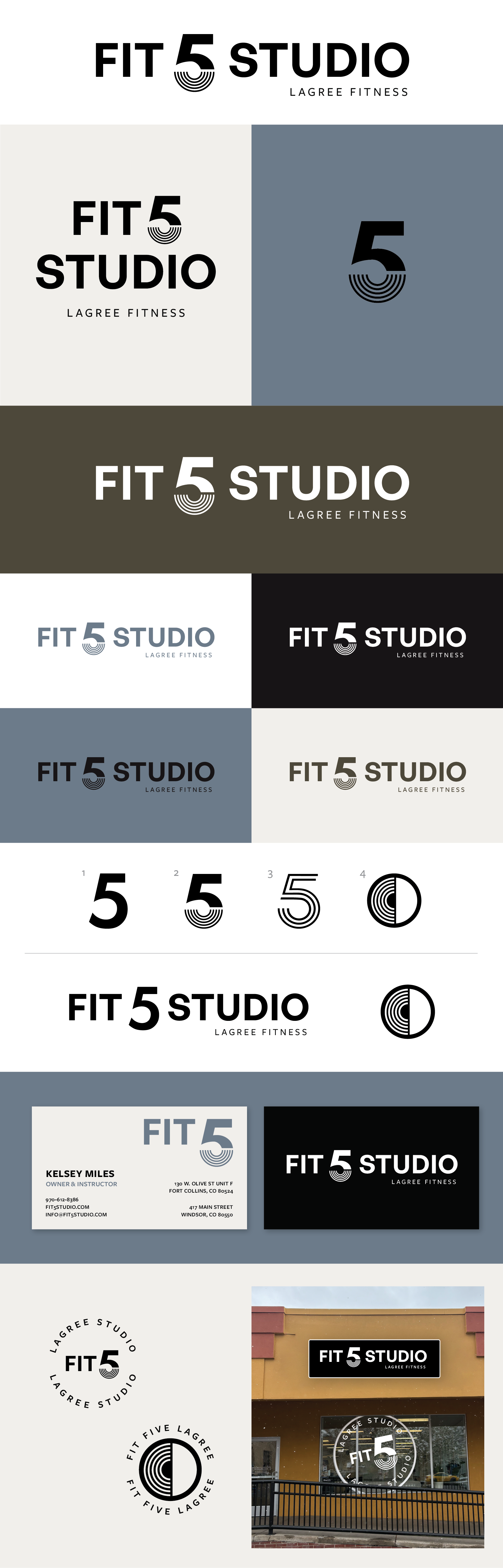
Concept 2
Chic, refined, boutique fitness, slightly more geared toward a feminine audience with a more spa-like quality
This version is softer and understated in a way that reads as really elevated. This feels like a more luxe approach but also slightly lean to a more feminine style, but I don’t think it is strong enough to exclude a male audience.
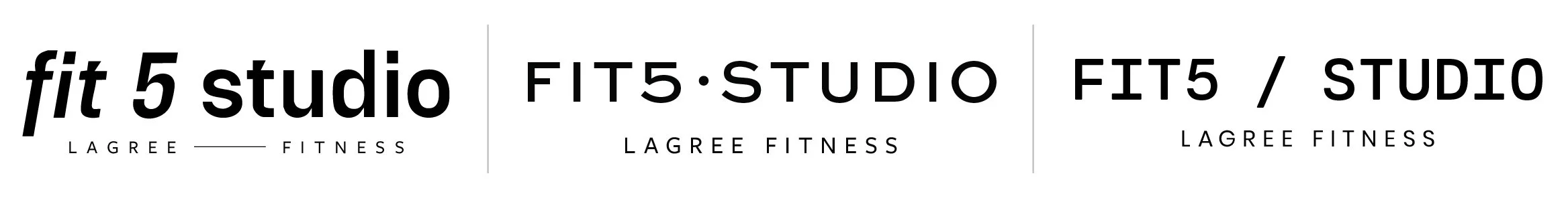
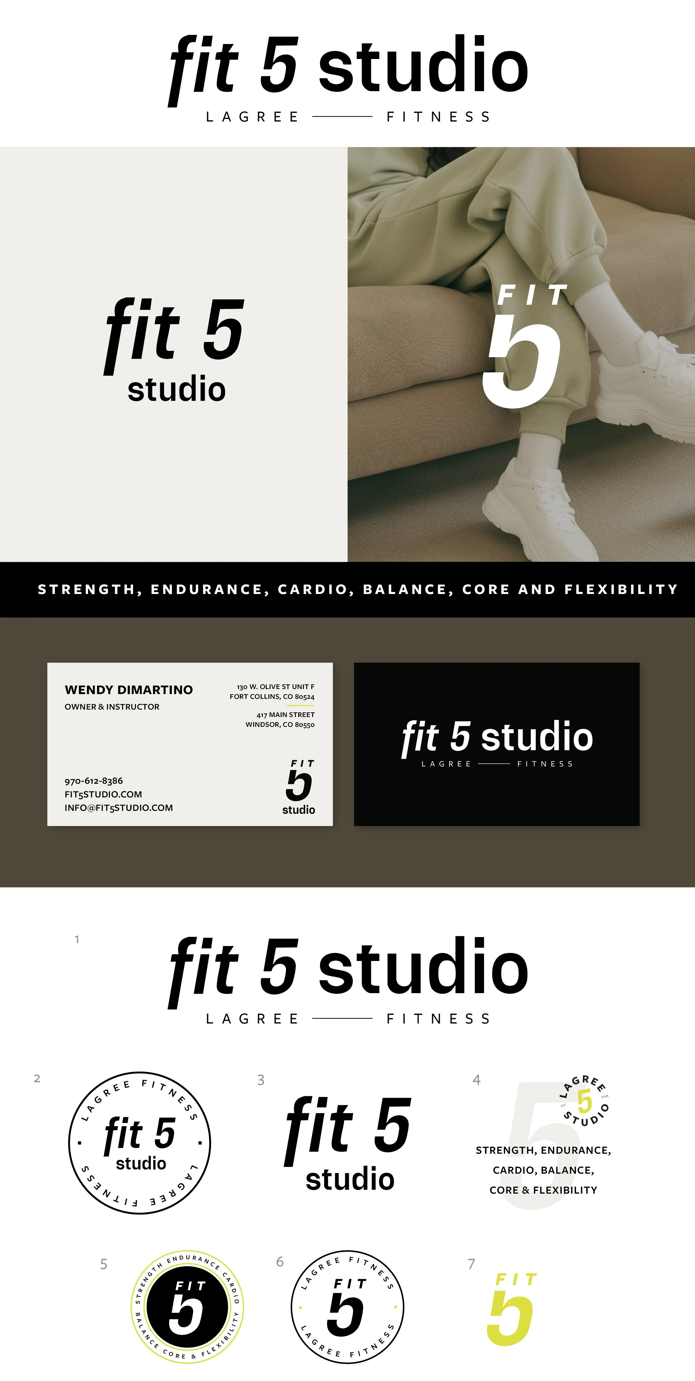
Concept 3
Chic, minimal, effortlessly cool
I wanted to try one version that had an actual logo mark, but something pretty minimal that you can use as much or as little as you want. This 5-pointed mark is a subtle nod to the 5 benchmarks of Fit5. It also feels very dynamic and has implied movement. This version has a contemporary, cool appeal. It strikes a balance between feeling cool and appealing to a chic audience but is minimal and modern enough to capture a large crowd.