Easy Day Dental
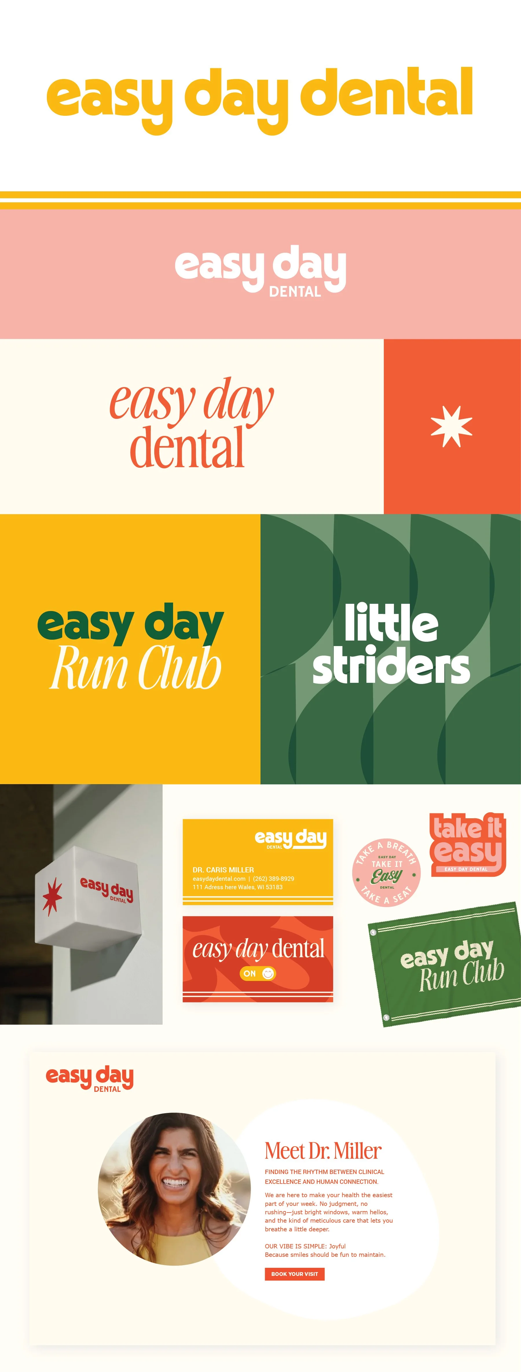
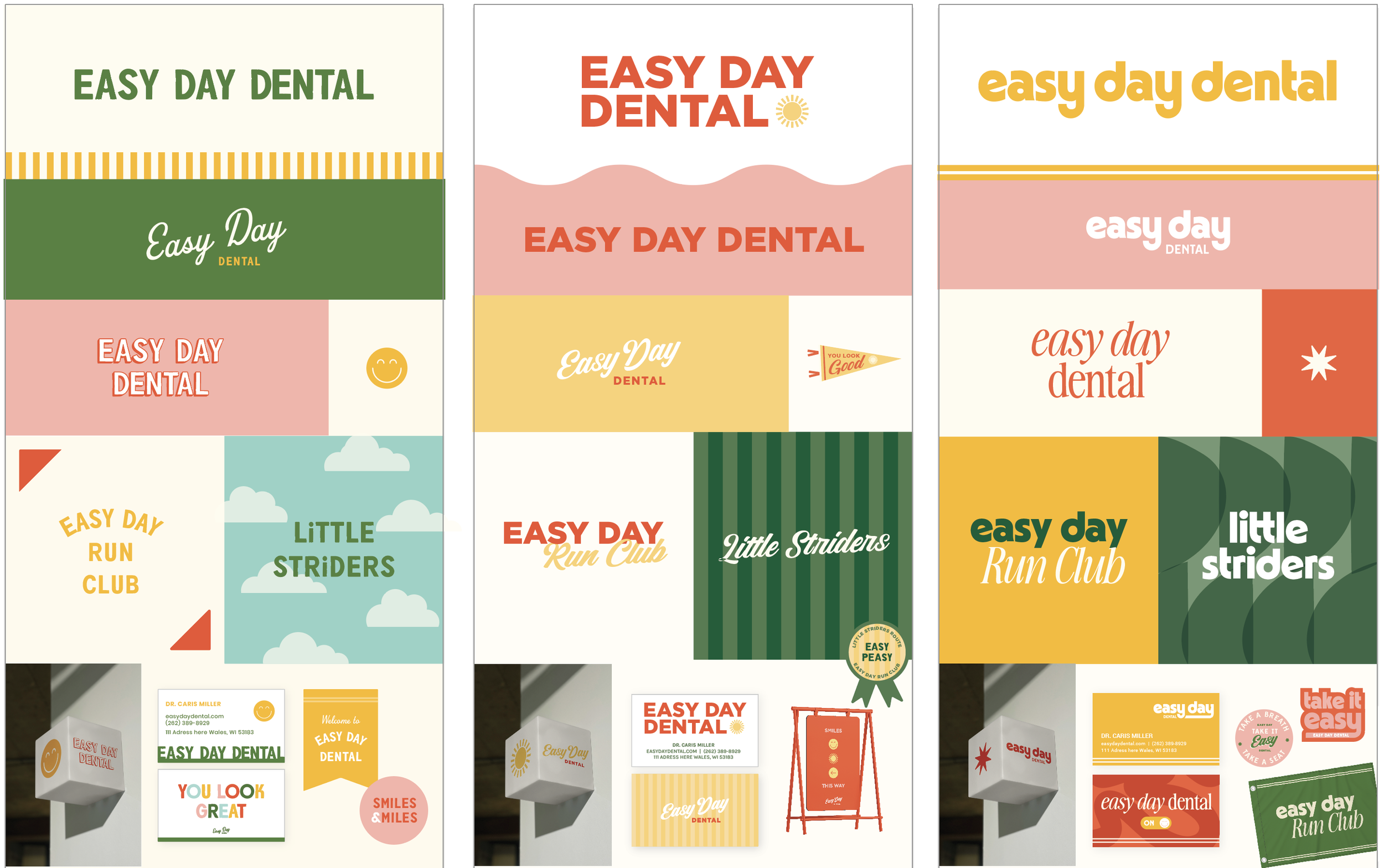
Below each of the three concepts shows the
Primary, Horizontal Logo
Vertical Logo
Monogram Mark
Horizontal Extended Logo
Business Card Mockup
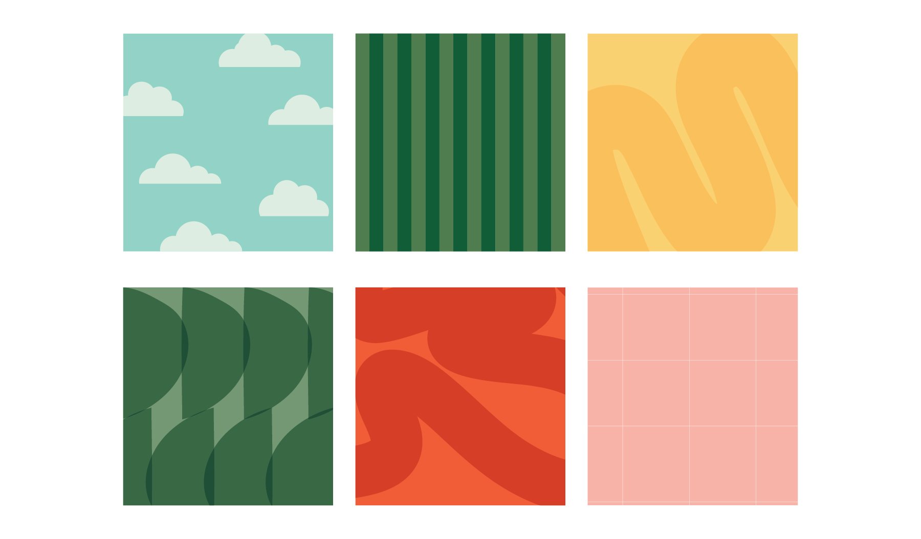
Photo Overlays
Logo Suite
Note
While each of these designs are meant to show a developed idea of each concept, each will be refined and the chosen concept will be carefully considered and added to until the brand is the strongest representation it can be.
Business card concepts and the homepage mockup are meant to show how the brand can progress beyond the logo alone and will be refined along with the logo. Additionally, the information shown is placeholder information.
Moodboard
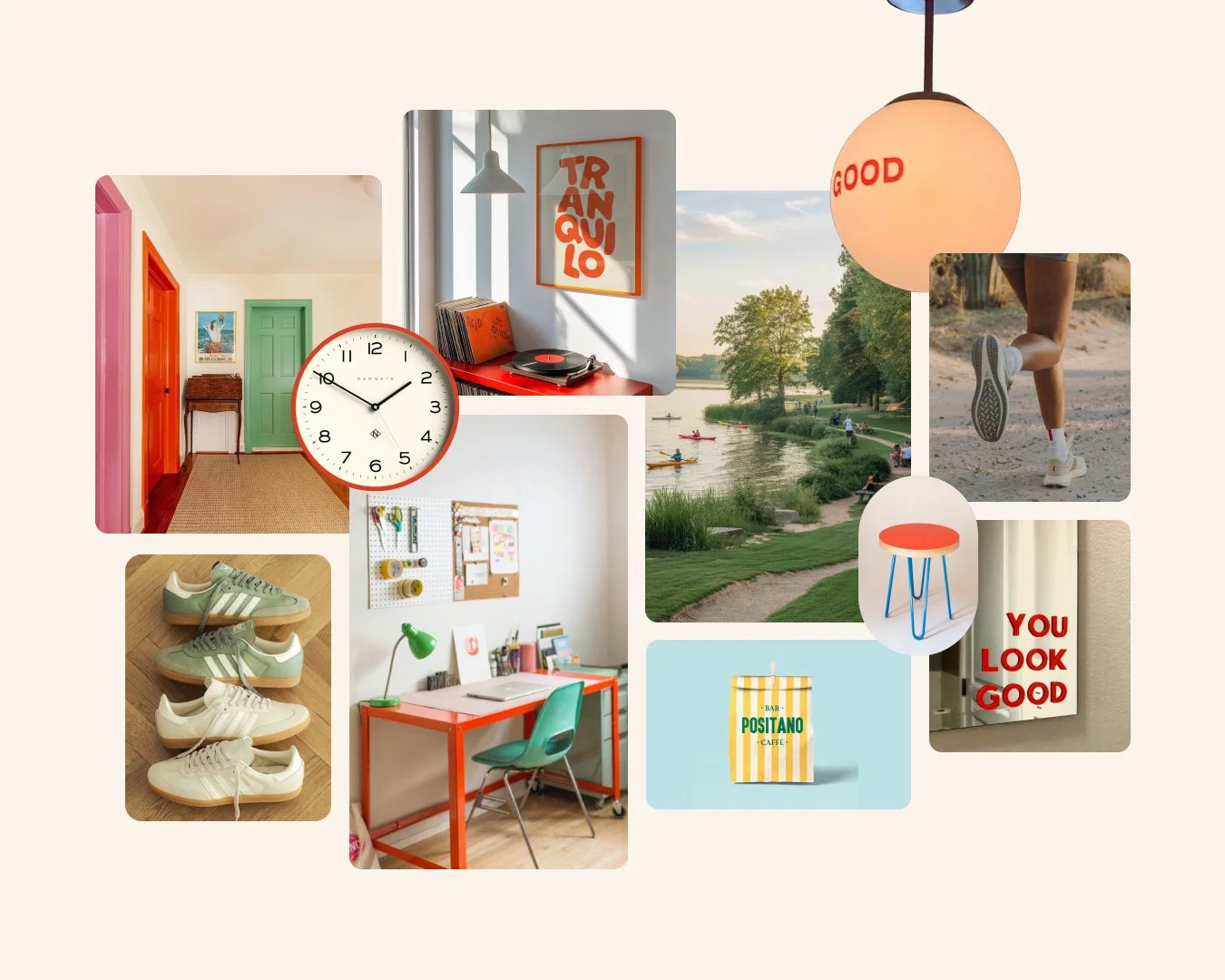
Inviting & Homey, Comfortable, Family-oriented, Small town, Good medicine, Current
Initial Concepts

Concept 1
This concept has a playful, vintage quality. The font draws inspiration from classic sign painting, with simple yet inviting letterforms that create a “friendly neighborhood staple” feel.
I customized the crossbar on the “A” with the subtlest hint of a smile—just enough to soften the overall look and introduce a touch of warmth without being overt.
Because the logo font is so distinct and versatile, it can carry across other brand elements seamlessly. The script variation adds flexibility, offering a nice contrast and working especially well in secondary applications, like the back of a business card.
Concept 2
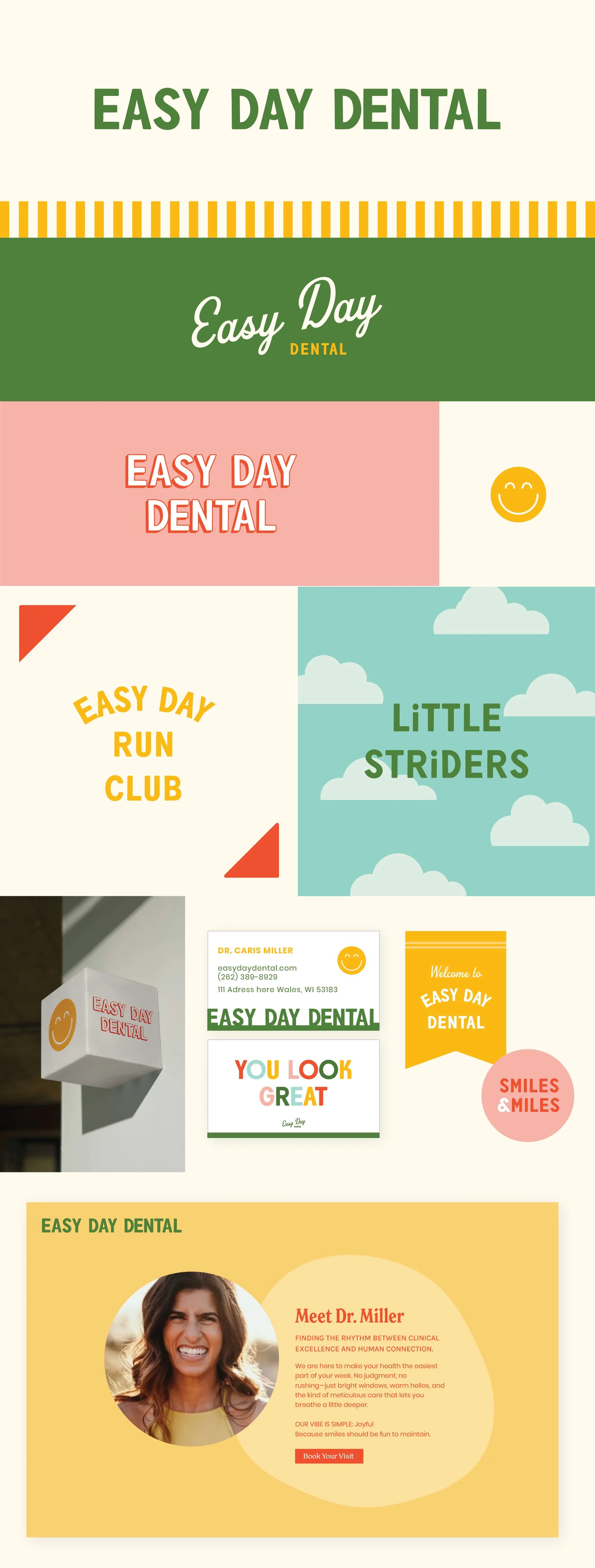
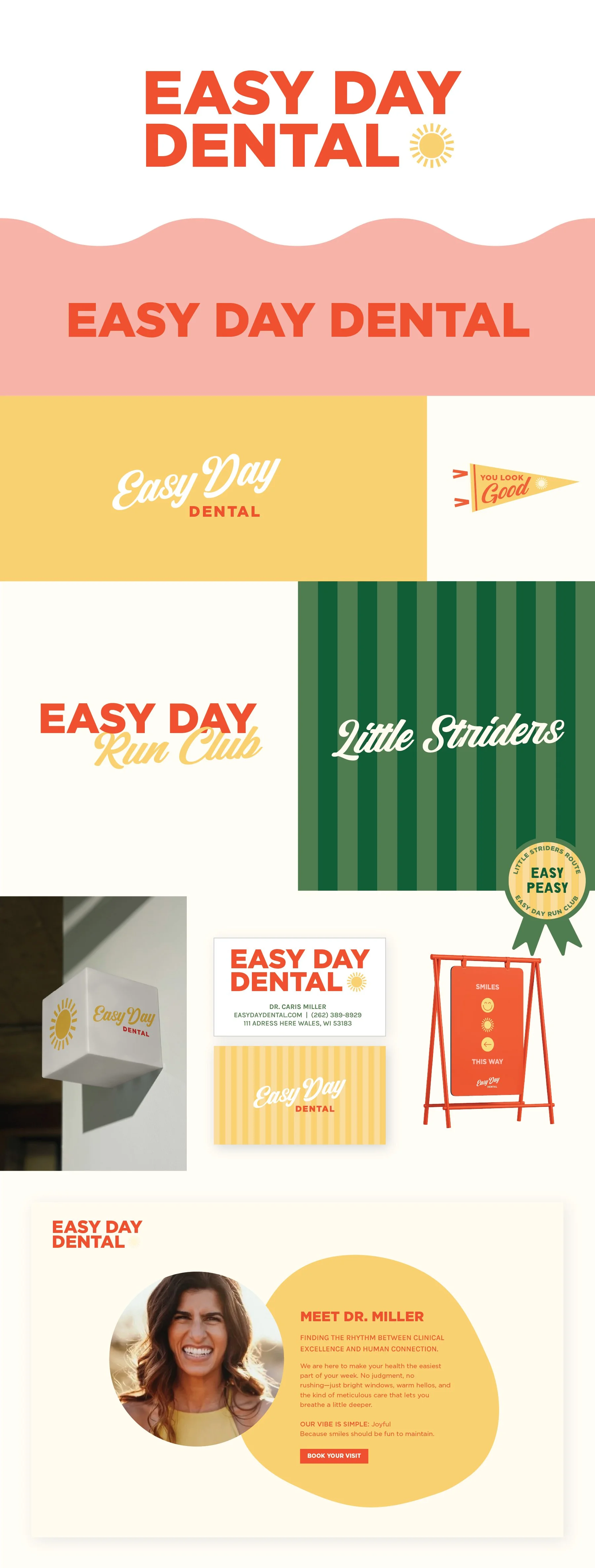
This concept is bold, versatile, and confident. It has the kind of effortless flexibility you see in brands like Field Notes—simple at its core, but able to adapt to a wide range of styles and environments.
It creates a strong foundation, allowing you to layer in personality elsewhere, whether that’s through interiors, artwork, or additional brand elements, without ever feeling disconnected.
The mark is intentionally noticeable and unapologetically bold. The script introduces a fun, unexpected softness, and extends naturally into additional applications like sub-brands (e.g., Run Club).
Concept 3
This concept carries a confident boldness that feels like a genuinely happy place to land. It opens the door for impactful signage and expressive typography across the entire brand experience.
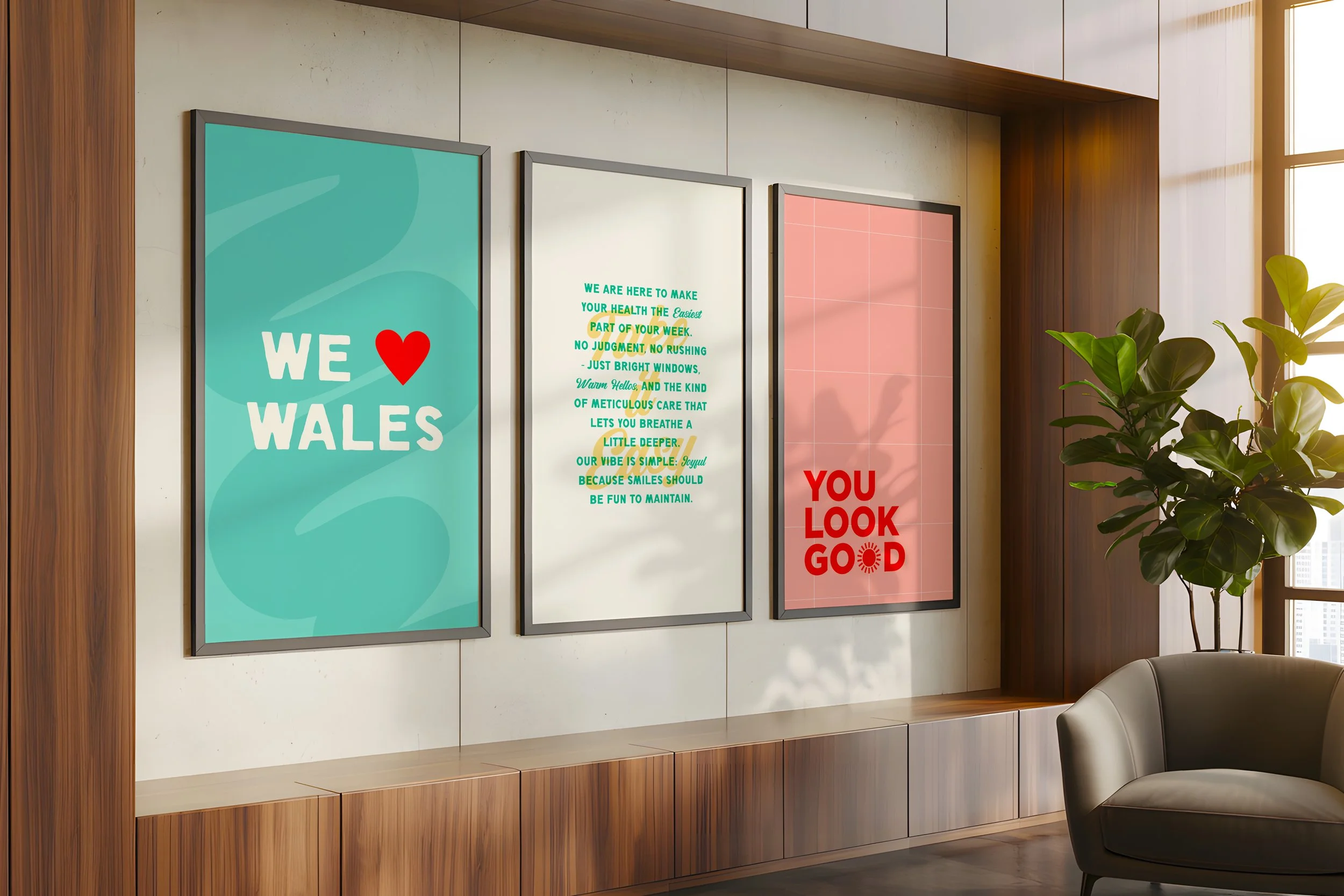
The direction leans into a graphic, high-contrast style, where pops of color throughout the space would feel natural and cohesive.
The font pairing adds an unexpected twist, elevating the concept beyond a purely retro look and giving it a more modern, intentional edge.