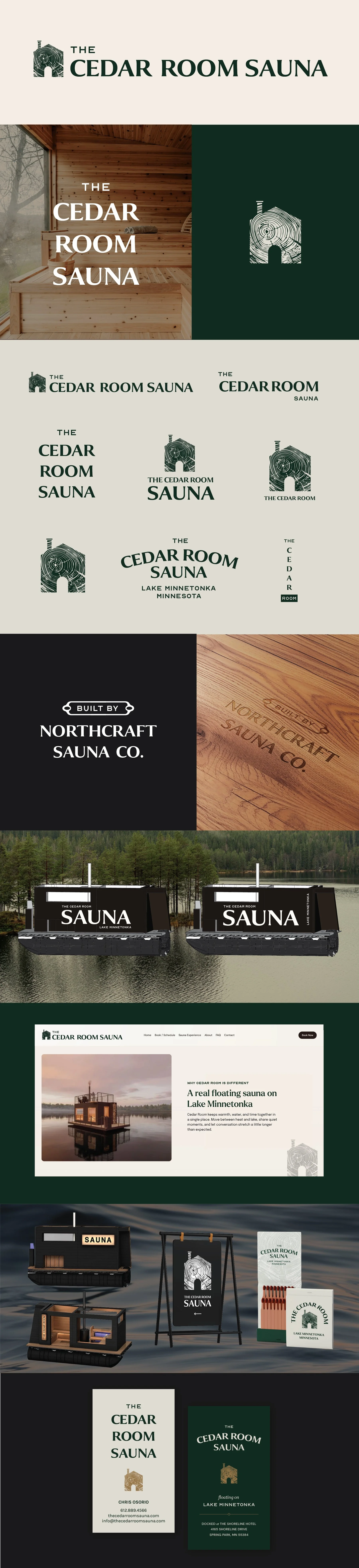
The Cedar Room Sauna
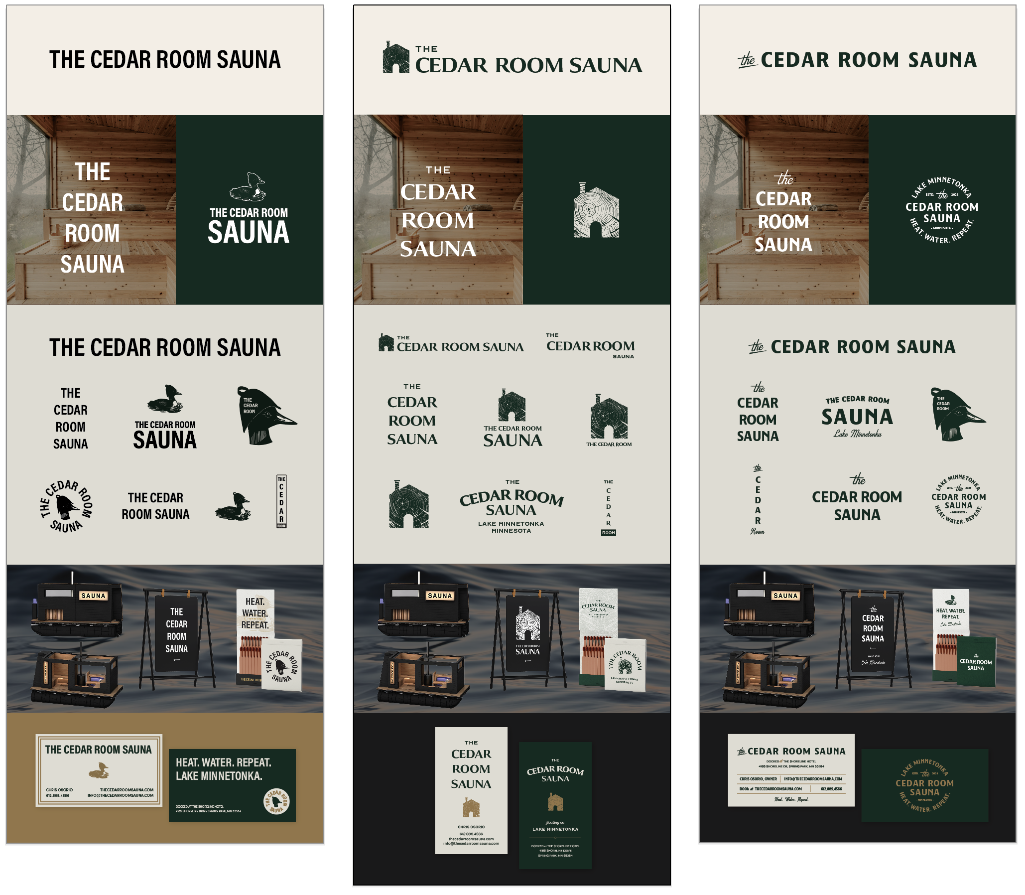
Below each of the three concepts shows the
Primary, Horizontal Logo
Vertical Logo
Monogram Mark
Horizontal Extended Logo
Business Card Mockup
Photo Overlays
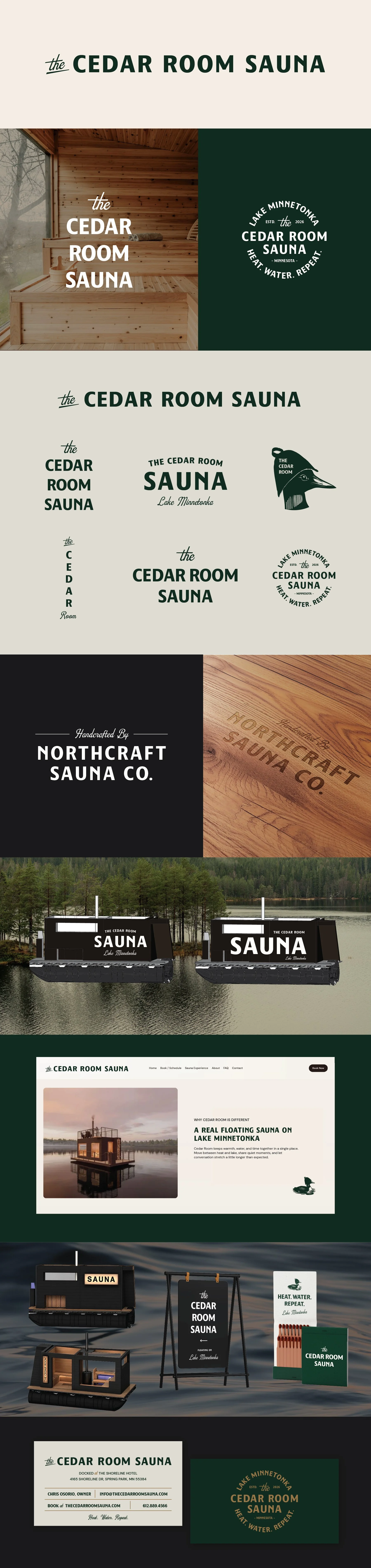
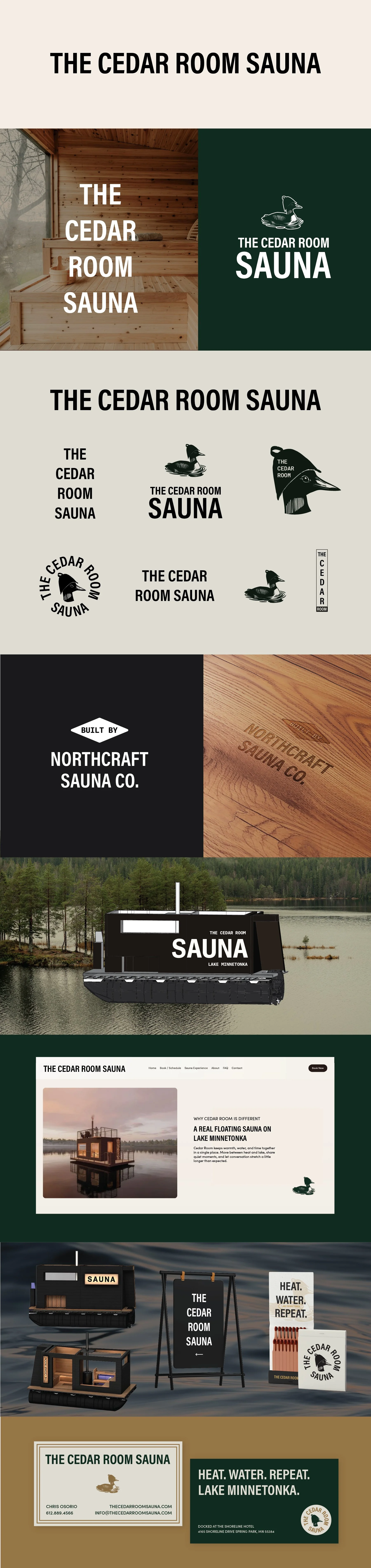
Logo Suite
Note
While each of these designs are meant to show a developed idea of each concept, each will be refined and the chosen concept will be carefully considered and added to until the brand is the strongest representation it can be.
Business card concepts and the homepage mockup are meant to show how the brand can progress beyond the logo alone and will be refined along with the logo. Additionally, the information shown is placeholder information.
Moodboard
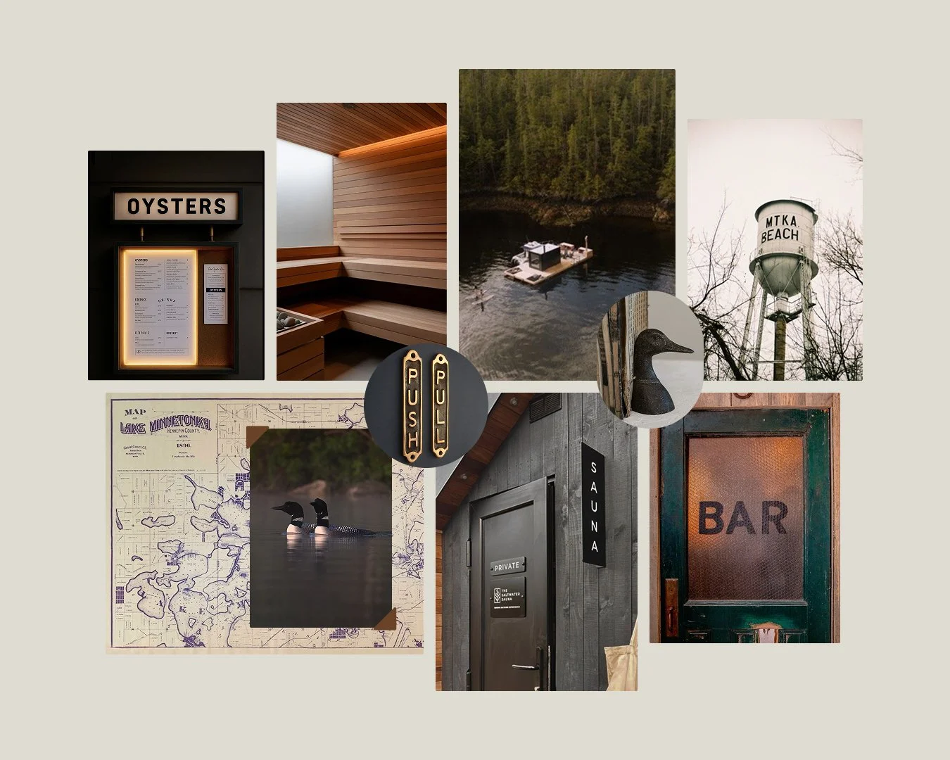
Inviting & Homey, Comfortable, Family-oriented, Small town, Good medicine, Current
Concept 1
Clean, bold, and built to last. This concept leans into simplicity as a strength. There's nothing extra here, and that is the whole point of the direction. It has a utilitarian confidence to it that feels timeless rather than trendy. The loon functions as a mascot of sorts, adding visual interest and versatility without complicating the mark. Of the three directions, this one has the most masculine lean.
Concept 2
This direction has a more traditional, established feeling to it. The text feels more traditional, with a wellness + cabin-quality combination.
The sauna icon takes a somewhat literal interpretation but reads as warm, organic, and inviting without feeling like it's trying too hard.
Concept 3
A close relative of Concept 1, but with a bit more history worked into it. The edges are softer, the feeling is more storied — like there's a community and a whole lot of good seasons behind it. A script font is introduced sparingly, used more as a visual accent than a headline, and it balances well against the cleaner primary type. This is largely a text-forward mark, with iconography like the loon or cedar structure playing a supporting role rather than anchoring the design.