Brighter
Summary
Brighter is a psilocybin coaching company with the goal of shining a light on what mushrooms can do for us.
Current customers experience a brighter outlook on life, so the branding needs to help destigmatize and educate new audiences and encourage existing audiences to view mushrooms as a tool to optimize their experiences.
The brand goal is to create a logo with a direct reference to mushrooms and maintain a sophisticated, non-cliche approach to the style as a whole.
**The taglines are placeholder info and can be updated in revision rounds.
Tagline ideas “Brighter outlook on life”
Below each of the three concepts shows the
Primary, Vertical Logo
Initial/Logo Mark
Alternate Logo Composition
Business Card Mockup
Photo Overlay
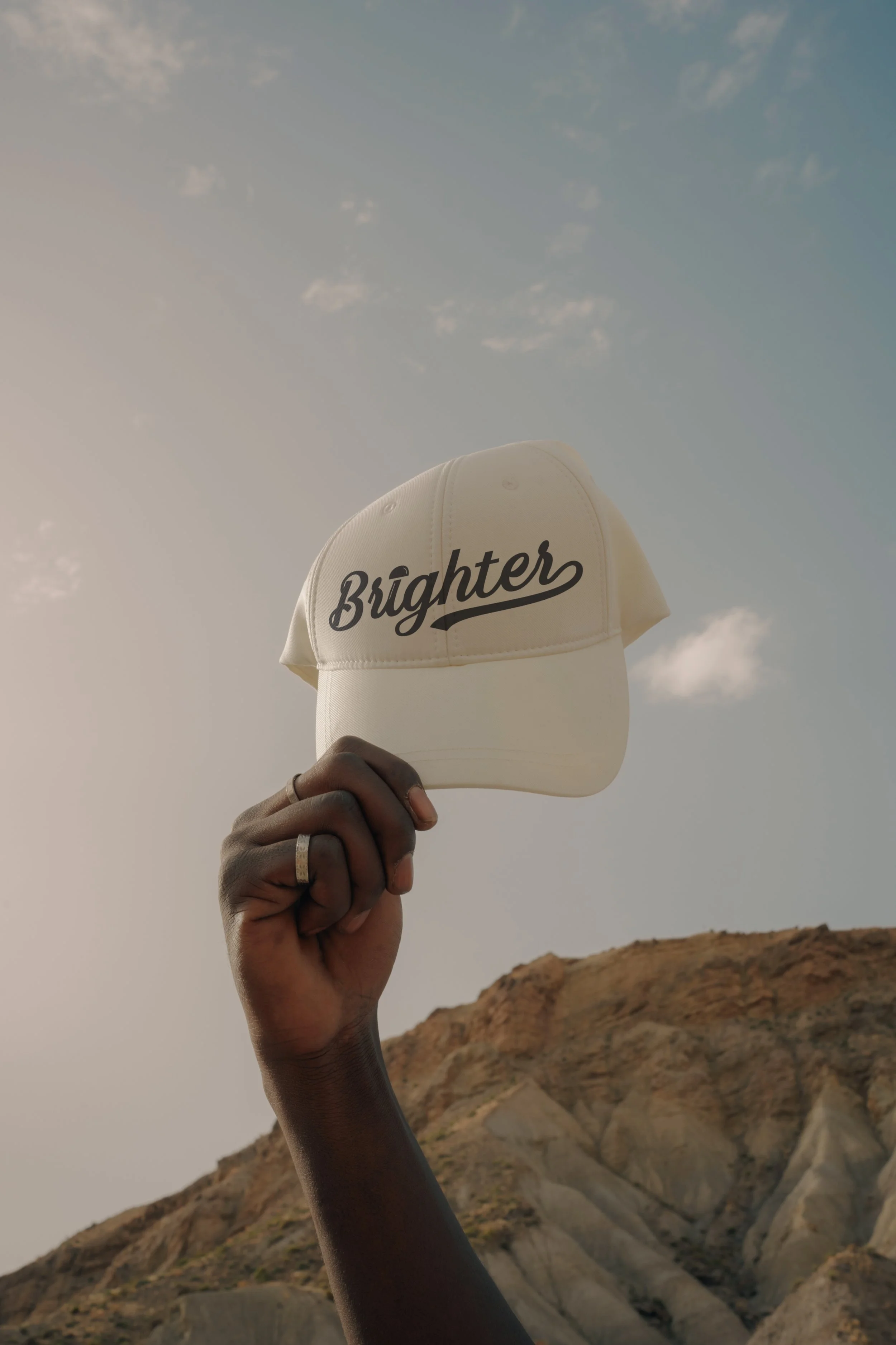
Shopping Bag Mockup
Logo Suite
Note
While each of these designs are meant to show a developed idea of each concept, each will be refined and the chosen concept will be carefully considered and added to until the brand is the strongest representation it can be.
Business card concepts and the homepage mockup are meant to show how the brand can progress beyond the logo alone and will be refined along with the logo. Additionally, the information shown is placeholder information.
Initial Concepts
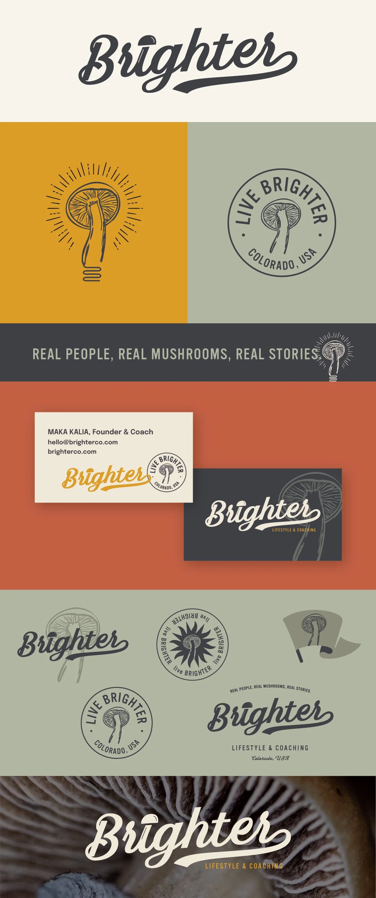
Concept 1
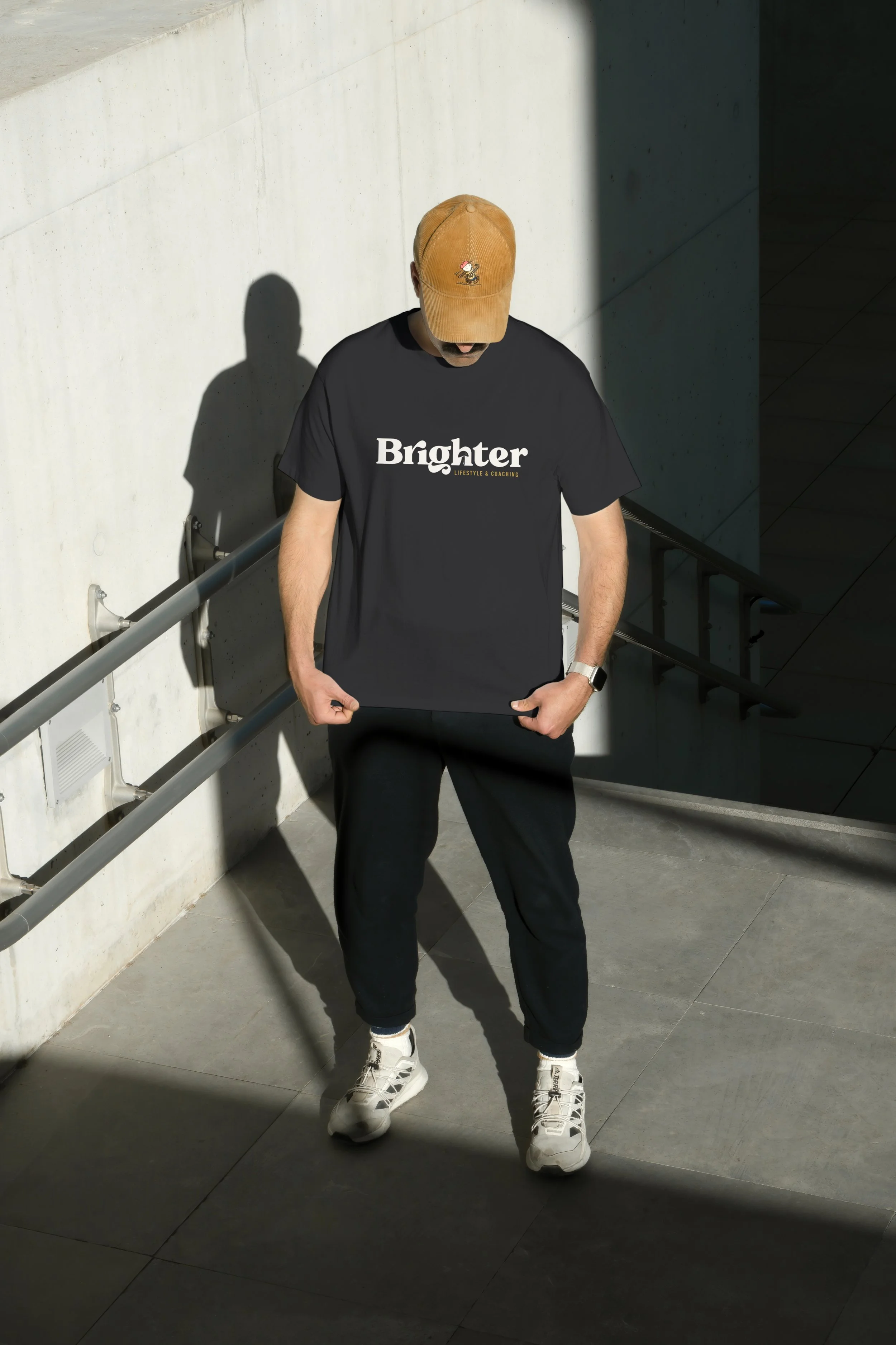
The stone suit of this one is the pairing of something that is both truly direct and subtle. Once you see the mushroom in the negative space of the h, the is no mistaking what it is, but it also doesn’t feel like it’s in your face at all.
The font is playful and inviting with a nostalgic feeling that doesn’t come across as cheesy or 70s cliche.
I imagine the main mushroom logo to be the one in the lower case h, but this logo is clean enough that the brand as a whole could have more detailed, hand-drawn elements incorporated as well.
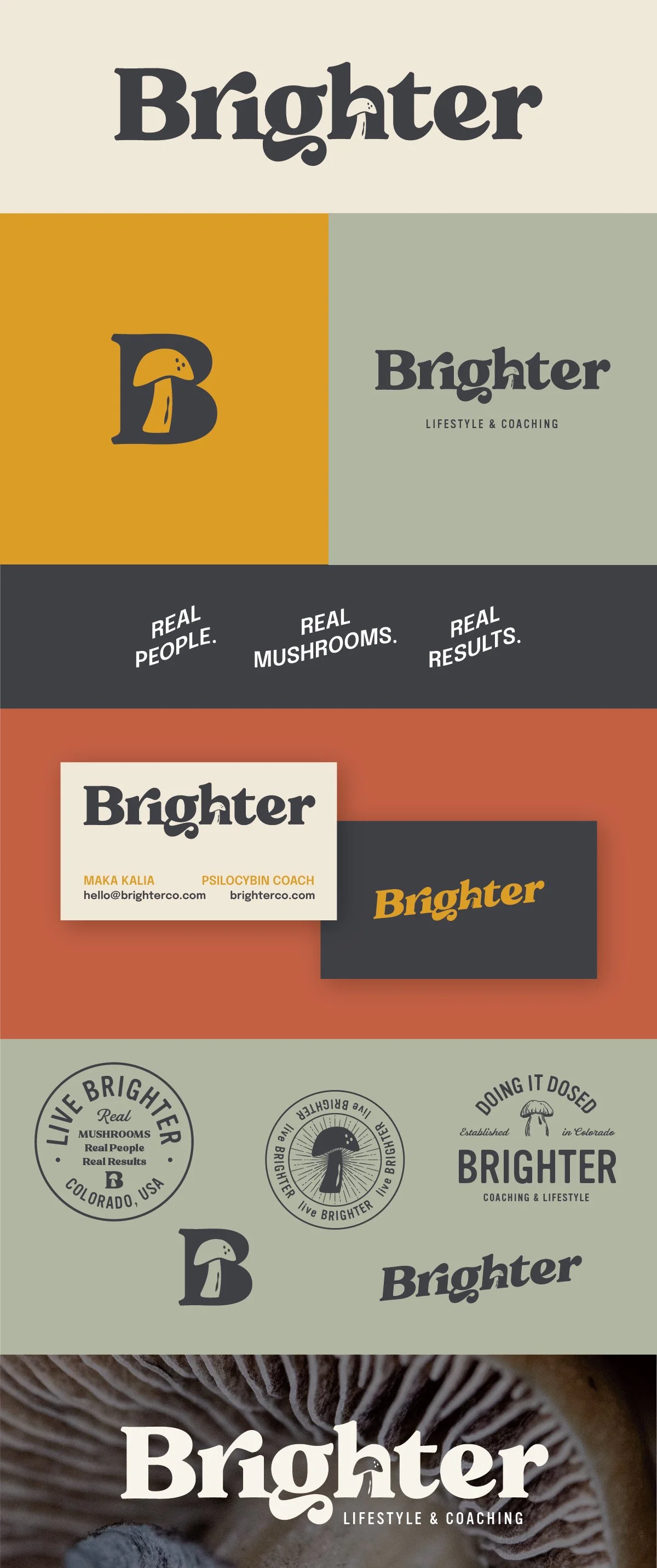


Concept 2
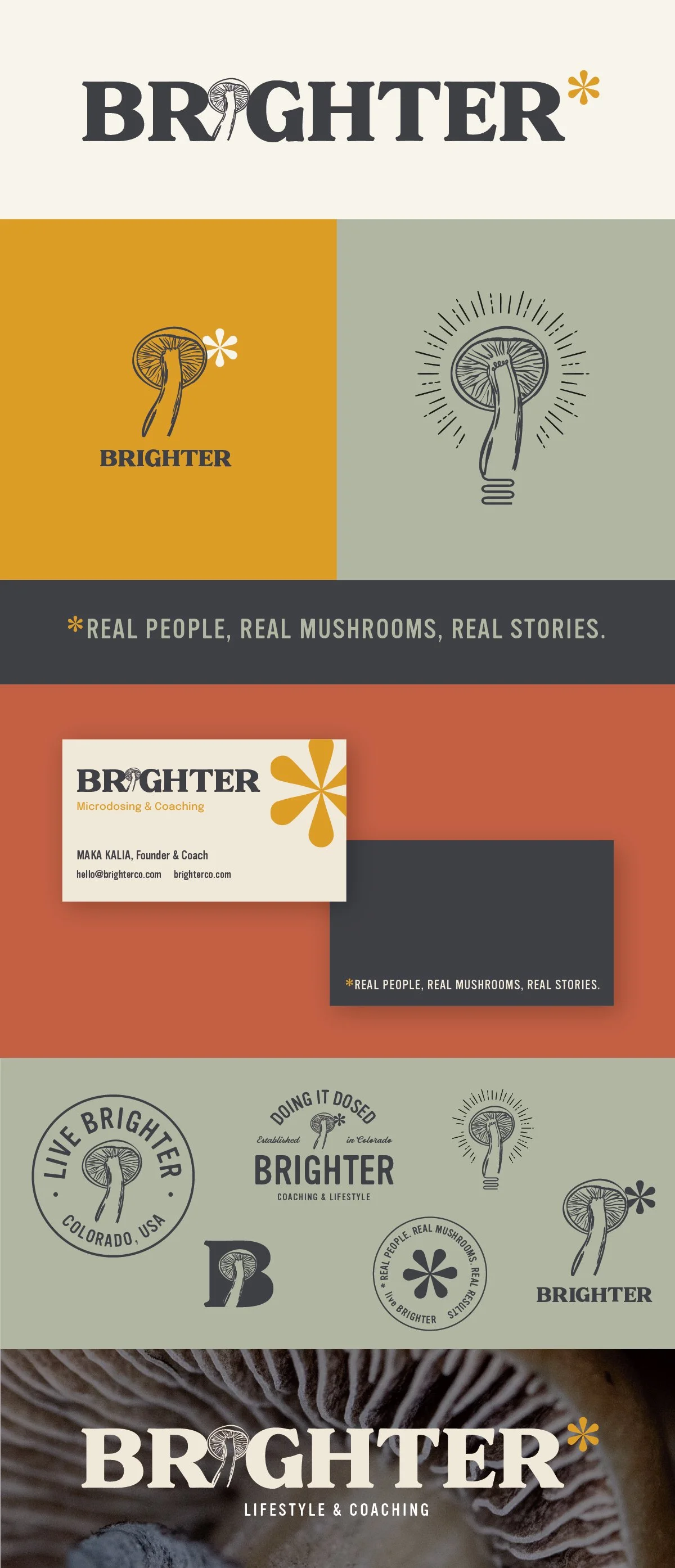
This is the most detailed and artistic of the three concepts, but the other elements are clean and minimal enough to feel really balanced. One of the strong suits of this concept is having a few different elements you can focus on with the mushroom and the asterisk. I liked the idea of the asterisk functioning like a bright spot/sun and being able to pull it into a tagline or other text to pair the name with a function.
The mushroom and * can be used together or apart which creates a lot of versatility within the brand and a lot of opportunity for apparel and packaging from these base elements.
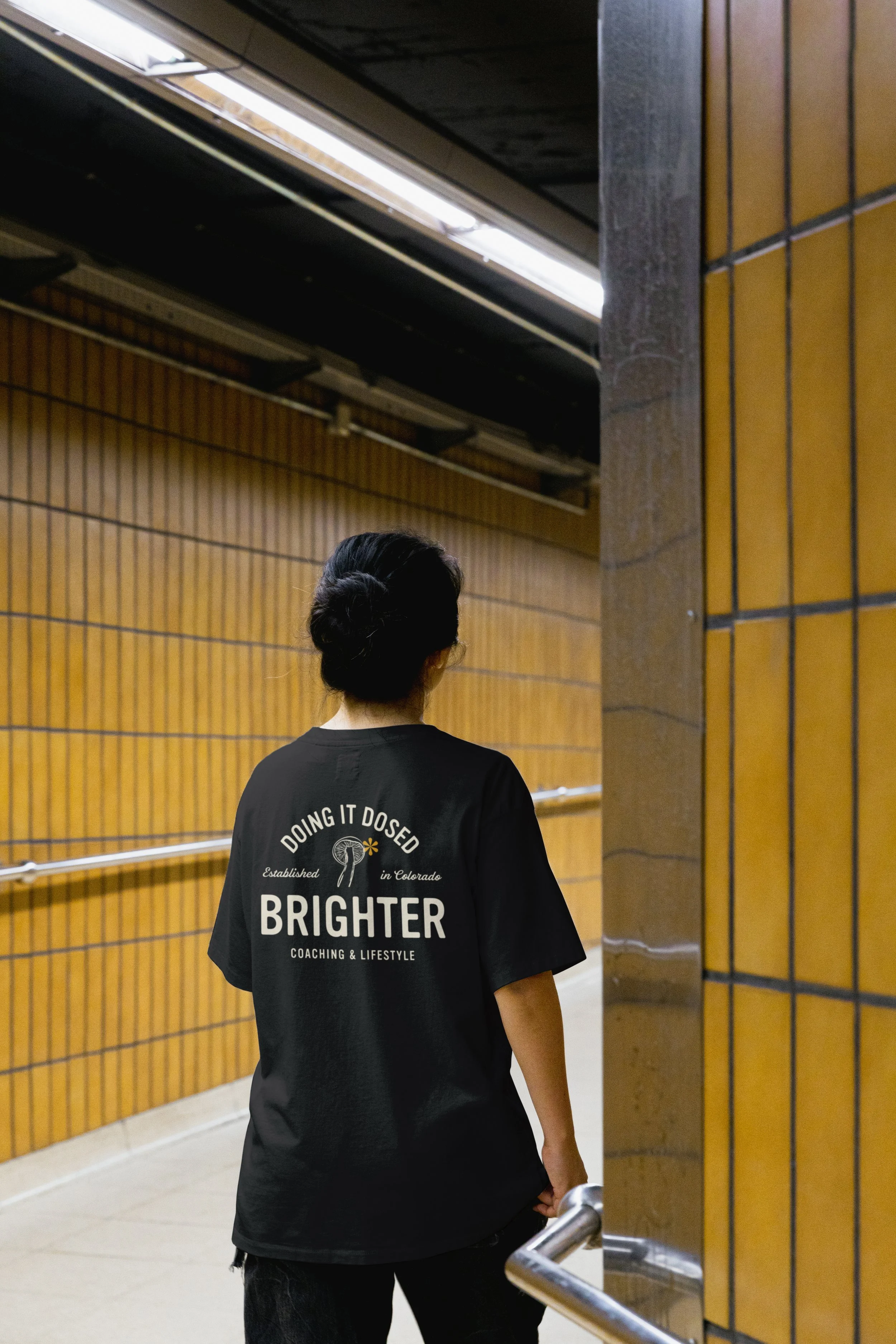

Concept 3
This concept harnesses a subtle, polished, modern-vintage style. I think the subtlety of this one could be a strong suit to bring in people in various stages of their openness to or enthusiasm about mushrooms.
Because the logo mark is so subtle, I do think there’s an opportunity here to incorporate more detailed depictions of mushrooms.
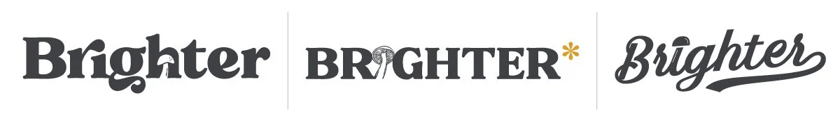
*Another idea with this one would be simplifying the text to have a traditional dot over the lower case “i” and using this as a secondary mark in Concept 2.