

Body Sense
Summary
Body Sense is about self-awareness, knowing how your body works, and learning to read its cues so that you can work with your body instead of against it on your path to healing and physical and emotional well-being.
Having Body Sense means you are knowledgeable about your unique anatomy, conscious of your movement and your internal cycles, and aware of your capabilities. You can make informed choices about when and how to move, when to rest, and how to keep doing the things you love.
Body Sense targets these goals in a number of ways, specifically specializing in Pilates, movement therapy, and menstrual cycle training.
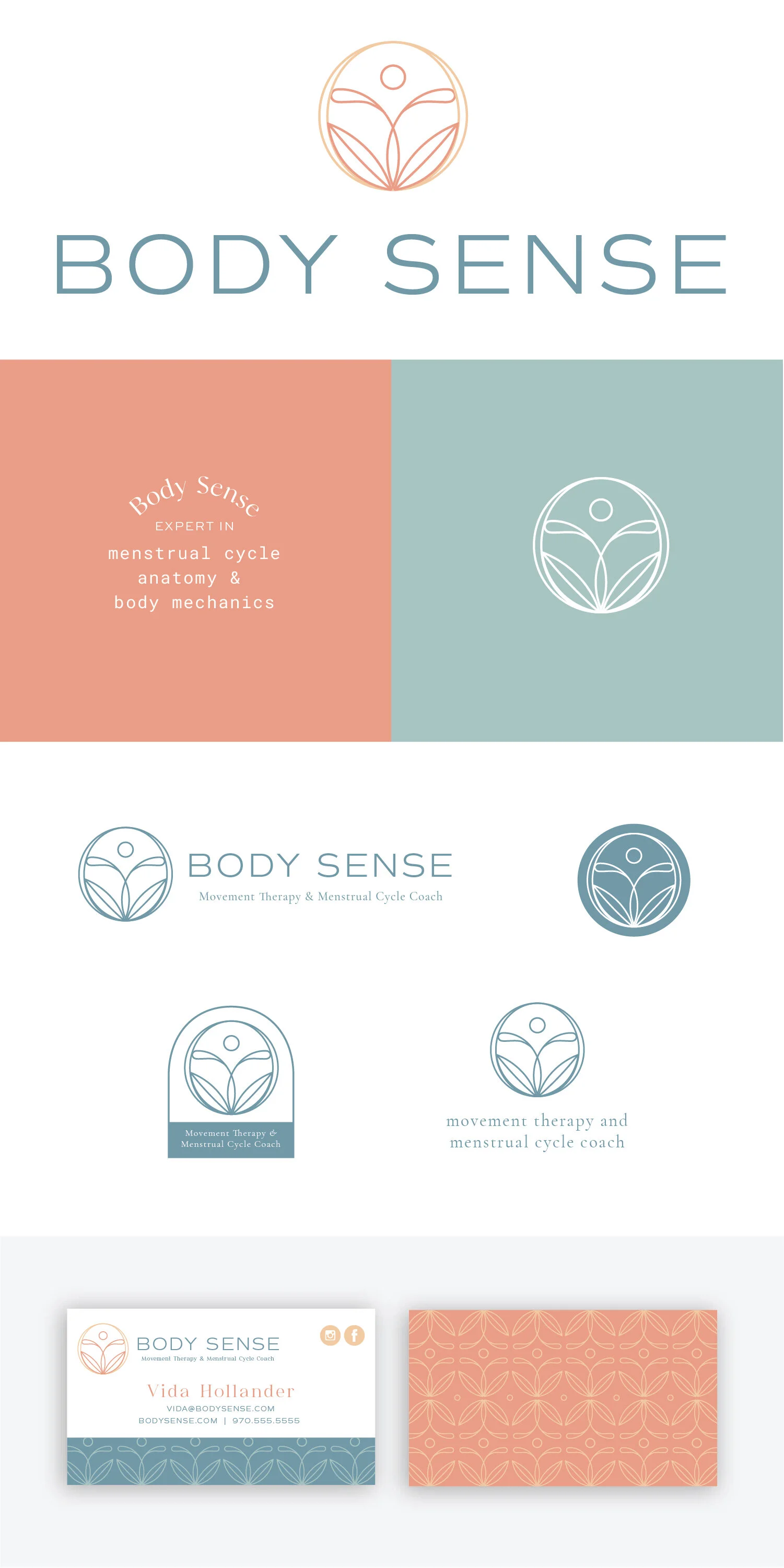
Below each of the three concepts shows the
Primary Logo
Tagline Example
Secondary Logo/Logo Mark
Logo Variations
Business Card Design
Note
While each of these designs are meant to show a developed idea of each concept, each will be refined and the chosen concept will be carefully considered and added to until the brand is the strongest representation it can be.
Business card concepts are meant to show how the brand can progress beyond the logo alone and will be refined along with the logo. Additionally, the information shown is placeholder information.
Moodboard

Grounded, knowledgeable, authentic, embodied, committed, hopeful
Initial Concepts

Concept 1
I would describe this concept as simple and memorable. The main idea generated by this logo is the idea of expansion. The drop is a familiar symbol and can communicate many facets of your brand in a simple way.
Having the drop start smaller and layer on itself is a reference to your intuition and beginning from an inward place.
Most obviously in your practice, it can reference your period or your cycle. One of the strongest underlying messages is the way that a drop creates a ripple effect and a compounding effect. Starting your Body Sense practice is similar to starting a ripple effect to create momentum. Small positive actions create bigger momentum and if you keep working at it drops of effort and practice over time add up.

Concept 2
This concept fuses multiple ideas together using a natural, organic style. The hand-drawn style of the logo mark brings in an element to tie in nature and evokes softness and a feeling of kindness.
The symbols themselves have an abstract anatomical reference starting with the head or the top of the spine. The side shapes represent the curvature of the human figure, particularly in women’s bodies, but can also represent a blooming shape as well. The shapes at the bottom serve as the anchor points and can be seen as leaves or sit bones to represent a meditative posture.
The components in this logo mark balance downward grounding movement along with rising, upward growth. Together these two create a strong message of growth and transformation.

Concept 3
This option is a more simplified idea of creating an abstracted anatomical symbol. The style of the shapes is minimal without feeling bare and creates a balance between strong and graceful shapes. The circles, both as the outer framing shape and the inner circle for the head are grounding and create a strong focal point. Together, the shapes in the middle create a reference to both the pelvis and the limbs of the body. The linework creates a sense of fluidity and movement between the shapes.
One of the strong suits of this concept is the way the logo mark works on its own but can also be expanded on to create a strong, unique pattern like on the back of the business. card. This is a pattern that can be used throughout branding materials and on the website.
Revisions
Primary differences include:
Addition of the burst above the head - I think this really brings energy and does a great job of conveying radiance and growth
The type from Concept 1 paired with the mark from Concept 3
Concept 1 Business Card with updated logo elements
Sunburst and drop applied as secondary design elements
Addition of a horizontal text logo with the drop element - This may not be used very often, but can be nice to have as an option and is also meant to serve as an example of how the drop can be incorporated.
