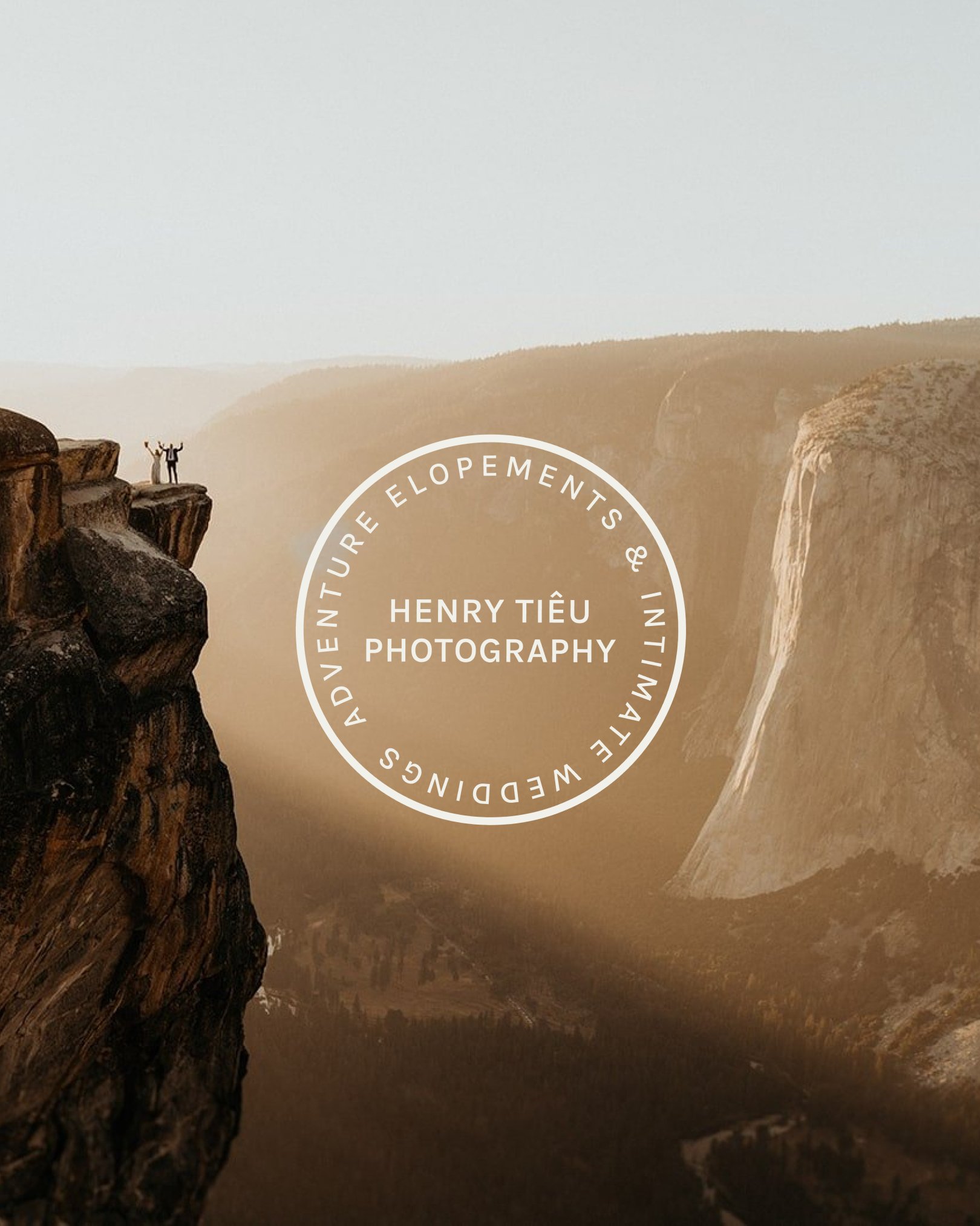
Henry Tieu Photography Brand Reveal
The only way to describe Henry Tieu is as a true artist. His particular form of artistry is elopement photography, but he elevates it to a new standard. His reason to rebrand was prompted by the desire for his style to reflect his elevated experience and attention to detail he provides to his couples.
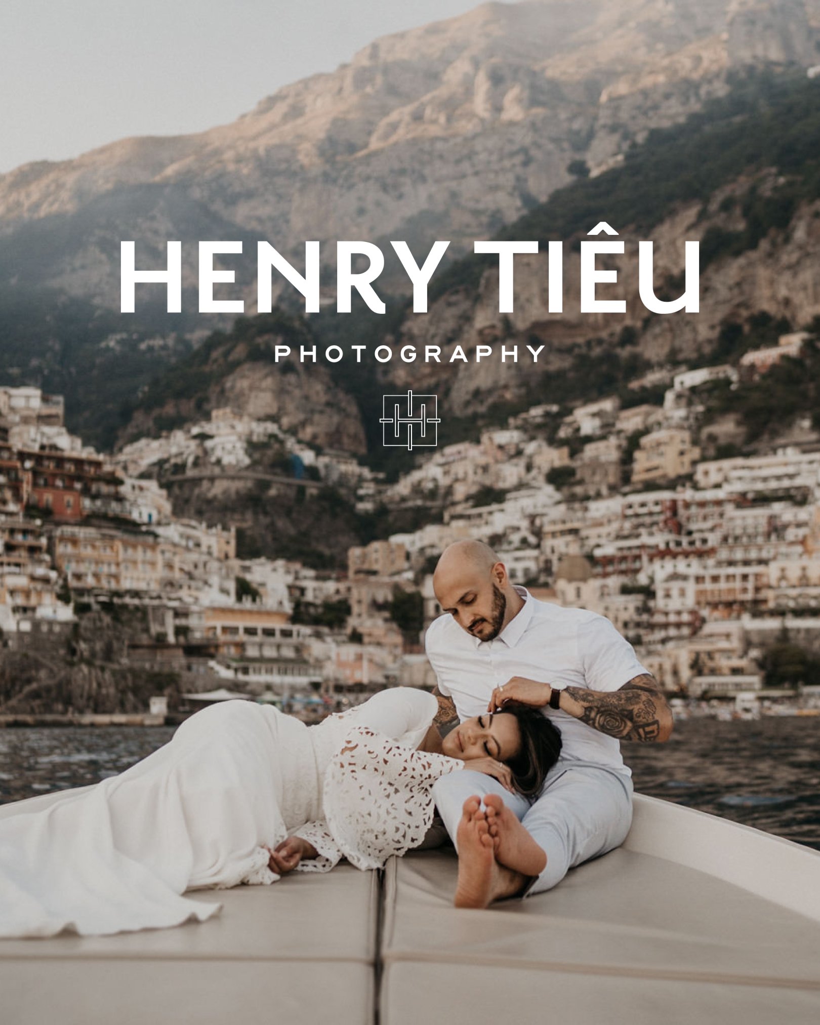
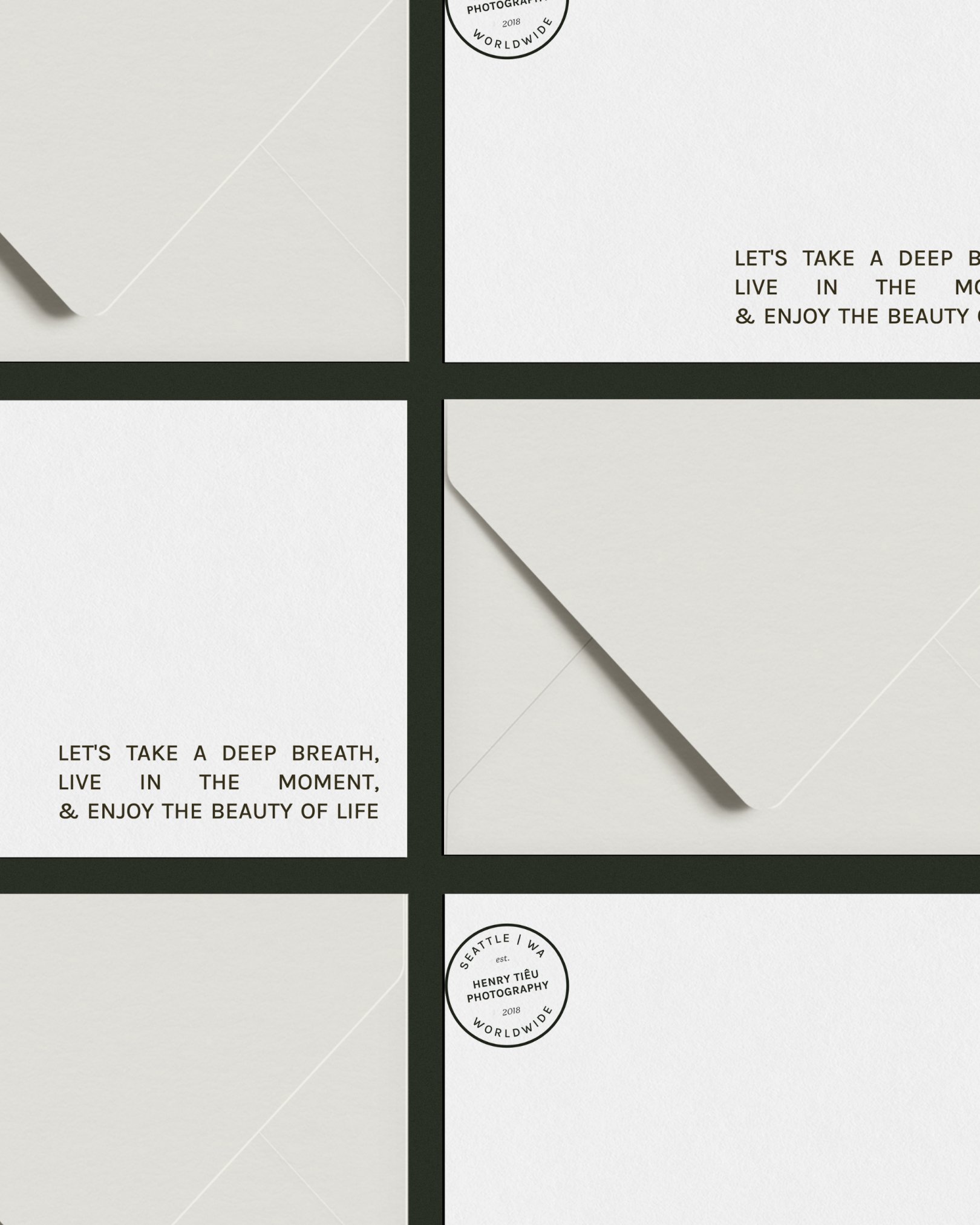
Specifically, the goal was to switch from a rugged, adventurous, outdoorsy brand to a more refined, luxury brand. To achieve this, I used a modern, but approachable font for the logo text and focused on a minimal design.
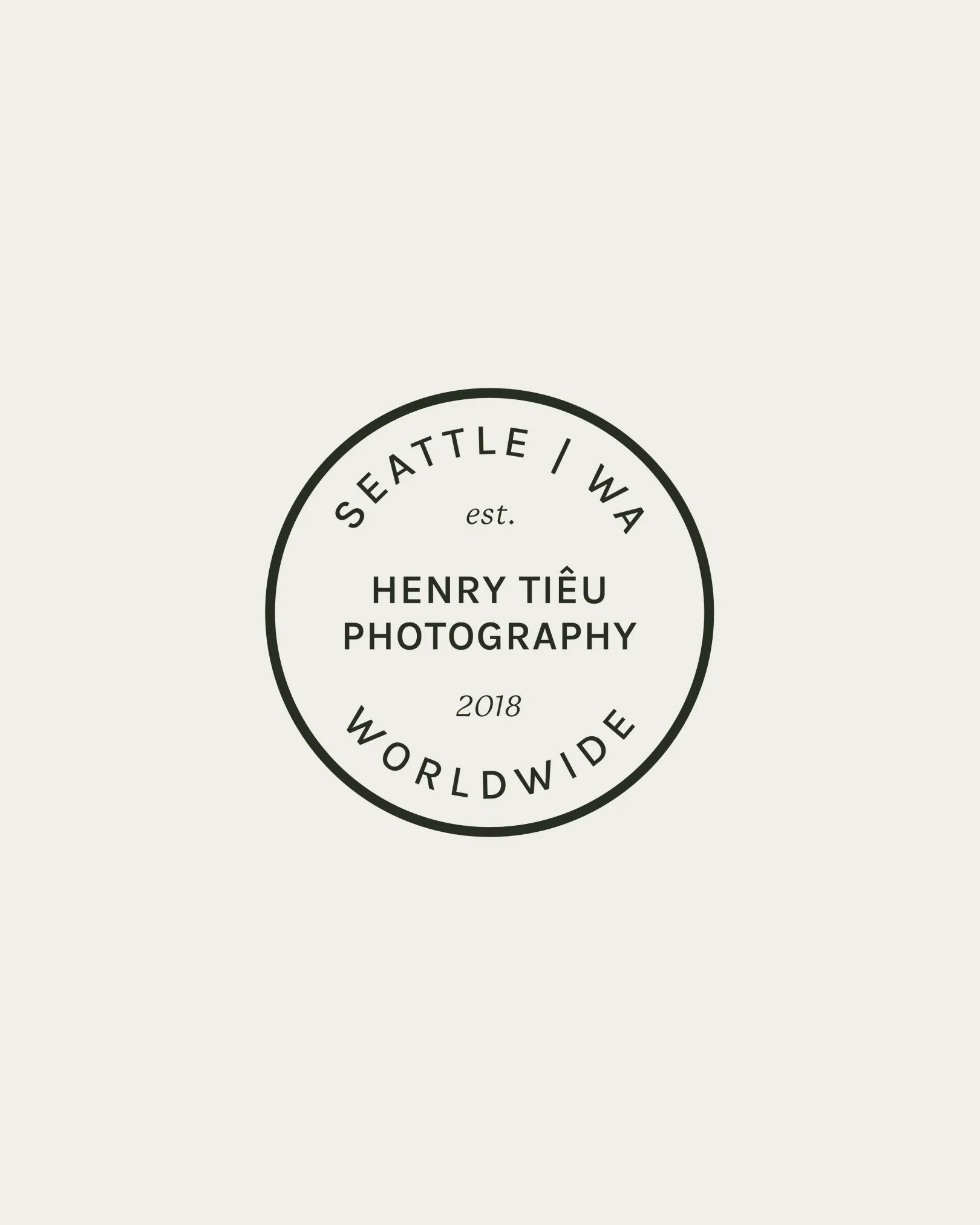
For the logo mark, I wanted to use Henry’s initials. His name recognition is very strong within in the elopement industry, so I wanted to capitalize on that.

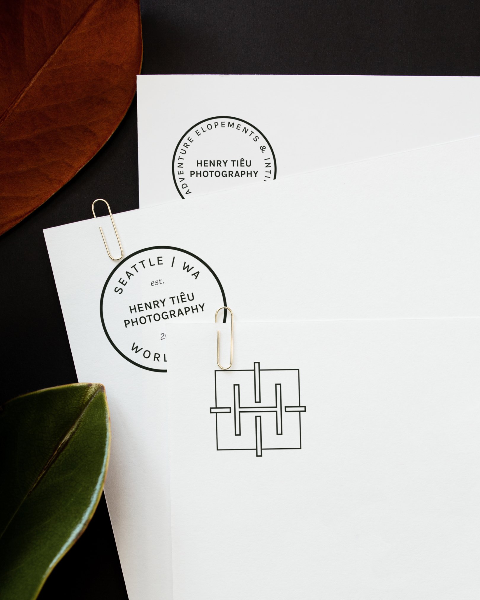

Henry uses a lot of symmetry in his art, so I wanted to reference that in his logo mark. The intersection of the initials are surrounded by simple rectangle shape to reference framing, another key distinguisher in Henry’s photography.