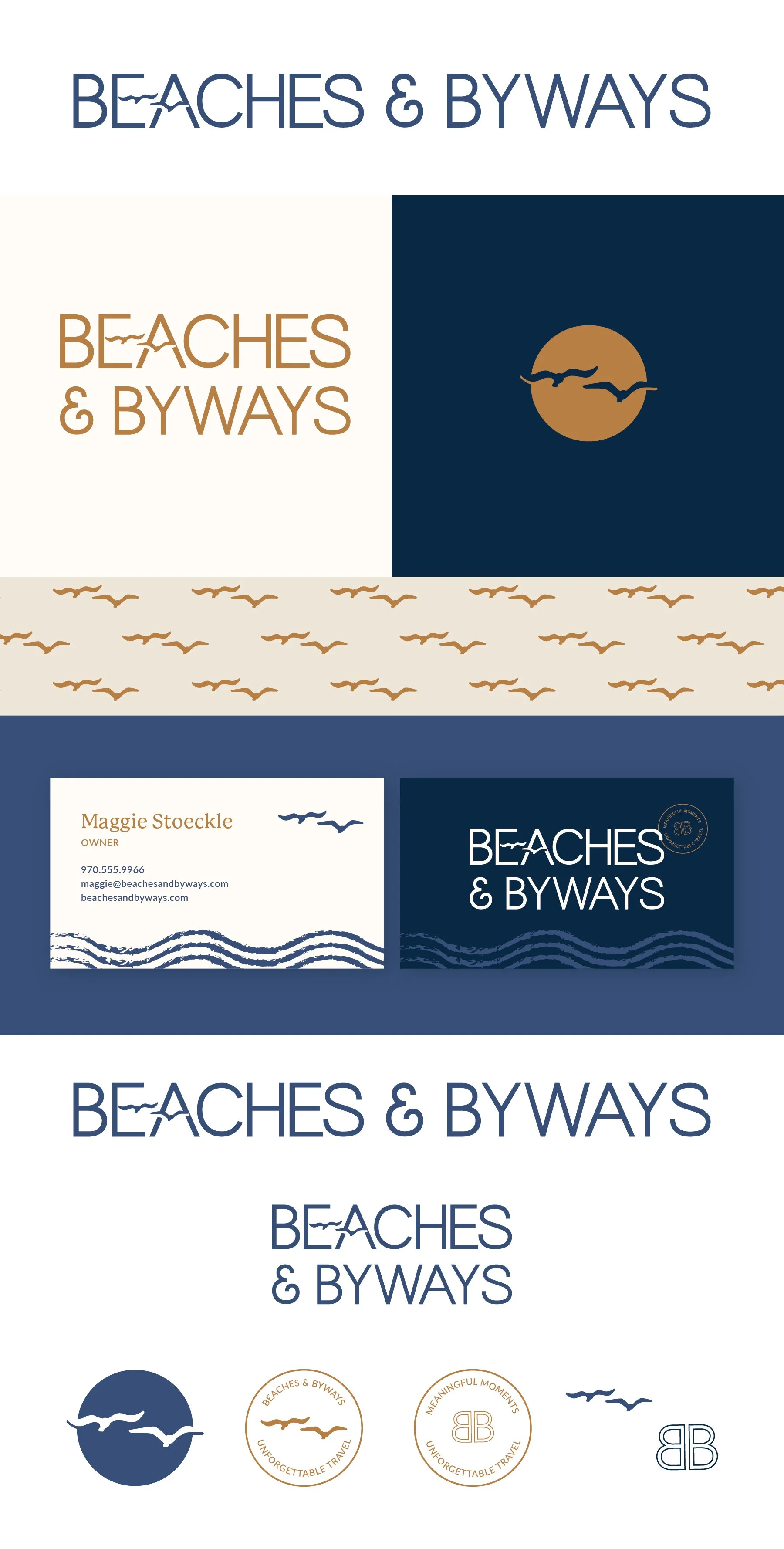
Beaches & Byways
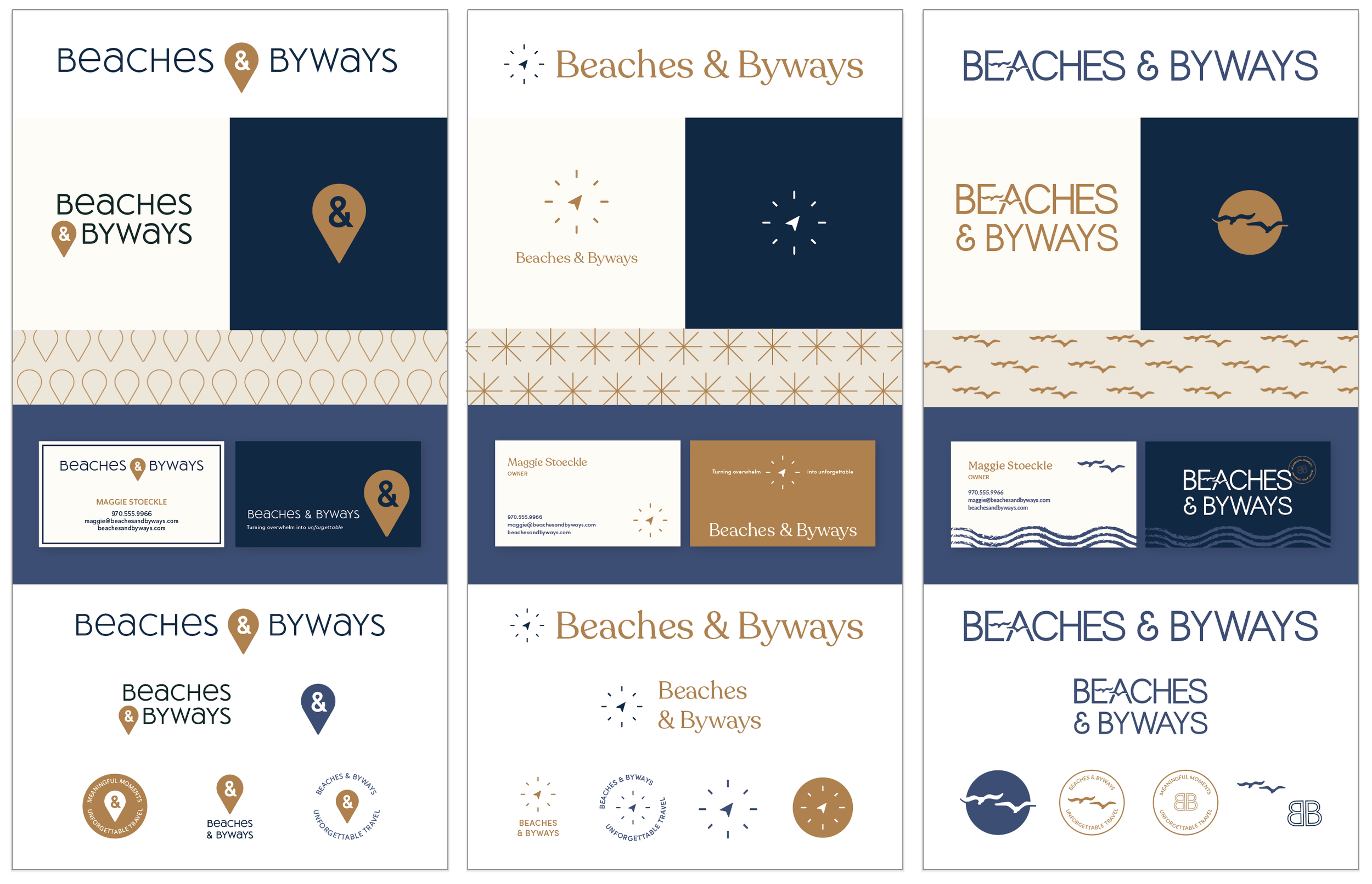
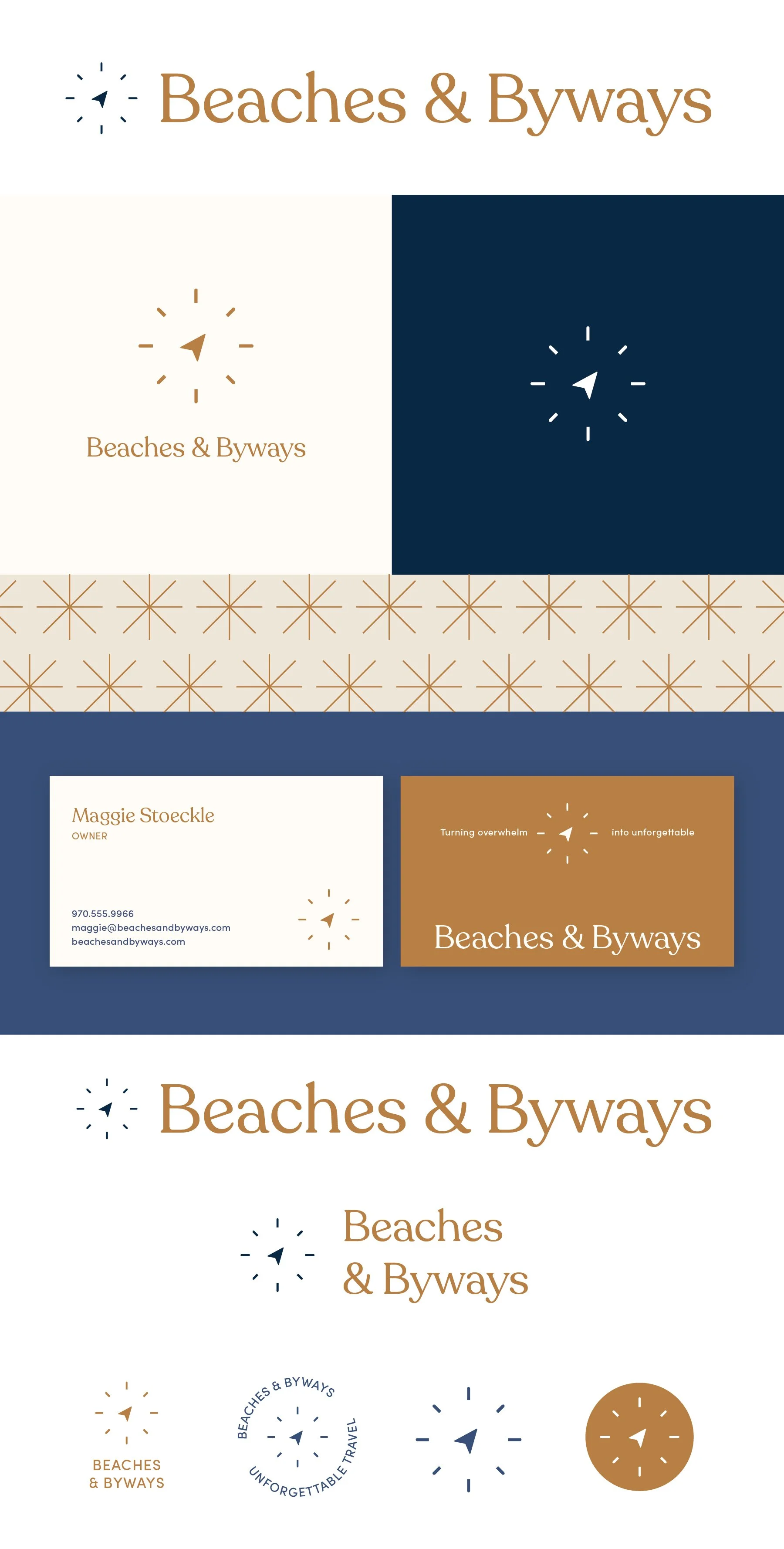
Below each of the three concepts shows the
Primary, Vertical Logo
Initial/Logo Mark
Alternate Logo Composition
Business Card Mockup
Photo Overlay
Shopping Bag Mockup
Logo Suite
Note
While each of these designs are meant to show a developed idea of each concept, each will be refined and the chosen concept will be carefully considered and added to until the brand is the strongest representation it can be.
Business card concepts and the homepage mockup are meant to show how the brand can progress beyond the logo alone and will be refined along with the logo. Additionally, the information shown is placeholder information.
Initial Concepts

Concept 1
Modern, approachable, and versatile.
One strong suit of this option is that it very broadly encapsulates location and travel - without having to reference a specific place or use a plane, making it subtle, but you don’t sacrifice having a “travel” related visual in the logo. This mark will work well on its own in marketing materials and can be expanded on to use as bullet point, as a pattern, etc.
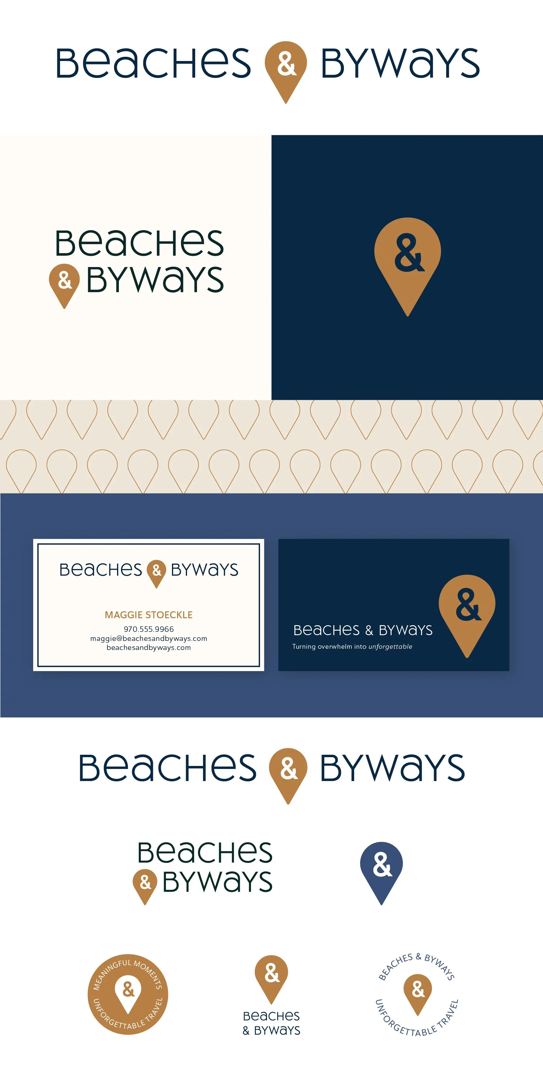
Concept 2
This concept combines a few travel-related ideas. The primary reference is a subtle, stylized compass, but the compass rose is stylized to resemble sun rays to evoke a vacation mindset. The whole logo has a light nautical feeling to it, which pairs well with your names, but it isn’t over the top or specifically pinpointing a certain geography.
Concept 3
This concept plays on the idea of feeling “free as a bird”. It loosely ties in with your names, as many people are familiar with gulls and various birds at the beach, but birds are everywhere, so it easily translates to travel destinations worldwide. It also brings a subtle idea of taking off, flying, feeling light, feeling free, and being somewhere far away.
I tried adding extra elements on this version, like wave lines as a design element on the business card, but those could easily be removed and wouldn’t be part of the primary logo, simply something to add texture to branded materials.