Adventure Instead
Below each of the three concepts shows the
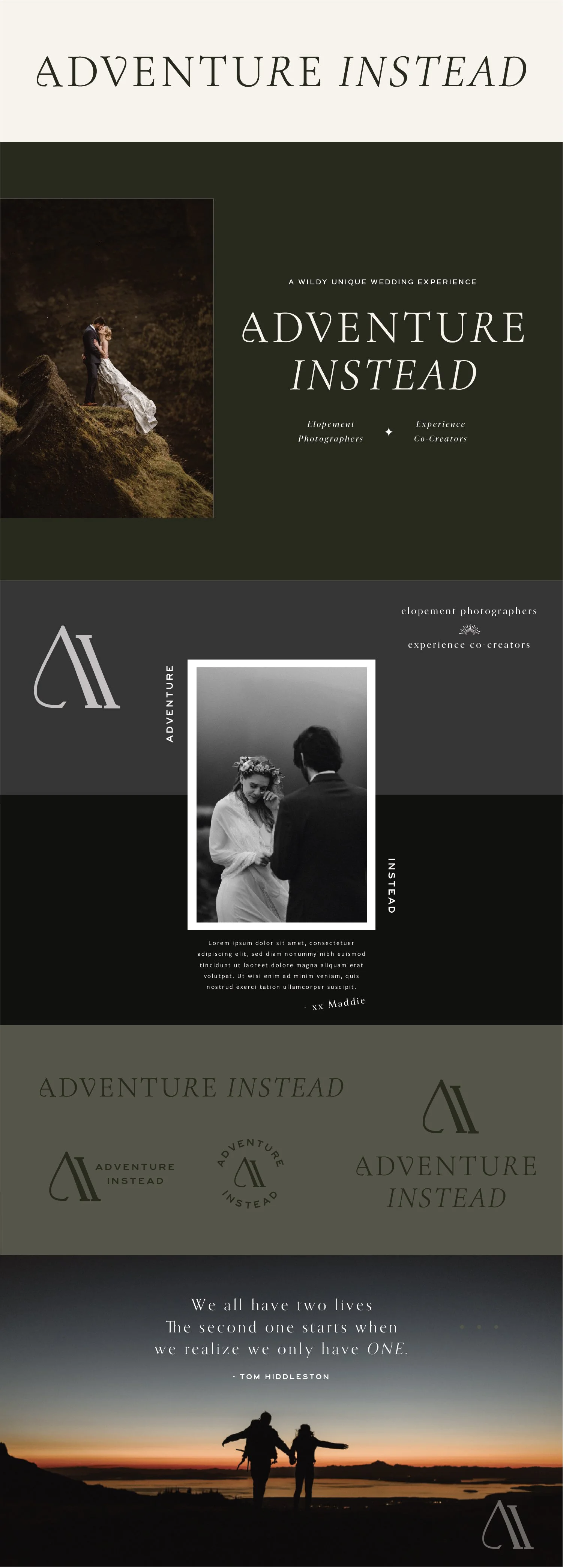
Primary Horizontal Logo
Vertical Tagline Logo
Initial Logo Mark
Logo Variations
Pull Quote Example
**Beginning Color Palette
Note
While each of these designs are meant to show a developed idea of each concept, each will be refined and the chosen concept will be carefully considered and added to until the brand is the strongest representation it can be.
The Adventure Instead brand has so many applications, that regardless of the concept chosen it will evolve and have elements added as new needs arise.
Particularly, the color palette is meant to show a general direction and starting point and will be added to/refined within the first few marketing items.
Initial Logo Mark Concepts
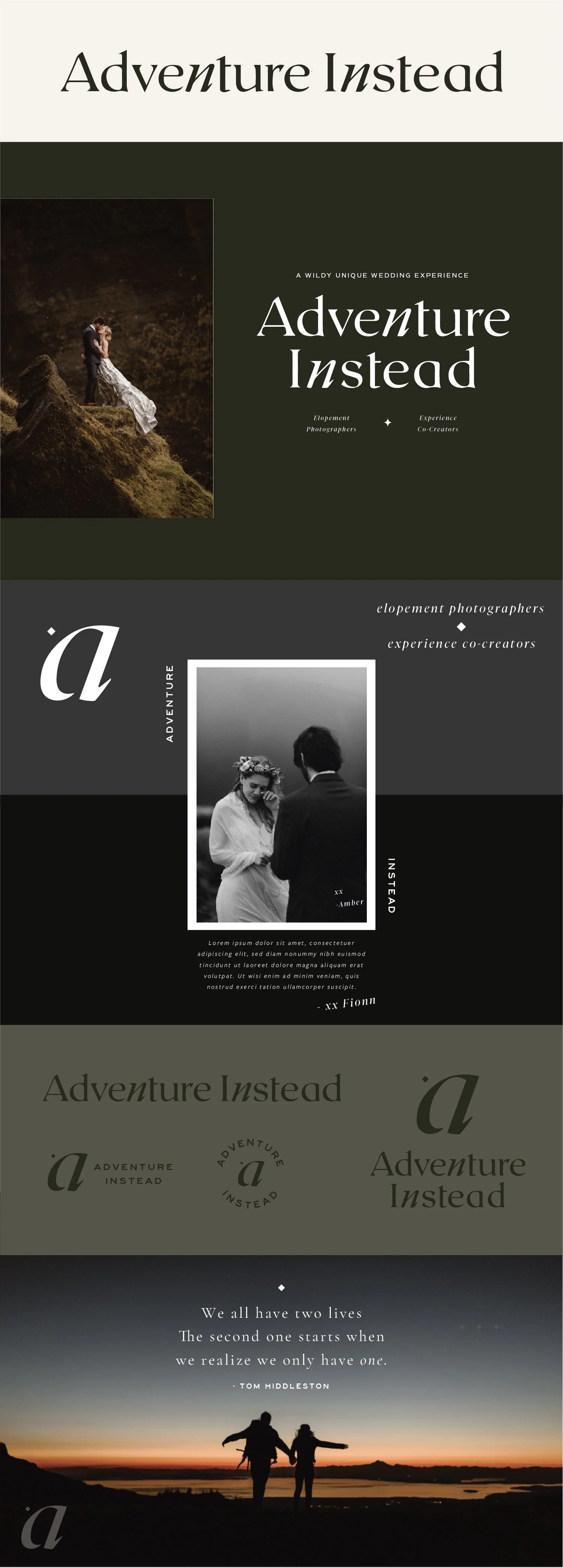
Concept 1
Key descriptor words: Delicate, romantic, ethereal, dreamy, fantasy day, understated
I think the strong suit of this version is how clean and simple it is. It lets the photos fully speak for themselves. I like the idea of having the primary website logo be simple, straightforward text and having a lot of elements to play with around that, so I designed a more artistic A for the logo mark based on the primary logo font. It has a nice movement and doesn’t communicate anything overly literal, but it does subtly convey a journey, like a wedding day.
One of the strong suits of the initial mark is the verstility. It works well as a single dividing line. It also works well when it is doubled and rotated as a more distinct mark. I love the idea of this logo mark kind of conveying two figures, closely interacting. It also has a slight calligraphic look to it, so it captures some of that classic flourish, type treatment without being frilly or overly feminine.
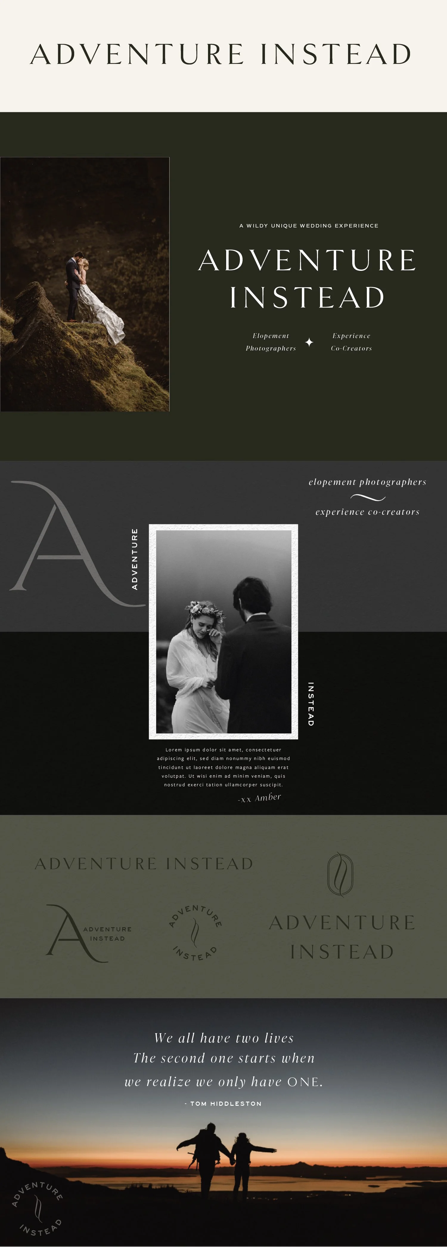
Concept 2
Key descriptor words: Nostalgic, classic, not as delicate as Option 1
The way I would describe this is as confident. I wouldn’t call this rugged, but there’s less of a refined “polish” than the text in Concept 1. I think. This has a lot of opportunity to play up the emotional, personal connection with your couples. It feels welcoming and familiar. It is also very timeless, so it should be able to evolve with the brand.
I know that generally script font isn’t your go-to, but I wanted to try out one small handwritten detail. This handwritten AI would only be used as a watermark element - to be used in a story-telling manner. Ideally, I imagine an animated version of this so there’s motion involved. I see this as AI’s details to capture a personal & nostalgic feeling. I was thinking of the detail shots of couples writing thier vows and how that evokes emotion, and I wanted to replicate that feeling for AI.
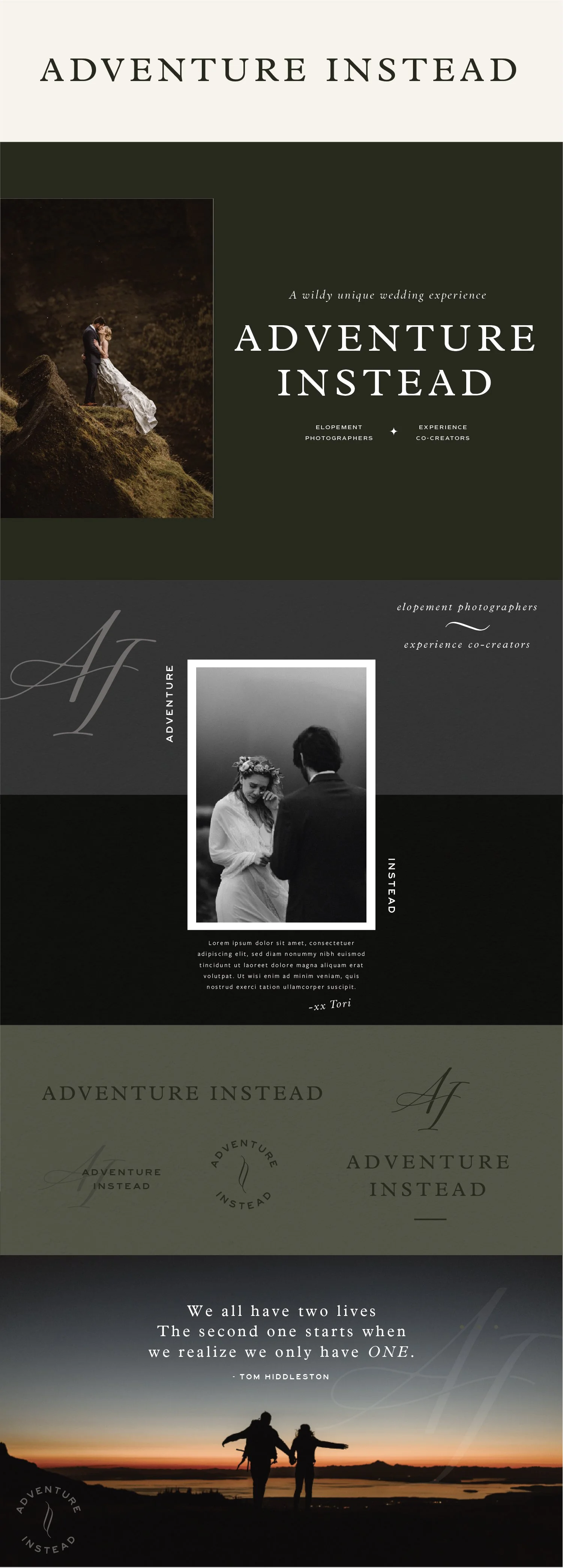
Concept 3
Key descriptor words: Nostalgic, classic, not as delicate as Option 1
This concept has the most customization in the primary text logo of the four options, so it will stand out as unique to you the most. It has a character! The thing I really like about it is that it subtly communicates “not playing by the rules.” Choosing a few italic letters within one word isn’t a go-to type solution - but I love that it kind of feels like choosing whatever works for you for your wedding day.
I also love the way the A and the V relate to one another. They are mirroring one another, feeling similar in intimacy and closeness to your couples. I also love in the initial mark the way the A and I feel like they lean leaning on and supporting one another.
I would say this is a little more playful, but stops short of “quirky” and would still describe it as refined first.
Concept 4
I wanted to include another version that is similar to concept 3 with a few different call-outs. This text is a little more playful / unique / funky. I this it’s really fun and distinct.
In case, the A and V were too much in concept 3, this has the same idea of “not playing by the rules” with the italicized n, just a little less “story” behind the letters. I like the simplicity of this and the way there could be call-out italics throughout elements in the brand. I think that could be a cool story-telling, repeat visual.
**This Concept is using outlined text, meaning I didn’t purchase this font at this stage and there are a couple of very minor imperfections in the letters, so the final would appear slightly different. You can view full text samples here.